Use the Home dashboard
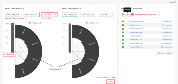
The Home dashboard is the main dashboard of the Content Pack for Unix Dashboards and Reports. The dashboard displays performance statistics on two configurable radial graphs as well as an alert "ticker" that displays the most recently triggered alerts within the app.
Perform the following steps to open the Home dashboard:
- In Splunk Web, open ITSI or IT Essentials Work.
- From the navigation bar, choose Dashboards > Dashboards.
- Open the Home - Unix dashboard. The App name is DA-ITSI-CP-unix-dashboards.
Performance radial graphs
On the left side of the screen are two performance radial graphs. These graphs display information about real-time performance for a category or group of hosts. Each radial graph operates independently, and the graphs update once every 15 seconds by default.
The radial graphs are divided into slices, depending on which category and groups you selected for that radial graph. If you have configured more than one host in a group, the graph displays the metric averaged across all machines within the group.
As performance levels increase or decrease for a certain category or group of hosts, the slices of the radial graph fill in with white, beginning at the center and extending out to their edges. The higher the performance metric, the more the slices fill up.
You can configure these radial graphs to display information on any single host or group of hosts that the Content Pack for Unix Dashboards and Reports has collected data for, and based on categories and groups you have defined in the content pack Settings page.
To learn how to define categories and groups of hosts, see Configure the Content Pack for Unix Dashboards and Reports.
Change radial graph display stats
To change which statistics a radial graph displays, perform the following steps:
- Click the Category menu under the title for a radial graph. The radial graph refreshes to load groups and hosts contained by the chosen category.
- Click the Group menu. A window pop up displays the groups in that category.
- Activate one or more groups by clicking the checkbox next to the desired group. The radial graph updates to show statistics for the selected host groups.
- Click the performance metric dropdown next to the Group dropdown. A window pops up and displays the available performance statistics.
- Choose the performance metric from the items in the pop-up window. The radial graph updates to display the desired performance metrics for the chosen category and group(s).
Change radial graph threshold colors
You can select radial graph colors by editing the threshold bars that are next to each radial graph.
Each threshold bar is divided into sections. Clicking the threshold bar adds a slider at the point where you clicked, and displays a color palette from which you can choose a color for a specific level of performance metric.
Once you have added a slider, you can change what threshold that slider represents by moving it up or down on the threshold bar. The radial graph updates to show your changes immediately.
To remove a slider, drag it off of the threshold bar. The radial graph updates again to reflect the color changes.
Clear all customizations on radial graphs
On the home dashboard, click Clear to reset the radial graphs to their default settings. This removes all colors and sliders in the threshold bars.
View triggered alerts
The Recent Unix Headlines window displays the most recent alerts triggered by the Content Pack for Unix Dashboards and Reports.
You can see the alerts that have triggered recently, as well as their severity. To learn how to configure these triggers, see Configure the Content Pack for Unix Dashboards and Reports.
You can limit the alerts that the app displays by clicking on the green circle, yellow triangle, and a red circle on the right, above the list of triggered alerts.
You can find out more about an alert by clicking it in the list.
Use the Manage Headlines button to edit the headlines you see when an alert triggers. You can create headlines which you can then link to alerts. When the alerts trigger, the headlines appear in the Recent Headlines panel.
Headlines are only configurable by users with admin permissions.
| Use the Content Pack for Unix Dashboards and Reports | Use the Metrics dashboard |
This documentation applies to the following versions of Content Pack for Unix Dashboards and Reports: 1.2.0, 1.3.0

 Download manual
Feedback submitted, thanks!