Predict Numeric Fields
The Predict Numeric Fields assistant uses regression algorithms to predict numeric values. Such models are useful for determining to what extent certain peripheral factors contribute to a particular metric result. After the regression model is computed, you can use these peripheral values to make a prediction on the metric result.

The visualization above illustrates a scatter plot of the actual versus predicted results. This visualization is from the showcase example for Predict Numeric Fields, with the Server Power Consumption data in the Splunk Machine Learning Toolkit.
Algorithms
The Predict Numeric Fields assistant uses the following algorithms:
Fit a model to predict a numeric field
Prerequisites
- For information about Preprocessing, see Preprocessing.
- If you are not sure which algorithm to choose, start with the default algorithm, Linear Regression, or see Algorithms.
Workflow
- Create a new Predict Numeric Fields Experiment, including the provision of a name.
- On the resulting page, run a search.
- (Optional) To add preprocessing steps, click + Add a step.
- Select an algorithm from the Algorithm drop down menu.
- Select a field from the drop down menu Field to Predict.
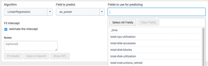
- Select a combination of fields from the drop down menu Fields to use for predicting.
As seen below in the server power showcase example, the drop down menu contains a list of all the possible fields that could be used to predict ac_power using the linear regression algorithm.
- Split your data into training and testing data.
- (Optional) Depending on the algorithm you selected, the toolkit may show additional fields to include in your model.
- (Optional) Add information to the Notes field to keep track of adjustments you make as you adjust and fit the algorithm to your data.
- Click Fit Model.
When you select the Field to predict, the other drop down Fields to use for predicting populates a list of fields that you can include in your model.

Fit the model with the training data, and then compare your results against the testing data to validate the fit. The default split is 50/50, and the data is divided randomly into two groups.
To get information about a field, hover over it to see a tooltip. The example below shows the optional field N estimators from the Random Forrest Regressor algorithm.

View any changes to this model under the Experiment History tab.
Important note: The model will now be saved as a Draft only. In order to update alerts or reports, click the Save button in the top right of the page.
Interpret and validate
After you fit the model, review the results and visualizations to see how well the model predicted the numeric field. You can use the following methods to evaluate your predictions.
| Charts & Results | Applications |
|---|---|
| Actual vs. Predicted Scatter Plot | This visualization plots the predicted value (yellow line), against the raw actual values (blue dots), for the predicted field. The yellow line showing the perfect result generally isn't attainable, but the closer the points are to the line, the better the model. Hover over the blue dots to see actual values. |
| Residuals Histogram | A histogram that shows the difference between the actual values (yellow line), and the predicted values (blue bars). Hover over the blue bars to see the residual error, different between the actual and predicted result, and sample count, the number of results with this error. In a perfect world all the residuals would be zero. In reality, the residuals probably end on a bell curve that is ideally clustered tightly around zero. |
| R2 Statistic | This statistic explains how well the model explains the variability of the result. 100% (a value of 1) means the model fits perfectly. The closer the value is to 1 (100%), the better the result. |
| Root Mean Squared Error | The root mean squared error explains the variability of the result, which is essentially the standard deviation of the residual. The formula takes the difference between actual and predicted values, squares this value, takes an average, and then takes a square root. This value can be arbitrarily large and just gives you an idea of how close or far the model is. These values only make sense within one dataset and shouldn’t be compared across datasets. |
| Fit Model Parameters Summary | This summary displays the coefficients associated with each variable in the regression model. A relatively high coefficient value shows a high association of that variable with the result. A negative value shows a negative correlation. |
| Actual vs. Predicted Overlay | This shows the actual values against the predicted values, in sequence. |
| Residuals | The residuals show the difference between predicted and actual values, in sequence. |
Refine the model
After you interpret and validate the model, refine the model by adjusting the fields you used for predicting the numeric field. Click Fit Model to interpret and validate again.
Suggestions on how to refine the model:
- Remove fields that might generate a distraction.
- Add more fields.
In the Experiment History tab, which displays a history of models you have fitted, sort by the R2 statistic to see which combination of fields yielded the best results.
Deploy the model
After you interpret, validate and refine the model, deploy it:
- Click the Save button in the top right corner of the page. You can edit the title and add or edit and associated description. Click Save when ready.
- (Click Open in Search to open a new Search tab. This shows you the search query that uses all data, not just the training set.
- Click Open in Search to open a new Search tab.
- Click Show SPL to see the search query that was used to fit the model.
- Under the Experiments tab, you can see experiments grouped by assistant analytic. Under the Manage menu, choose to:
- Create Alert
- Edit Title and Description
- Schedule Training
- Click Create Alert to set up an alert that is triggered when the predicted value meets a threshold you specify. Once at least one alert is present, the bell icon will be highlighted in blue.
This shows you the search query that uses all data, not just the training set.
For example, you could use this same query on a different data set.
If you make changes to the saved experiment you may impact affiliated alerts. Re-validate your alerts once experiment changes are complete.
For more information about alerts, see Getting started with alerts in the Splunk Enterprise Alerting Manual.
|
PREVIOUS Custom visualizations |
NEXT Predict Categorical Fields |
This documentation applies to the following versions of Splunk® Machine Learning Toolkit: 3.2.0, 3.3.0
Feedback submitted, thanks!