Use the Metrics dashboard
The Metrics dashboard displays a variety of performance statistics for any number of hosts in various different customizable graphs.
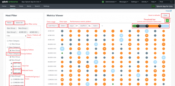
The dashboard divides into two panels: The Host Filter panel, which allows you to type in a host name to see only its data or filter hosts by category and group, and the Metrics Viewer, which shows the metrics that the Splunk App for Unix and Linux has collected over time in a circle-graph pattern.
Host Filter
The Host Filter panel allows you to select which host(s) you want to view. It contains a Filter text box and a list of all of the categories and groups you have created when you configured the Splunk App for Unix and Linux.
Each category entry has an arrow next to it that, when clicked, opens to show all groups and hosts in that category. When you load the page in the Splunk App for Unix and Linux, all of these entries have been expanded.
You can also select groups and categories by clicking on the name of a group or category. Clicking on a group selects all hosts in the group, and clicking on a category selects all groups and all hosts in the category.
To choose hosts:
1. In the category list, use your mouse to scroll through the list of available hosts.
Note: Optionally, you type in the full or partial name of a host in the Filter text box and press Enter. The Splunk App for Unix and Linux updates the category entries to show only those hosts that contain the text string you entered.
2. Select the host(s) which you want to display metrics on. The Splunk App for Unix and Linux updates the Metrics Viewer to show metrics for the selected host(s).
Note:
- To select multiple hosts, shift-click (control-click on Windows, Command-click on Mac OSX) the host entries.
- If you select all of the hosts in a group, the Splunk App for Unix and Linux automatically selects the group.
- You can also select groups and categories, by clicking on the name of a group or category, respectively.
- Clicking on a group selects all hosts in the group, and clicking on a category selects all groups (and thus all hosts) in the category.
Remove filters
To remove an existing host filter, click on the X button on the right side of the Filter text box.
Metrics Viewer
The Metrics Viewer panel displays metrics on the hosts that you have selected in the Host Filter panel. If you have not selected any hosts, this panel is empty.
The Metric Viewer allows you to display various different performance metrics over various ranges of time. It also allows you to add color to your graphs in a way that is meaningful to you.
View desired performance metrics
To change the data that the Metrics Viewer displays:
- Select hosts in the Host Filter panel, if you have not already done so. No data will display in the Metrics Viewer without your completing this step.
- Set the time range for the graph by clicking the time range drop-down picker (the left-most of the row of buttons under the "Metrics Viewer" text) and selecting the desired time range.
- Select the kind of data you want to view by clicking on the data type drop-down picker (the second button from the left) and selecting the desired type of data.
- CPU
- Memory
- Disk
- Process
- I/O
- Choose the performance metric you want to see by selecting the appropriate entries in the performance metric drop-down pickers.
The Splunk App for Unix and Linux updates the next three drop-down buttons to include metrics on the type of data you selected.
Note: There are five data types to choose from:
For example, if you chose the "Memory" data type and wanted to see maximum free memory by host, you would select:
- max in the first performance metric picker,
- memFreeMB in the second picker, and
- host in the third picker.
The Splunk App for Unix and Linux updates the graphs to show the selected time range, data type, and performance metrics.
What the graphs mean
- In these graphs, larger bubbles represent higher levels of metrics, while smaller bubbles represent lower levels of metrics.
Set the color in your graph bubbles
You can adjust the color of the graph bubbles to give them more meaning.
To set a color range, move the slider to to the desired color level. The slider color shows your chosen range, all bubbles currently displayed by the metrics viewer updates to the chosen color range, and a number relative to the position between 0 and 100 appears on the slider.
Reset to defaults
To remove all customized graphs and return to the default Metrics Viewer screen, click the Clear button in the upper right corner.
| Use the Home dashboard | Use the Hosts dashboard |
This documentation applies to the following versions of Splunk® App for Unix and Linux (EOL): 5.2.2, 5.2.3, 5.2.4, 5.2.5, 6.0.0, 6.0.1, 6.0.2

 Download manual
Feedback submitted, thanks!