 Download topic as PDF
Host Performance Reports
The Host Performance Reports page lets you see the status of your Exchange servers based on their Exchange server role.
How to use this page
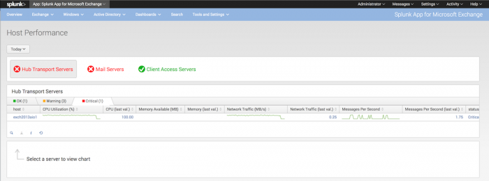
When the page initially loads, you see three status indicators for Hub Transport servers, Mail servers, and Client Access servers. The indicators show the status of each group of servers:
- If all servers in the group are functioning normally, the status indicator shows a checkmark with the text in green.
- If any server in the group has warnings, the status indicator shows an exclamation icon with text in yellow.
- If any server in the group has a critical error, the status indicator shows an "x" icon with text in red.
You can then click on one of the status indicators to get a list of the servers in that group. The list has three tabs, "OK", "Warning", and "Critical". The list categorizes servers based on the status they report. For example, if a server reports itself as "Critical", the list shows the server under the "Critical" tab.
Each server in the list has columns that show CPU usage, available memory, network traffic, messages per second, and status based on these factors. The CPU, memory, network traffic, and messages per second columns also have corresponding spark lines that show recent activity over time.
- To switch between the different lists based on status, click the tab at the top of the list.
- To get a graph of recent host activity for a given host, click the host in the list. The app opens a second chart that displays this information.
- To sort a list by a specific metric, click the metric's column header. Click again to toggle an ascending or descending sort.
- You can click the magnifying glass icon in the lower left corner of each panel to display the base search that produced the panel.
- You can mouse over any line in a panel to see individual values for that plot.
- You can click on a point in any chart to load the Performance Monitoring page for the servers that generate the chosen chart data.
|
PREVIOUS Dashboard reference |
NEXT Client Access Servers |
This documentation applies to the following versions of Splunk® App for Microsoft Exchange (EOL): 3.0.2, 3.0.3

Feedback submitted, thanks!