Visualization reference
Compare options and select a visualization to show the data insights that you need.
To quickly view the most fundamental overview of common visualizations and their use cases, note that you can access the Splunk Dashboards Quick Reference guide by clicking the link in Getting started.
| Visualization | Usage | To learn more see | |
|---|---|---|---|
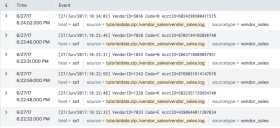
| Events list | Show the events that a search generates.
|
Using events lists | |
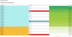
| Table | Compare and aggregate field values.
|
Table visualization overview | |
| Charts | Visualize one or more dimensions in a data set. Use one of the following chart types depending on how many dimensions, or fields, you are visualizing.
|
Chart overview | |
| Single value | Show an aggregated metric in context.
|
Single value overview | |
| Gauges |
|
Using gauges | |
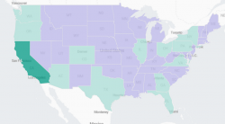
| Maps | Visualize data with geographic coordinates.
|
Mapping data | |
| Custom visualizations | Analyze and represent unique data sets. An admin must install custom visualization apps to make them available for Splunk users. |
See Custom visualizations for more details. |
| Getting started | Data structure requirements for visualizations |
This documentation applies to the following versions of Splunk® Enterprise: 7.1.0, 7.1.1, 7.1.2, 7.1.3, 7.1.4, 7.1.5, 7.1.6, 7.1.7, 7.1.8, 7.1.9, 7.1.10, 7.2.0, 7.2.1, 7.2.2, 7.2.3, 7.2.4, 7.2.5, 7.2.6, 7.2.7, 7.2.8, 7.2.9, 7.2.10, 7.3.0, 7.3.1, 7.3.2, 7.3.3, 7.3.4, 7.3.5, 7.3.6, 7.3.7, 7.3.8, 7.3.9, 8.0.0, 8.0.1, 8.0.2, 8.0.3, 8.0.4, 8.0.5, 8.0.6, 8.0.7, 8.0.8, 8.0.9, 8.0.10, 8.1.0, 8.1.1, 8.1.2, 8.1.3, 8.1.4, 8.1.5, 8.1.6, 8.1.7, 8.1.8, 8.1.9, 8.1.10, 8.1.11, 8.1.12, 8.1.13, 8.1.14, 8.2.0, 8.2.1, 8.2.2, 8.2.3, 8.2.4, 8.2.5, 8.2.6, 8.2.7, 8.2.8, 8.2.9, 8.2.10, 8.2.11, 8.2.12, 9.0.0, 9.0.1, 9.0.2, 9.0.3, 9.0.4, 9.0.5, 9.0.6, 9.0.7, 9.0.8, 9.0.9, 9.0.10, 9.1.0, 9.1.1, 9.1.2, 9.1.3, 9.1.4, 9.1.5, 9.1.6, 9.1.7, 9.1.8, 9.1.9, 9.2.0, 9.2.1, 9.2.2, 9.2.3, 9.2.4, 9.2.5, 9.2.6, 9.3.0, 9.3.1, 9.3.2, 9.3.3, 9.3.4, 9.4.0, 9.4.1, 9.4.2


 Download manual
Feedback submitted, thanks!