Events viewer
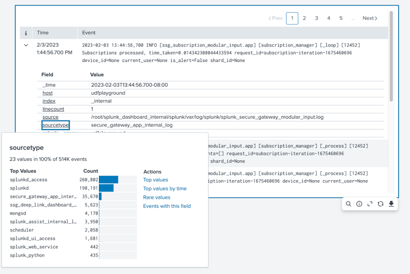
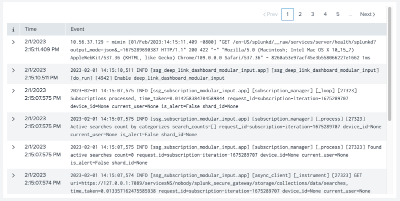
Use the events viewer visualization to capture logs and look at raw data for visibility into the specific attributes of each event. In View mode, you can select an individual event for more detailed information, such as the event's host, source type, and server.
Generate an events viewer
- Select the Add chart button (
 ) in the editing toolbar and browse through the available charts. Choose the events viewer chart.
 - Select the chart on your dashboard to highlight it with the blue editing outline.
- Set up a new data source by selecting + Create search and adding a search to the SPL query window. Or, you can select an existing data source under the Search, Saved search, or Chain search sections.
- (Optional) You can also write a new ID that describes the search better than the default by changing the ID in Data source name.
- Select Apply and close.
Configuration panel options
You can use the Configuration panel to configure the following events viewer components.
Title
Give your visualization a name. The title name is also helpful when searching for individual visualizations in the dashboard definitions and is not the same as the automatically assigned unique ID.
Description
Give your visualization a description to explain what the user is viewing.
Data sources
Choose an existing search or create a new one.
Visibility
You can hide the event viewer if it does not have an attached search query, or that query returns an error or no results.
Position & Size
You can use your mouse or the Position & Size section of the Configuration panel to change the size or location of the visualization for pixel-perfect sizing and placement.
Color and style
Select your event viewer's background color with the supplied colors or a hexadecimal code to apply the color.
Data display
You can show more details for each field in an event by selecting Show field summary. You must add a secondary data source for field summaries to populate. Without a secondary data source, the events viewer will prompt you for an additional data source.
Code
Select your visualization or its search to view and edit the source code in real-time. You can also change the Visualization ID to a more readable ID to help identify this visualization in the source code.
Events viewer in View mode
In View mode, the events viewer can expand on each event and provide more granular detail. For example, you can select a specific event, see the event's source type, and even expand on the source type to view all other source types and their impact on all events.
Events viewer example
The following events viewer example displays pagination for events in chronological order with expandable rows for more in-depth details.
Source code
The following is the source code for the events viewer example.
{
   "visualizations": {
       "viz_XhOpDnJV": {
           "type": "splunk.events",
           "dataSources": {
               "primary": "ds_zo0sYXeT",
               "fieldsummary": "ds_e7So4KvZ"
           }
       }
   },
   "dataSources": {
       "ds_zo0sYXeT": {
           "type": "ds.search",
           "options": {
               "query": "index=_internal "
           },
           "name": "Search_1"
       },
       "ds_rpNV5LBw": {
           "type": "ds.search",
           "options": {
               "query": "index=_internal"
           },
           "name": "Search_2"
       },
       "ds_e7So4KvZ": {
           "type": "ds.chain",
           "options": {
               "query": "| fieldsummary maxvals=10",
               "extend": "ds_zo0sYXeT"
           },
           "name": "Search_3"
       }
   },
   "defaults": {
       "dataSources": {
           "ds.search": {
               "options": {
                   "queryParameters": {
                       "latest": "$global_time.latest$",
                       "earliest": "$global_time.earliest$"
                   }
               }
           }
       }
   },
   "inputs": {
       "input_global_trp": {
           "type": "input.timerange",
           "options": {
               "token": "global_time",
               "defaultValue": "-24h@h,now"
           },
           "title": "Global Time Range"
       }
   },
   "layout": {
       "type": "absolute",
       "options": {
           "width": 1440,
           "height": 960,
           "display": "auto-scale"
       },
       "structure": [
           {
               "item": "viz_XhOpDnJV",
               "type": "block",
               "position": {
                   "x": 30,
                   "y": 20,
                   "w": 1000,
                   "h": 500
               }
           }
       ],
       "globalInputs": [
           "input_global_trp"
       ]
   },
   "description": "",
   "title": "Events viewer example"
}
Source options for events viewers
The following options are available for editing events viewers in the source editor:
| Property | Type | Default | Description |
|---|---|---|---|
| backgroundColor | string | > themes.defaultBackgroundColor | Specify the color used for the background by using a hexadecimal code. For example, #0000FF. |
| eventActions | object | n/a | Specify the available actions to take for an event. For example, [{ "eventType": "eventAction.buildEventType.click", "label": "Build Event Type" }]. Event types should end in .click if utilizing event handlers. |
| fieldActions | object | n/a | Specify the available actions for this field. For example, { default: [{ "eventType": "fieldAction.sharedAction1.click", "label": "Shared Action 1" }] }. Actions under the default key are shared across all field dropdowns. Event types should end in .click if utilizing event handlers. |
| footerFields | string | n/a | Specify field(s) that should display in the footer component. Specify one or more fields to display in the footer component. For example, specify ["source", "dest"] to display the source and destination fields. |
| highlightValuesByField | object | n/a | Specify the field-value pairs to highlight. For example, {"source": "$srcToken$", "dest": "12.21.1.11"} |
| showFieldSummary | boolean | TRUE | fieldsummary maxvals=10 SPL command. |
| Choropleth SVG | Filler and marker gauges |
This documentation applies to the following versions of Splunk Cloud Platform™: 9.0.2303


 Download manual
Feedback submitted, thanks!