Horizon chart components
Learn how horizon chart components emphasize meaning.
Visual elements
Lanes
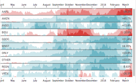
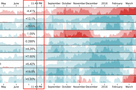
- A horizon chart shows multiple lanes stacked on top of one another. Every horizontal lane in the horizon chart represents one time series.

Bands
- Every lane in a horizon chart shows layered bands or areas. A band is like a horizontal slice of an area chart. Layering bands collapses taller areas into a smaller space. Higher value bands appear in front of lower value bands.

Color
- Bands use color to show how their values relate to a baseline. Values above a baseline appear in shades of one color. Values below a baseline appear in shades of a contrasting color. Deeper shades represent higher values.
Interactive elements
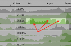
Hover
- When you over any part of a horizon chart, a vertical line appears. This line represents a particular time in the chart time range. On hover, the line shows the values for each time series at the selected time.

Last modified on 19 August, 2016
| Create a horizon chart query | Customize a horizon chart |
This documentation applies to the following versions of Horizon Chart (EOL): 1.0.0, 1.1.0, 1.2.0, 1.3.0, 1.4.0, 1.5.0
Feedback submitted, thanks!