Use the Splunk App for Microsoft Exchange
Exchange Overview page
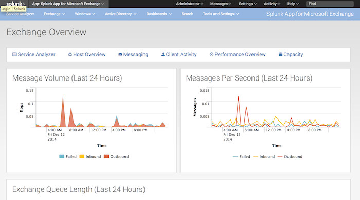
The Exchange Overview page is the starting point for using the Splunk App for Microsoft Exchange. From this page, you can:
- See message volume for the last 24 hours, in kilobytes per second. The area graph shows inbound, outbound, and failed message volume.
- See messages per second for the last 24 hours. This graph also shows inbound, outbound, and failed message volume.
- See current Exchange queue length.
- Visit the Service Analyzer page, which gives you a top-down view of your Exchange services.
- Visit the Host Overview page, which lets you see detailed information about the hosts in your Exchange environment.
- Visit the Message Activity Overview page, which shows you current Exchange messaging statistics at a glance.
- Visit the Client Service Overview page, which displays information on the Exchange users in your environment.
- Visit the Host Performance page, which gives you information on the performance of hosts based on Exchange role.
- Visit the Environment Overview page, which helps you plan for capacity increases as needed.
How to use this page
- In the banner above the charts, click on a link to be taken to that page in the Splunk App for Microsoft Exchange.
- (Optional) Click the Documentation link to view this documentation.
- (Optional) Click the "Learn More about Dashboards" link to learn how to customize and create your own pages in the app.
Message Volume chart
In the "Message Volume" charts, you can hover the mouse over a point on the chart to see that value. Since the chart is an area chart, the highest volume is always at the top.
You can limit the type of volume you see in the chart by hovering over one of the three entries at the bottom of the chart.
To see detailed information about a specific volume type, click inside the area of that volume. The Splunk App for Microsoft Exchange loads the appropriate message activity page for the type of message volume you clicked. See
Message Rate chart
Like with the "Message Volume" chart, you can hover over a point in the chart to see its value and limit the display of the message type you want by hovering over the entries at the bottom of the chart.
When you click on a point in the chart, the Splunk App for Microsoft Exchange loads a Search page that displays a list of the message events that occurred at the point in time that you clicked on the chart.
| Configure the Splunk App for Microsoft Exchange | Dashboard reference |
This documentation applies to the following versions of Splunk® App for Microsoft Exchange (EOL): 3.1.0, 3.1.1, 3.1.2, 3.1.3, 3.2.0, 3.2.1, 3.3.0

 Download manual
Feedback submitted, thanks!