Column and bar charts
Use column and bar charts to compare field values across a data set.
Data formatting
Column and bar charts represent one or more data series. To make sure that a search generates one or more series, check the Statistics tab. The table should have at least two columns.
Search results not structured as a table with valid x-axis or y-axis values cannot generate column or bar charts. For example, using the eval or fields commands might change search result structure.
Statistics table order and chart axes
Column and bar charts handle Statistics table values differently.
Column charts get x-axis values from the first column in the table. The next table columns contain y-axis values.
Bar charts get y-axis values from the first column in the table. The next table columns contain x-axis values.
As an example, any search using the timechart reporting command generates a table where _time is the first column. A column chart generated with this search has a _time x-axis. A bar chart using this search has a _time y-axis.
Single and multiple data series
Column and bar charts can visualize single or multiple data series. The following examples show you how to generate these series.
Single series
A search compares the average number of bytes passed through each source. In this search, the over operator indicates that source is the first table column.
...| chart avg(bytes) over source
The search produces the following table.
Column and bar charts represent this single series differently.
- Column chart
sourcevalues are used for the x-axis. The y-axis in the column chart isavg(bytes).
- Bar chart
avg(bytes)values are used for the x-axis. The bar chart y-axis would representsourcefield values.
Multiple data series
To generate multiple data series, introduce the timechart command to add a _time field to search results. You can also change the query to introduce a split-by field.
For example, change the previous single series search by adding clientip as a split-by field.
...| chart avg(bytes) over source by clientip
The split-by field produces multiple data series. Each clientip is a data series with its own avg(bytes) values for each source.
To show multiple series in a bar or column chart, use the Format menu to configure stacking and multi-series mode.
Configuration options
Use the Format menu to customize one or more of the following column and bar chart components.
- Chart titles
- Axis titles
- Minimum and maximum axis values
- Use a logarithmic unit scale. This option is helpful when there are very small and very large axis values.
- Specify whether to abbreviate y-axis numerical values. For example, a value of 20,000 will be abbreviated to 20K if you toggle this option to On. Only y-axis values can be abbreviated in column and bar charts.
- Chart legend placement and text truncation
- Label rotation
Multiple series options
If the chart represents multiple data series, you can also configure the following options.
Multi-series mode
Compare trends across multiple series. Enable the mode to show independent axis ranges for each series.
Stacked charts
Use a stacked chart to see more details for values in a particular field. You can select unstacked, stacked, and 100% stacked bar and column charts. See the following comparison.
| Stack option | Column or bar appearance | Use case |
|---|---|---|
| Unstacked | Columns or bars for different series appear next to each other. | An unstacked chart is useful for a lower number of series. As the number of series increases, the chart can become more difficult to understand. |
| Stacked | Data points within a series appear as segments of a column or bar. The total column or bar value is the sum of all of the segments. | Use a stacked column or bar chart to highlight the relative volume, frequency, or importance of data points in a series. See the stacked chart example below. |
| Stacked 100% | Each bar or column is divided into segments representing the distribution percentage for each data value in one series. | Use stacked 100% to show data distributions when there is significant segment size variation in each column or bar. |
Create a column or bar chart
Prerequisites
Review the following details about building column and bar charts.
Steps
- Write a search that generates one or more data series.
- Run the search.
- Select the Statistics tab below the search bar. The statistics table here should have two or more columns.
- Select the Visualization tab and use the Visualization Picker to select the column or bar chart visualization.
- (Optional) Use the Format menu to configure the visualization.
Examples
Bar chart
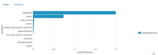
This search calculates a CPU seconds sum for each processor. The search also sorts the processors with the ten highest sums in descending order.
index=_internal "group=pipeline" | stats sum(cpu_seconds) as totalCPUSeconds
by processor | sort 10 totalCPUSeconds desc
The search generates this bar chart.

Stacked column chart
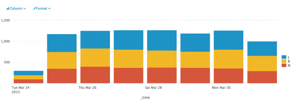
This search portion aggregates events according to code values over time. The query specifies the _time field and Code field values to include. This query generates a series for each Code field value.
...| timechart count by Code | fields _time L B N
The stacked columns show event counts for each code at different points in time. You can compare how many L, B, and N flagged events there were at each point in time.
| Pie chart | Line and area charts |
This documentation applies to the following versions of Splunk® Enterprise: 7.0.0, 7.0.1, 7.0.2, 7.0.3, 7.0.4, 7.0.5, 7.0.6, 7.0.7, 7.0.8, 7.0.9, 7.0.10, 7.0.11, 7.0.13


 Download manual
Feedback submitted, thanks!