Line and area charts
Use line and area charts to track value trends over time. You can also use a line or area chart x-axis to represent a field value other than time.
Data formatting
Line charts can represent one or more data series. Area charts represent multiple data series.
If a search generates multiple series, each line or area in the chart appears in a different color.
To make sure that a search generates data series correctly, check the Statistics tab below the search bar. The Statistics table should have at least two columns for a single series, and three or more columns for multiple series.
Statistics table order and chart axes
Line and area charts get x-axis values from the first column in the Statistics table. The next table columns contain y-axis values.
As an example, any search using the timechart reporting command generates a table where _time is the first column. A line or area chart generated with this search has a _time x-axis.
Search results not structured as a table with valid x-axis or y-axis values cannot generate line or area charts. For example, using the eval or fields commands might change search result structure.
Single and multiple data series
Typically, line or area charts represent multiple series. Line charts can also be used for a single data series, but area charts cannot.
Single series
A search compares the average number of bytes passed through each source. In this search, the over operator indicates that source is the first table column.
...| chart avg(bytes) over source
The search produces the following table.
In a line chart, source values are used for the x-axis. The y-axis represents avg(bytes) values.
Multiple data series
To generate multiple data series, introduce the timechart command to add a _time field to search results. You can also change the query to introduce a split-by field.
For example, change the previous single series search by adding clientip as a split-by field.
...| chart avg(bytes) over source by clientip
The split-by field produces multiple data series. Each clientip is a data series with its own avg(bytes) values for each source.
Configuration options
Use the Format menu to configure one or more of the following line and area chart components.
- Chart title
- Axis titles
- Null y-axis value handling. Choose one of the following options.
- Show null data points as a gap. The chart shows markers for any disconnected data points in this case.
- Connect null data points to zero data points.
- Connect to the next positive data point.
- Show minimum and maximum y-axis values.
- Use a logarithmic unit scale for y-axis values. This option is helpful when there is a wide range in y-axis values.
- Specify whether to abbreviate y-axis numerical values. For example, a value of 20,000 will be abbreviated to 20K if you toggle this option to On. Only y-axis values can be abbreviated in area and line charts.
- Chart legend position and label truncation
Multiple series options
If the chart represents multiple data series, you can also configure the following options.
Multi-series mode
Compare trends across multiple series. Enable the mode to show independent axis ranges for each series.
Stacked area charts
Stacked area charts are available when a search generates multiple data series. Stacking is not available for line charts.
Use a stacked area chart to see more details about a series and how it relates to the entire data set. Review the comparison table here to select a stacking option.
| Stack option | Column or bar appearance | Use case |
|---|---|---|
| Unstacked | Areas for different series share the same space on the chart. | An unstacked chart is useful for a lower number of series. As the number of series increases, the chart can become more difficult to understand. |
| Stacked | Each series area is shown separately. | Use a stacked area chart to highlight the relative volume, frequency, or importance of a series. See the stacked chart example below. |
| Stacked 100% | The chart shows distribution percentage for each series over the whole data set. | Use stacked 100% to focus on data distributions. |
Create a line or area chart
Prerequisites
Review the following details about building column and bar charts.
Steps
- Write a search that generates multiple data series. If you are building a line chart you can opt to generate a single data series.
- Run the search.
- Select the Statistics tab below the search bar. The statistics table here should have two or more columns.
- Select the Visualization tab and use the Visualization Picker to select the line or area chart visualization.
- (Optional) Use the Format menu to configure the visualization.
Examples
Line chart
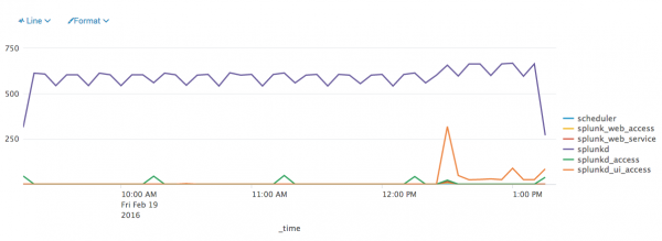
This search tracks sourcetype frequency over time.
index=_internal | timechart count by sourcetype
The search generates multiple data series. The line chart represents each series with a different line.
Area chart
Shading in an area chart emphasizes quantities. This example search tracks historical and real-time search volume over time.
index=_internal source=*metrics.log group=search_concurrency "system total" NOT user=*
| timechart max(active_hist_searches) as "Historical Searches" max(active_realtime_searches) as "Real-time Searches"
The search generates two data series. Each series appears as a different shaded area on the chart.
Stacked area chart
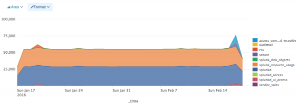
This search tracks throughput for different series over time.
index=_internal per_sourcetype_thruput | timechart sum(kb) by series useother=f
The search generates multiple series. Each series appears as a colored area of the stacked chart. The stacking lets you compare the sums for different series.
| Column and bar charts | Scatter chart |
This documentation applies to the following versions of Splunk® Enterprise: 7.0.0, 7.0.1, 7.0.2, 7.0.3, 7.0.4, 7.0.5, 7.0.6, 7.0.7, 7.0.8, 7.0.9, 7.0.10, 7.0.11, 7.0.13


 Download manual
Feedback submitted, thanks!