Chart controls
This topic describes advanced behavior for viewing data in charts.
Pan and zoom chart controls
The pan and zoom feature allows you to highlight chart details and optionally view the details in a separate panel. Pan and zoom is available for the following charts:
- Column
- Line
- Area
The following examples show how to access the pan and zoom charting features.
Pan and zoom behavior
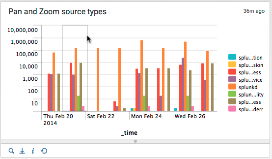
The following dashboard shows a chart displaying source types over a seven day period. The Y-axis uses a logarithmic scale to provide a more meaningful graphic. The panel specifies the following search.
index=_internal | timechart count by sourcetype
The screen capture below shows a selection for the results for two days.
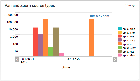
The resulting chart zooms in to the selection and now displays details of the selected area.
- Use the left and right arrows along the X-axis to move the selection window earlier or later.
- Click Reset Zoom to return to the original chart.
Zoom to another chart
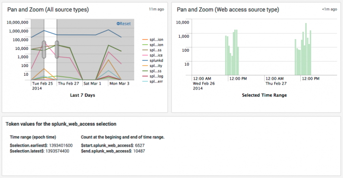
You can specify pan and zoom behavior to display results in a separate chart. The following example uses the same base example illustrated above in Pan and zoom behavior. The chart on the left lists all source types and also shows the selection for a single day. The other chart lists only the splunk_web_access source type for the selected time range.
You can drag an edge of the time range in the left chart to expand the time range. You can also move the selected time range to the left or right to specify an earlier or later time range.
The chart at the bottom shows the values for the tokens that implement the pan and zoom behavior.
Implementation details
To display zoom results in a separate chart, first edit the base chart in simple XML. Use the <selection> element to set token values for the selection time range.
- Note: See Token usage in dashboards for information on tokens. The section Define tokens for pan and zoom chart controls provides details for tokens specific to pan and zoom behavior.
$start$
$end$
Predefined tokens that capture the values of the X-axis at the beginning and end of the selection time range. In this example, capture the time at the beginning and end of a time chart. The value is in epoch time.
$start.splunk_web_access$
$end.splunk_web_access$
Captures the values of the Y-axis for the specified series at the beginning and end of the selection. In this example, the value is the number of events for the field splunk_web_access.
The start and end tokens are valid only in the context of the chart. Assign the values to tokens that you define so you can access the values throughout the dashboard.
<chart>
  <title>Pan and Zoom (All source types)</title>
  <search>
    <query>
    index=_internal | timechart count by sourcetype
    </query>
  <earliest>-7d@h</earliest>
  <latest>now</latest>
 </search>
  . . .
  <selection>
    <set token="selection_earliest">$start$</set>
    <set token="selection_latest">$end$</set>
    <set token="start_splunk_web_access">$start.splunk_web_access$</set>
    <set token="end_splunk_web_access">$end.splunk_web_access$</set>
  </selection>
  . . .
</chart>
In the target chart, use $selection_earliest$ and $selection_latest$ to access the selection time range.
<chart>
  <title>Pan and Zoom (Web access source type)</title>
  <search>
    <query>
      index=_internal sourcetype=splunk_web_access
      |  timechart count by sourcetype
    </query>
    <earliest>$selection_earliest$</earliest>
    <latest>$selection_latest$</latest>
  </search>
  . . .
</chart>
The HTML panel shows the values captured by the $start$ and $selection$ tokens.
<html>
  <h3>Token values for the splunk_web_access selection</h3>
  <table border="0" cellpadding="12" cellspacing="0">
  <tr>
    <td>
        <p><b>Time range (epoch time)</b></p>
        <p><b>$$selection_earliest$$</b>: $selection_earliest$
        <br /><b>$$selection_latest$$</b>: $selection_latest$</p>
    </td>
    <td>
        <p><b>Count at the begining and end of time range.</b></p>
        <p><b>$$start_splunk_web_access$$</b>: $start_splunk_web_access $
        <br /><b>$$end_splunk_web_access$$</b>: $end_splunk_web_access$</p>
    </td>
  </tr>
</table>
</html>
Chart overlay
Use chart overlays to represent two different series on a single chart. You can highlight one series of search results as a line graph on top of a column chart, area chart, or another line chart.
When using overlays, you can specify the overlaid values on a single axis or dual axis. With single axis, you plot the overlaid value and the search results against the same Y-axis. For dual axis, you specify a second Y-axis to represent the overlaid values.
Chart overlay example (single axis)
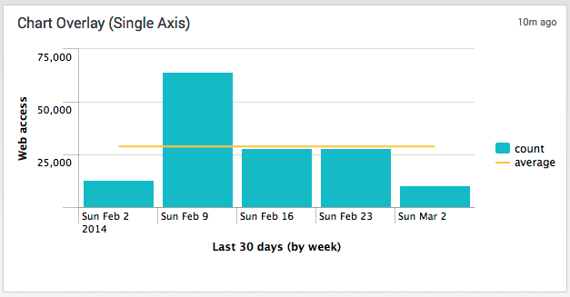
This example shows the count of splunk_web_access source type events over a time chart on a weekly basis for one month. Overlaid on this chart is the weekly average count of these events.
Here is the search to create this chart:
index=_internal sourcetype=splunk_web_access | timechart span=1week count | eventstats avg(count) as average | eval average=round(average,0)
You can create the overlay using the Visualization Editor.
- From the dashboard, click Edit > Edit Panels.
- Add a panel specifying the following:
- Content Title: Chart Overlay (Single Axis)
- Search String: The search string listed above.
- Time Range: 30 days.
- For the chart overlay panel, click the Edit Properties icon. Click Chart Overlay.
- Click in the Overlay field. Select average from the fields available for selection as an overlay.
- For View as Axis, click Off.
This example does not specify a second Y-axis.
Chart overlay example (dual axis)
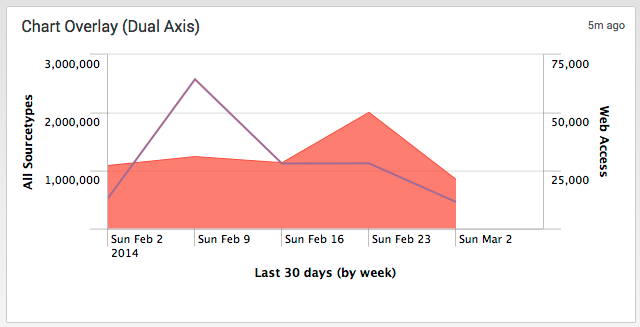
This example overlays the event count of the splunk_web_access source type against the total for all source types. The chart plots the Web Access totals against a separate Y-axis.
Here is the search to create this chart:
index=_internal sourcetype=* | timechart span=1week count as "All Sourcetypes" count(eval(sourcetype="splunk_web_access")) as "Web Access"
You can create the overlay using the Visualization Editor.
- From the dashboard, click Edit > Edit Panels.
- Add a panel specifying the following:
- Content Title: Chart Overlay (Dual Axis)
- Search String: The search string listed above.
- Time Range: 30 days.
- For the chart overlay panel, click the Edit Properties icon. Click Chart Overlay.
- Click in the Overlay field. Select Web Access from the fields available for selection as an overlay.
- For View as Axis, click On to specify a second Y-axis.
- For Title, click Custom. Type Web Access in the adjacent text field to specify a title for the second axis..
- For Scale, click Inherit to inherit the selection for the scale from the first Y-axis.
| Token usage in dashboards | Configure dashboard permissions |
This documentation applies to the following versions of Splunk® Enterprise: 7.0.0, 7.0.1, 7.0.2, 7.0.3, 7.0.4, 7.0.5, 7.0.6, 7.0.7, 7.0.8, 7.0.9, 7.0.10, 7.0.11, 7.0.13
 Download manual
Feedback submitted, thanks!