Chart overview
Select a chart type to show one or more data dimensions in a results set. Learn how charts visualize data series.
For a quick glance at common charts and common chart use case commands, you can view the Splunk Dashboards Quick Reference guide by clicking the link in Getting started.
Select a chart
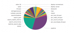
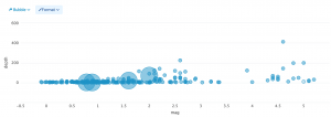
You can select a chart depending on the number of data dimensions that you want to visualize. For example, use a pie chart to show how values combine in a single field. A bubble chart can show relationships between multiple fields in a data set.
| Chart type | Description |
|---|---|
| Pie | Shows a single dimension. Pie slice size represents the density or frequency of values in a field. |
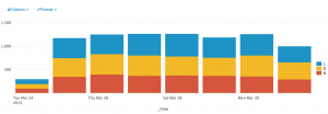
| Column and bar
|
Represent one or more dimensions in a results set. These charts plot data on two axes. Each axis represents a results field. Column and bar charts can compare values and fields. |
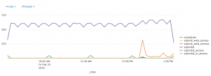
| Line and area | Line charts can show value changes over time. Area charts show changes in an aggregated value over time. |
| Scatter and bubble | Represent multiple dimensions in a results set. These charts plot data on two axes. Data point appearance, size, and/or distribution show additional patterns or relationships. |
Get started
The following topics show you how to build and configure charts.
| Table column Simple XML | Data for charts |
This documentation applies to the following versions of Splunk® Enterprise: 7.0.0, 7.0.1, 7.0.2, 7.0.3, 7.0.4, 7.0.5, 7.0.6, 7.0.7, 7.0.8, 7.0.9, 7.0.10, 7.0.11, 7.0.13


 Download manual
Feedback submitted, thanks!