gauge
Description
Use the gauge command to transform your search results into a format that can be used with the gauge charts. Gauge charts are a visualization of a single aggregated metric, such as a count or a sum.
The output of the gauge command is a single numerical value stored in a field called x. You can specify a range to display in the gauge or use the default range of 0 to 100.
For more information about using the gauge command with the gauge chart types, see Using gauges in the Gauges section in Dashboards and Visualizations.
Syntax
- gauge <value> [<range_val1> <range_val2> ...]
Required arguments
- value
- Syntax: field_name | <num>
- Description: A numeric field or literal number to use as the current value of the gauge. If you specify a numeric field, the
gaugecommand uses the first value in that field as the value for the gauge.
Optional arguments
- range values
- Syntax: <range_val1> <range_val2> ...
- Description: A space-separated list of two or more numeric fields or numbers to use as the overall numeric range displayed in the gauge. Each range value can be a numeric field name or a literal number. If you specify a field name, the first value in that field is used as the range value. The total range of the gauge is from the first
range_valto the lastrange_val. See Usage. - Default range: 0 to 100
Usage
You can create gauge charts without using the gauge command as long as your search results in a single value. The advantage of using the gauge command is that you can specify a set of range values instead of using the default range values of 0 to 100.
Specifying ranges
If you specify range values, you must specify at least two values. The gauge begins at the first value and ends at the last value that you specify.
If you specify more than two range_val arguments, the intermediate range values are used to split the total range into subranges. Each subrange displays in different color, which creates a visual distinction.
The range values are returned as a series of fields called y1, y2, and so on.
If you do not specify range values, the range defaults to a low value of 0 and a high value of 100.
If a single range value is specified, it is ignored.
Gauge colors
With a gauge chart, a single numerical value is mapped against a set of colors. These colors can have particular business meaning or business logic. As the value changes over time, the gauge marker changes position within this range.
The color ranges in the gauge chart are based on the range values that you specify with the gauge command. When you specify range values, you define the overall numerical range represented by the gauge. You can define the size of the colored bands within that range. If you want to use the color bands, add four range values to the search string. These range values indicate the beginning and end of the range. These range values also indicate the relative sizes of the color bands within this range.
Examples
1. Create a gauge with multiple ranges
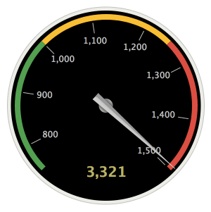
Count the number of events and display the count on a gauge with four ranges, from 0-750, 750-1000, 1000-1250, and 1250-1500.
Start by generating the results table using this search. Run the search using the Last 15 minutes time range.
index=_internal | stats count as myCount | gauge myCount 750 1000 1250 1500
The results appear on the Statistics tab and look something like this:
| x | y1 | y2 | y3 | y4 |
|---|---|---|---|---|
| 3321 | 750 | 1000 | 1250 | 1500 |
Click on the Visualizations tab. There are three types of gauges that you can choose from: radial, filler, and marker. The following image shows the radial gauge that is created based on the search results.
For more information about using the gauge command with the gauge chart type, see the Gauges section in Dashboard and Visualizations.
See also
| from | gentimes |
This documentation applies to the following versions of Splunk® Enterprise: 7.0.0, 7.0.1, 7.0.2, 7.0.3, 7.0.4, 7.0.5, 7.0.6, 7.0.7, 7.0.8, 7.0.9, 7.0.10, 7.0.11, 7.0.13, 7.1.0, 7.1.1, 7.1.2, 7.1.3, 7.1.4, 7.1.5, 7.1.6, 7.1.7, 7.1.8, 7.1.9, 7.1.10, 7.2.0, 7.2.1, 7.2.2, 7.2.3, 7.2.4, 7.2.5, 7.2.6, 7.2.7, 7.2.8, 7.2.9, 7.2.10, 7.3.0, 7.3.1, 7.3.2, 7.3.3, 7.3.4, 7.3.5, 7.3.6, 7.3.7, 7.3.8, 7.3.9, 8.0.0, 8.0.1, 8.0.2, 8.0.3, 8.0.4, 8.0.5, 8.0.6, 8.0.7, 8.0.8, 8.0.9, 8.0.10, 8.1.0, 8.1.1, 8.1.2, 8.1.3, 8.1.4, 8.1.5, 8.1.6, 8.1.7, 8.1.8, 8.1.9, 8.1.10, 8.1.11, 8.1.12, 8.1.13, 8.1.14, 8.2.0, 8.2.1, 8.2.2, 8.2.3, 8.2.4, 8.2.5, 8.2.6, 8.2.7, 8.2.8, 8.2.9, 8.2.10, 8.2.11, 8.2.12, 9.0.0, 9.0.1, 9.0.2, 9.0.3, 9.0.4, 9.0.5, 9.0.6, 9.0.7, 9.0.8, 9.0.9, 9.0.10, 9.1.0, 9.1.1, 9.1.2, 9.1.3, 9.1.4, 9.1.5, 9.1.6, 9.1.7, 9.1.8, 9.1.9, 9.2.0, 9.2.1, 9.2.2, 9.2.3, 9.2.4, 9.2.5, 9.2.6, 9.3.0, 9.3.1, 9.3.2, 9.3.3, 9.3.4, 9.4.0, 9.4.1, 9.4.2

 Download manual
Feedback submitted, thanks!