Formatter API reference
| The custom visualization API has been updated for Splunk software version 6.5 and is now fully supported. If you are building a new custom visualization app, use the latest version of the API. Developers whose apps use the experimental API offered with software version 6.4 are encouraged to update their apps. See API updates and migration advice for more information. |
Use the Formatter API to build a custom visualization format menu. The Formatter API supports user experience consistency with the Splunk Web visualization Format menu.
Custom HTML element overview
The Splunk platform supports a set of custom HTML elements that manage the behavior and rendering of user interface controls. Here is an overview of the available elements.
| Custom HTML element | Description |
|---|---|
<splunk-control-group>
|
Wrapper element for a set of interface controls. |
<splunk-select>
|
Selection control that takes options in HTML. |
<splunk-radio-input>
|
Radio group that takes options in HTML. |
<option>
|
Declares an option for select and radio group elements. Child element of these input elements. |
<splunk-text-area>
|
Resizable text area. |
<splunk-text-input>
|
Text input. |
<splunk-color-picker>
|
Color picker element with three preconfigured palette types. Also allows a custom palette. |
<splunk-color>
|
Declares a color value for a custom color picker palette. Child element of the <splunk-color-picker> element.
|
These elements have styling consistent with standard Splunk Web elements, although they do not have the standard Splunk Web layout by default.
Property namespacing
Use the following case-sensitive namespace element and syntax to specify a property in formatter.html.
{{VIZ_NAMESPACE}}.<property name>
The {{VIZ_NAMESPACE}} element is replaced with the namespaced portion of a property name. When the namespace element is combined with the property name, it works equivalently to the following fully-qualified syntax.
display.visualizations.custom.<app name>.<viz name>.<property name>
Selection elements
The following elements present options and a selection interface to users.
splunk-select
Use the <splunk-select> element to create a selection control. Options appear in a list.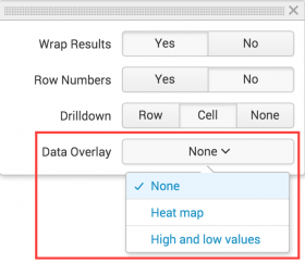
Requirements
- Specify one or more
<option>child elements defining the options that appear in the list.
splunk-radio-input
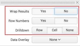
Use the <splunk-radio-input> element to declare a radio group control.
There are three <splunk-radio-input> elements in this example.
Requirements
- Specify one or more
<option>child elements to indicate the options that appear as radio buttons.
option
Use an <option> child element with a <splunk-select> or <splunk-radio-input> to specify available options. The <option> enclosed text appears as the option label. When a user selects an option, the <option> value is set as the control value.
This example shows an option list for specifying decimal precision. Each precision level is an option.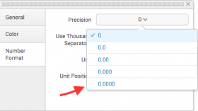
Examples
Example splunk-select
<splunk-select name="{{VIZ_NAMESPACE}}.legendPosition" value="right">
    <option value="right">Right</option>
    <option value="bottom">Bottom</option>
    <option value="left">Left</option>
    <option value="top">Top</option>
    <option value="none">None</option>
</splunk-select>
Example splunk-radio-input
<splunk-radio-input name="{{VIZ_NAMESPACE}}.theme" value="light">
    <option value="light">Light</option>
    <option value="dark">Dark</option>
</splunk-radio-input>
Text entry elements
The following elements let users add text to a visualization.
splunk-text-input
Use a <splunk-text-input> element to create a text input control where users can enter up to a single line of text.
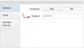
This example text input lets users specify a visualization caption.
splunk-text-area
Use a <splunk-text-area> element to create a text area control where users can type multiple lines of text.
Examples
Example splunk-text-input
<splunk-text-input name="{{VIZ_NAMESPACE}}.yAxisMaximum"></splunk-text-input>
Example splunk-text-area
<splunk-text-area name="{{VIZ_NAMESPACE}}.xAxisTitle"></splunk-text-area>
Color configuration element
This element lets users customize colors in a visualization.
splunk-color-picker
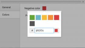
Use this element to provide a color configuration user interface.
Guidelines
- Specify one of the following types for the color picker.
splunkCategorical. Default type if none is specified.splunkSemanticsplunkSequentialcustom- Specify colors in the custom palette or extend one of the available palette types using
<splunk-color>tags.
- For custom color palettes, the
<splunk-color>tag accepts valid CSS color strings. Invalid strings are ignored.
- You can use the
valuetag to set a default value for the picker.
Example
<!-- Default color picker with splunkCategorical colors -->
<splunk-color-picker>
</splunk-color-picker>

<!-- Color picker with splunkSemantic colors -->
<splunk-color-picker type="splunkSemantic">
</splunk-color-picker>

<!-- Custom color picker with only black and white. Default value is set to black -->
<splunk-color-picker type="custom" value="#000000">
    <splunk-color>#ffffff</splunk-color>
    <splunk-color>#000000</splunk-color>
</splunk-color-picker>

<!-- A splunkCategorical color picker that also includes black. Default value is set to black -->
<splunk-color-picker value="#000000">
    <splunk-color>#000000</splunk-color>
</splunk-color-picker>
Developers can customize the format menu to group different form elements into sections. Each section renders as a separate tab in the format menu.
This example shows a format menu with tabs for different format option groups.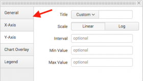
Guidelines
- Use the schema to implement multiple form elements at the top level of the HTML hierarchy.
- Each form element should have the class
splunk-formatter-sectionand asection-labelattribute to indicate the tab label.
Example
<form class="splunk-formatter-section" section-label="Tab 1">
    ...
    <splunk-select>...</splunk-select>
    ...
</form>
<form class="splunk-formatter-section" section-label="Tab 2">
    ...
    <splunk-text-input>...</splunk-text-input>
    ...
</form>
Wrapper for input elements and labels
Input elements
Wrap all format menu input elements with this component.
<splunk-control-group>
You can specify the following <splunk-control-group> attributes.
| Attribute | Description |
|---|---|
label
|
Label for the input element. Appears in the UI. |
help
|
String appearing underneath the control. |
Complete formatter.html example
This example includes a text input and a color picker.
<form class="splunk-formatter-section" section-label="Max value">
    <splunk-control-group label="Maximum dial value">
        <splunk-text-input name="{{VIZ_NAMESPACE}}.maxValue" value="100">
        </splunk-text-input>
    </splunk-control-group>
</form>
<form class="splunk-formatter-section" section-label="Dial color">
    <splunk-control-group label="Color">
        <splunk-color-picker name="{{VIZ_NAMESPACE}}.mainColor" value="#f7bc38">
        </splunk-color-picker>
    </splunk-control-group>
</form>
| Custom visualization API reference | Data handling guidelines |
This documentation applies to the following versions of Splunk® Enterprise: 7.0.0, 7.0.1, 7.0.2, 7.0.3, 7.0.4, 7.0.5, 7.0.6, 7.0.7, 7.0.8, 7.0.9, 7.0.10, 7.0.11, 7.0.13, 7.1.0, 7.1.1, 7.1.2, 7.1.3, 7.1.4, 7.1.5, 7.1.6, 7.1.7, 7.1.8, 7.1.9, 7.1.10, 7.2.0, 7.2.1, 7.2.2, 7.2.3, 7.2.4, 7.2.5, 7.2.6, 7.2.7, 7.2.8, 7.2.9, 7.2.10, 7.3.0, 7.3.1, 7.3.2, 7.3.3, 7.3.4, 7.3.5, 7.3.6, 7.3.7, 7.3.8, 7.3.9, 8.0.0, 8.0.1, 8.0.2, 8.0.3, 8.0.4, 8.0.5, 8.0.6, 8.0.7, 8.0.8, 8.0.9, 8.0.10, 8.1.0, 8.1.1, 8.1.2, 8.1.3, 8.1.4, 8.1.5, 8.1.6, 8.1.7, 8.1.8, 8.1.9, 8.1.10, 8.1.11, 8.1.12, 8.1.13, 8.1.14, 8.2.0, 8.2.1, 8.2.2, 8.2.3, 8.2.4, 8.2.5, 8.2.6, 8.2.7, 8.2.8, 8.2.9, 8.2.10, 8.2.11, 8.2.12, 9.0.0, 9.0.1, 9.0.2, 9.0.3, 9.0.4, 9.0.5, 9.0.6, 9.0.7, 9.0.8, 9.0.9, 9.0.10, 9.1.0, 9.1.1, 9.1.2, 9.1.3, 9.1.4, 9.1.5, 9.1.6, 9.1.7, 9.1.8, 9.1.9, 9.2.0, 9.2.1, 9.2.2, 9.2.3, 9.2.4, 9.2.5, 9.2.6, 9.3.0, 9.3.1, 9.3.2, 9.3.3, 9.3.4, 9.4.0, 9.4.1, 9.4.2
 Download manual
Feedback submitted, thanks!