Analytics in the Analytics Workspace
Configure analytic functions and operations in the Analysis panel to gain insight from your charts. All analytic functions generate Splunk Search Processing Language (SPL) in the background.
Perform separate analytics for each time series on a chart. For more information about charts, see Charts in the Analytics Workspace.
View additional time series for a metric
View additional time series for a metric to analyze different facets of your data. You can clone a time series to compare data based on a different aggregation, dimension, time range, or set of filters.
- In the main panel of the Analytics Workspace, select the chart that you want to modify.
- In the Analysis panel, locate the name of the time series that you want to clone.
- Next to the time series name, click the Clone (
 ) icon.
A duplicate of the time series appears on the chart. You can modify this time series in the Analysis panel. After you configure the new series, it appears in the chart legend.
Configure aggregations
Charts in the Analytics Workspace contain time series based on aggregated data. To calculate aggregations, data points within the same approximate time frame are categorized into buckets. Aggregations are calculated from data points in the same bucket. The bucket size, or span, is automatically configured based on your specified time range. Increasing the time range causes the span to increase automatically.
You can add multiple time series to a chart to view different aggregations of your data. To maintain a separate scale for an aggregation, display the time series on the right vertical axis of the chart.
The following aggregations are available:
| Aggregation | Use | Description |
|---|---|---|
| Average (Avg) | Numeric data | Average value from each bucket of data. Default aggregation for numeric data. |
| Maximum (Max) | Numeric data | Maximum value from each bucket of data. |
| Minimum (Min) | Numeric data | Minimum value from each bucket of data. |
| Standard deviation (Std dev) | Numeric data | Standard deviation for each bucket of data. |
| Sum | Numeric data | Sum of values from each bucket of data. |
| Percentiles | Numeric data | Percentile values from each bucket of data. Default percentiles are 90 and 99. To configure additional percentiles, enter a percentile value between 1 and 99 in the Aggregation field. For example, to view the 25th percentile, type p25.
|
| Count | String data | Number of values in a dataset field within each bucket of data. Default aggregation for string data. |
| Distinct count (Dist count) | String data | Number of distinct values in a dataset field within each bucket of data. |
Select an aggregation
Select an aggregation to specify which facet of your data to view as a time series.
- In the main panel of the Analytics Workspace, select the chart that you want to configure.
- In the Analysis panel, select the time series that you want to modify the aggregation for.
- Under the
Aggregationfield, select or type the aggregation to apply. - (Optional) To move the vertical axis for your selected time series to the right side of the chart, click the Display on right axis checkbox.
Examples
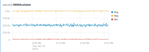
The following chart shows the Average, Maximum, and Minimum aggregations for the aws.ec2.MEMAvailable metric.
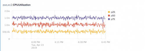
The following chart shows the 25th, 50th, and 75th Percentile aggregations for the aws.ec2.CPUUtilization metric.
The following chart shows the Average aggregation for the aws.ec2.CPUUtilization and aws.ec2.MEMAvailable metrics. The aws.ec2.MEMAvailable metric displays on the right axis of the chart.
Compare time ranges
Shift the time range of a series to investigate whether your data has changed significantly over time.
Shifting the time range is not available for datasets.
Shift the time range of a series
Shift the time range of a series to compare changes in your data over time. Shifting the time range replaces the original series with a series of your selected time range.
Prerequisites
To compare two time ranges for a metric, you first need to clone the original series. For more information, see View additional time series for a metric.
Steps
- In the main panel of the Analytics Workspace, select the chart that you want to configure.
- In the Analysis panel, select the time series that you want to shift the time range for.
- Under the
Time Shiftfield, select an earlier time range from the list of preset time shifts or select Custom and enter the number and the time shift that you want to display.
Time-shifted series appear as dotted lines on the chart.
Remove a time shift from a series
Remove a time shift from a series to restore the original time range.
- In the main panel of the Analytics Workspace, select the chart that you want to configure.
- In the Analysis panel, select the time series that you want to remove the time shift from.
- Under the
Time Shiftfield, select None from the drop-down list.
Examples
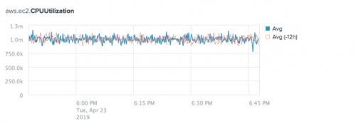
The following chart compares current average aws.ec2.CPUUtilization values to the values from 12 hours prior.
Split time series by dimension
Split a time series by a dimension to view a separate time series for each dimension value. Splitting a time series by a dimension shows the dimension values with the highest or lowest data points for the selected time range.
The highest and lowest dimension values are calculated based on the overall highest and lowest data points. Therefore, it is possible for a single dimension value to appear in both the highest and lowest categories. For example, imagine you have two charts in the workspace. The first chart shows CPU utilization split by the top five highest apps, and the second chart shows CPU utilization split by the top five lowest apps. If the data for a particular app contains a high level of variation and has both high and low CPU utilization levels, the app could appear on both charts.
Split a time series by a dimension
Split a time series by a dimension to show a separate time series for each dimension value.
- In the main panel of the Analytics Workspace, select the chart that you want to configure.
- In the Analysis panel, select the time series that you want to split by a dimension.
- Under the
Split Byfield, select the dimension that you want to split. - Under the dimension name, select Highest or Lowest to view either the highest or lowest spikes in data.
- Select the number of values to display.
The chart shows a new time series for each value of the split dimension.
Remove a dimension split
Remove a dimension split to view data for all dimensions in a single time series.
- In the main panel of the Analytics Workspace, select the chart that you want to configure.
- In the Analysis panel, select the time series that contains the dimension split that you want to remove.
- Under the
Split Byfield, select None.
Examples
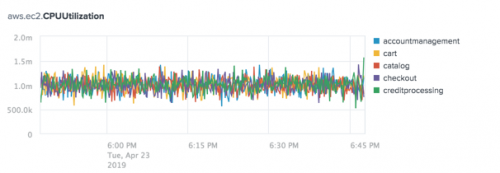
The following chart shows the Average aggregation for the aws.ec2.CPUUtilization metric split by the top five apps.
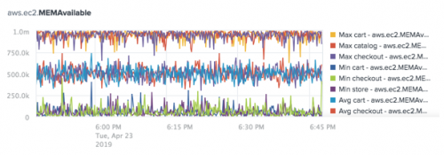
The following chart shows the Average, Maximum, and Minimum aggregations for the aws.ec2.MEMAvailable metric split by the top three apps.
Filter data by dimension
Filter data by dimension to view specific dimension values in a time series. If a metric is already split by a dimension, use filters to add or remove time series for selected dimension values.
Use wildcards from within the filter panel to filter for a dimension with a high number of values. For information about using wildcards in the Splunk platform, see Wildcards in the Search Manual.
Filter by dimension value from the Analysis panel
Filter time series data to view a specific subset of dimension values.
- In the main panel of the Analytics Workspace, select the chart that you want to configure.
- In the Analysis panel, select the time series that you want to filter by dimension.
- Under the
Filtersfield, click + Add New Filter. - From the drop-down list in the filter panel, select the dimension you want to filter.
- Click the radio button for Include or Exclude to add or remove the dimension values.
- From the list of dimension value names, select the dimension values you want to filter in the time series.
If the list contains more than 12 dimension values, a search bar appears. Type part or all of the dimension value name into the search bar to refine the list. Wildcards are supported.
- After you finish configuring the filter, click Add.
The time series shows data for the dimension values that you selected.
Filter by dimension value from the chart legend
If a time series is already split by a dimension, filter by dimension value using the legend to the right of the chart.
Prerequisites
Split a metric by a dimension. See Split a time series by a dimension for more information.
Steps
- From the main panel of the Analytics Workspace, select the chart you want to filter by dimension value.
- In the chart legend, click the name of the dimension value that you want to filter.
- From the options that appear, click either Keep Only or Exclude.
The chart shows data for the dimension values that you selected.
Remove or modify dimension value filters
Remove or modify filters to adjust the dimension values that appear in a time series.
- From the main panel of the Analytics Workspace, select the chart you want to configure.
- In the Analysis panel, select the time series that you want to remove or modify filters for.
- Under Filters, locate the name of the dimension filter that you want to change.
- Follow the steps to remove or modify the filter.
Option What to do Remove the filter Next to the filter name, click the X (  ) icon.
Modify the filter - Click the filter name to open the filter panel.
- Adjust the settings for the filter.
- Click Update.
The chart shows data for your updated filters.
Examples
The following chart shows the Average aggregation for the aws.ec2.CPUUtilization metric split by the App dimension and filtered to show time series for the accountmanagement, auth, and cart dimension values.
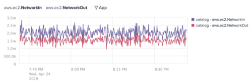
The following chart shows the Average aggregation for the aws.ec2.NetworkIn and aws.ec2.NetworkOut metrics split by the App dimension and filtered to show time series for the catalog dimension value.
Stack time series in an area chart
Stack the time series on an area chart to see how each series relates to the chart's data as a whole. Stacking time series in an area chart shows the sum of dimension values. In an area chart, each series appears as a filled-in area on the chart.
Stacking in an area chart is only supported for series using the left vertical axis of the chart.
- In the main panel of the Analytics Workspace, select the chart that you want to stack the series for.
- In the Analysis panel, click Chart Settings.
- From the Chart Type drop-down menu, select Area.
Examples
The following chart shows the Average aggregation for the aws.ec2.MEMAvailable metric split by the App dimension. The series is stacked to show the sum of the top five apps.
Distinguish metrics with the same metric name
If two metrics with the same name are ingested into different indexes, they appear aggregated in the Analytics Workspace. You can distinguish metrics with the same metric name by either splitting the metric by the index dimension or by creating an index filter.
Split the metric by the index dimension to show a separate time series for each index. To learn more, see Split a time series by a dimension.
Create an index filter to include or exclude metric values from a specific index. For more information, see Filter data by dimension.
Examples
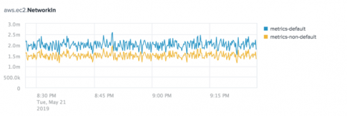
The following image shows a chart of the Average aggregation for the aws.ec2.NetworkIn metric split by index. There are two indexes with the aws.ec2.NetworkIn metric name: metrics-default and metrics-non-default.
Add reference lines
Add reference lines to compare, reference, or highlight data on your charts. You can add one or more reference lines to your charts.
- In the main panel of the Analytics Workspace, select the chart that you want to modify.
- Under the
Reference Linesfield, click + Add New Reference Line. - Click the radio button to set the reference line calculation to Raw Data which calculates and adds a reference line based on the underlying index data, or Constant Value which adds a static reference line to the chart.
- If you are using raw data calculations, select the calculation method you want to use for your reference line from the Value dropdown list.
- If you are using constant value reference lines, type a constant value in the Value field.
- Enter an optional label for your reference line. If you do not enter a label, the aggregation name is used for the reference line label.
- Select the Include Value checkbox to add the calculated or static value to the reference line label.
- Click Add.
Examples
The following image shows a chart of the spl.intr.resource_usage.PerProcess.data.pct_cpu metric, with a reference line indicating the Average of the indexed data.
| Data sources in the Data panel in the Analytics Workspace | Alerts in the Analytics Workspace |
This documentation applies to the following versions of Splunk® Enterprise: 8.0.0, 8.0.1, 8.0.2, 8.0.3, 8.0.4, 8.0.5, 8.0.6, 8.0.7, 8.0.8, 8.0.9, 8.0.10, 8.1.0, 8.1.1, 8.1.2, 8.1.3, 8.1.4, 8.1.5, 8.1.6, 8.1.7, 8.1.8, 8.1.9, 8.1.10, 8.1.11, 8.1.12, 8.1.13, 8.1.14, 8.2.0, 8.2.1, 8.2.2, 8.2.3, 8.2.4, 8.2.5, 8.2.6, 8.2.7, 8.2.8, 8.2.9, 8.2.10, 8.2.11, 8.2.12, 9.0.0, 9.0.1, 9.0.2, 9.0.3, 9.0.4, 9.0.5, 9.0.6, 9.0.7, 9.0.8, 9.0.9, 9.0.10, 9.1.0, 9.1.1, 9.1.2, 9.1.3, 9.1.4, 9.1.5, 9.1.6, 9.1.7, 9.1.8, 9.1.9, 9.2.0, 9.2.1, 9.2.2, 9.2.3, 9.2.4, 9.2.5, 9.2.6, 9.3.0, 9.3.1, 9.3.2, 9.3.3, 9.4.1, 9.3.4, 9.4.0, 9.4.2




 Download manual
Feedback submitted, thanks!