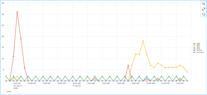
Charts
To build any chart, start with a transforming search that generates one or more data series.
A series is a sequence of related data points. These points can be plotted on a chart. For example, each line in a line chart shows one series.
When you run a transforming search in Search & Reporting using the Search tab, select Statistics. Review the statistics table to see the series generated. After the first column, each additional column represents a series. A single series search generates two columns. A multiple series search generates three or more columns.
Different chart types are optimized to visualize one or more data series.
| Chart name | Optimized for single series? | Optimized for multiple series? | Notes |
|---|---|---|---|
| Pie | Yes | No | Pie charts can only render a single series. |
| Bar | Yes | Yes | |
| Column | Yes | Yes | |
| Line | Yes | Yes | Typically, line charts are used for multiple series. |
| Area | No | Yes | Use an area chart to render multiple series. |
| Scatter | No | Yes | Scatter charts work best with two data series. |
| Bubble | No | Yes | Bubble charts work best with three or 4 data series. |
| Punchcard | No | Yes | Punchcard charts work best with 3 data series. |
| Advanced dynamic options syntax | Line and area charts |
This documentation applies to the following versions of Splunk® Enterprise: 8.2.1, 8.2.2, 8.2.3, 8.2.4, 8.2.5, 8.2.6, 8.2.7, 8.2.8, 8.2.9, 8.2.10, 8.2.11, 8.2.12

 Download manual
Feedback submitted, thanks!