Pie chart
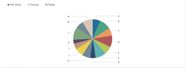
Use a pie chart to show how different field values combine over an entire data set. Each slice of a pie chart represents the relative importance or volume of a particular category.
Data formatting
Pie charts represent a single data series.
Use a transforming command in a search to generate the single series.
For example, count events in each source field category.
...| stats count by source
Check the Statistics table after running the search to make sure that a single series generated. The table should have two columns.
The example search generates the following table.
The first table column contains labels for each pie slice. The second column contains the numerical values that correspond to each label. The numerical values determine the relative size of each slice.
If the search generates a table with more than two columns, the extra columns are ignored.
Configuration options
You can use the Format menu to configure the following pie chart components.
Drilldown
Drilldown in a pie chart lets users click on a pie slice to open a secondary search using the clicked values. You can enable or disable drilldown in the Dashboard editor. See Use drilldown for dashboard interactivity for more details.
Minimum size
Set a minimum percentage size to apply when there are more than 10 slices. Data values below the minimum percentage are combined into an other slice.
Create a pie chart
Prerequisites
Review the following details about building pie charts.
Steps
- Write a search that uses a transforming command to aggregate values in a field.
- Run the search.
- Select the Statistics tab below the search bar. The statistics table here should have two columns.
- Select the Visualization tab and use the Visualization Picker to select the pie chart visualization.
- (Optional) Use the Format menu to configure the visualization.
Examples
This search portion aggregates events by Code field values.
... | stats count by Code
The search generates a single data series representing values in the Code field.
The chart is configured with a 5% minimum size. Field values that represent less than 5% of the total data set are combined into an other slice.
This search uses the bytes and source fields to generate a single series.
index = _internal | chart avg(bytes) over source
Here, the source column provides pie slice labels. The avg(bytes) column provides the relative size of each slice, as percentages of the sum of avg(bytes) returned by the search.
| Data for charts | Column and bar charts |
This documentation applies to the following versions of Splunk® Enterprise: 7.1.0, 7.1.1, 7.1.2, 7.1.3, 7.1.4, 7.1.5, 7.1.6, 7.1.7, 7.1.8, 7.1.9, 7.1.10, 7.2.0, 7.2.1, 7.2.2, 7.2.3, 7.2.4, 7.2.5, 7.2.6, 7.2.7, 7.2.8, 7.2.9, 7.2.10, 7.3.0, 7.3.1, 7.3.2, 7.3.3, 7.3.4, 7.3.5, 7.3.6, 7.3.7, 7.3.8, 7.3.9, 8.0.0, 8.0.1, 8.0.2, 8.0.3, 8.0.4, 8.0.5, 8.0.6, 8.0.7, 8.0.8, 8.0.9, 8.0.10, 8.1.0, 8.1.1, 8.1.2, 8.1.3, 8.1.4, 8.1.5, 8.1.6, 8.1.7, 8.1.8, 8.1.9, 8.1.10, 8.1.11, 8.1.12, 8.1.13, 8.1.14, 8.2.0, 8.2.1, 8.2.2, 8.2.3, 8.2.4, 8.2.5, 8.2.6, 8.2.7, 8.2.8, 8.2.9, 8.2.10, 8.2.11, 8.2.12, 9.0.0, 9.0.1, 9.0.2, 9.0.3, 9.0.4, 9.0.5, 9.0.6, 9.0.7, 9.0.8, 9.0.9, 9.0.10, 9.1.0, 9.1.1, 9.1.2, 9.1.3, 9.1.4, 9.1.5, 9.1.6, 9.1.7, 9.1.8, 9.1.9, 9.2.0, 9.2.1, 9.2.2, 9.2.3, 9.2.4, 9.2.5, 9.2.6, 9.3.0, 9.3.1, 9.3.2, 9.3.3, 9.3.4, 9.4.0, 9.4.1, 9.4.2


 Download manual
Feedback submitted, thanks!