Part 3 Add a table with column formatting
Let's say that you want to compare the revenue and number of purchases for games sold at Buttercup Games. In Splunk Dashboard Studio, you can format columns in a table visualization and add dynamic coloring options based on the value within each cell. In this part of the tutorial, you will add a table with game revenue and purchases data and adjust dynamic coloring based on the number of purchases.
The remaining Parts in this tutorial depend on you first completing one of the two following options:
- Complete the Search Tutorial.
- Complete Part 2 and Part 5 of the Search Tutorial. See About uploading data and Make the lookup automatic in the Search Tutorial manual.
If you do not configure the field lookups, the searches in the Dashboard Studio tutorial will not produce the correct results.
- Select the add chart icon (
 ) in the editing toolbar, and then select Table.
 - In the New Data Source panel, name the source Most Purchased Games.
- Add your search. For this tutorial, copy and paste the following search into the Search with SPL box:
index=main sourcetype=access_* action=purchase status=200
| stats count as Purchases by productName price
| table productName Purchases price
| eval Revenue=Purchases*price
| table productName Purchases Revenue
| sort -Purchases | rename productName as "Game"
| head 8
- Expand the Code section to view the source code for the Most Purchased Games data source. Edit the Data Source ID so that you can identify this data source in the source code. Change the Data Source ID to ds_most_purchased_games.
- Select Apply & Close. At this point, you've created a new data source, given it a unique ID, and assigned it to a table.
- To view all the data, click the Global Time Range dropdown and select Last 7 days.
- Title your table Most Purchased Games and leave the description box empty.
- In the Global Formatting section of the Configuration panel, follow these steps:
- Decrease the Rows Displayed value to 5. This value sets a fixed number of rows displayed in the table. Now you can paginate across all results.
- Increase the Rows Displayed value back to 8. The pagination will turn off because the SPL query (
| head 8) only returns 8 results.
- In the Column Formatting section, follow these steps:
- Select + Add column to format and choose the Revenue - number column.
- Select the edit icon (
 ).
). - Change the Units Position option to Before and enter $ in the Unit Label field.
- Increase the Precision value to 2 and turn on the Thousand Separator.
- The Thousand Separator is the character used to create space between every three digits in numbers with at least four digits.
- Select + Add column to format again, but this time choose the Purchases - number column.
- Select the edit icon (
 ).
). - Change the Dynamic Coloring option to Text.
- Select a color palette. For the best contrast, choose dark colors if you're using the light theme and light colors if you're using the dark theme.
- You can select + Add Range to add a color range, remove (
 ) a range, adjust the color thresholds, and reverse the order of colors (
 ) to best fit the range of data in your table. For this tutorial, enter the following five ranges:
- 240 and greater
- 230 to 240
- 220 to 230
- 200 to 220
- Less than 200
- Expand the Code section and change the Visualization ID to viz_gamesPurchased. At this point, you've given your table a unique ID and wired the values in the Purchases column to change color based on their value.
- Move and resize your table to center it in the top left gray rectangle.
- In the Global Formatting section of the Configuration panel, change the Background to transparent.
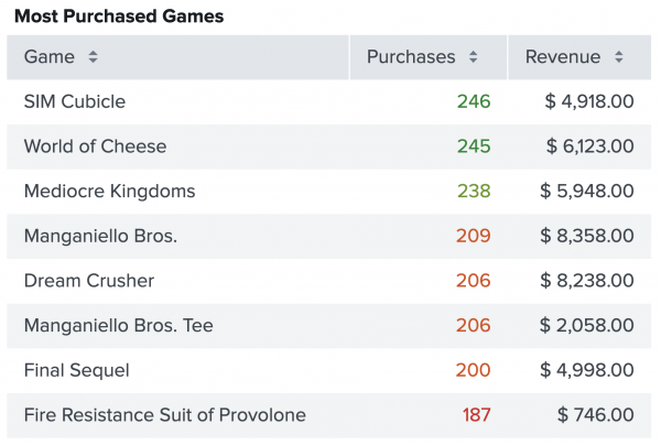
After completing Part 3, your table looks similar to the following:

Next step
You've completed Part 3 of the Splunk Dashboard Studio tutorial.
Now your dashboard has a table visualization with dynamic colors. Next, add another data source and use it to create a pie chart. Continue to Part 4: Add a pie chart visualization.
| Part 2 Create a dashboard | Part 4 Add a pie chart visualization |
This documentation applies to the following versions of Splunk® Enterprise: 9.0.3, 9.0.4, 9.0.5, 9.0.6, 9.0.7, 9.0.8, 9.0.9, 9.0.10
 Download manual
Feedback submitted, thanks!