Charts in the Analytics Workspace
Select a source from the Data panel to view your data in a chart in the Analytics Workspace. You can either create a new chart or add additional measurements to an existing chart. Each chart contains one or more time series based on at least one aggregation. Hover over any point on the chart to see the corresponding values in the chart legend.
Charts appear in the main panel of the Analytics Workspace. The following chart shows average values for the aws.ec2.CPUUtilization, aws.ec2.NetworkIn, and aws.ec2.NetworkOut metrics.

To learn how to apply analytic operations to charts, see Analytics in the Analytics Workspace.
View charts in the workspace
View a chart in the Analytics Workspace to see your data represented as a time series.
- In the Data panel, search or browse for the data source that you want to view in a chart.
Option What to do Search for a data source In the search box, type part or all of the data source name. The list of available data sources for each data type filters to match your criteria. Browse available data sources Click the tab for the type of data that you want to visualize in the workspace. Browse through the tree of available data sources. - Select the data source you want to view as a time series.
The data source appears as a chart in the main panel of the Analytics Workspace. For example, the following chart shows the aggregate average values for the aws.ec2.CPUUtilization metric.

Change the chart type
Two types of charts are available, time and categorical. Time charts show data over time allowing you to quickly visualize trends in your data. The data can be shown as a line, column, area, or heatmap chart. and can be split by dimensions. The following time chart example shows admission_quota_controller_depth values as a line chart and a column chart.

Categorical charts show data over time, grouped by data dimensions, allowing you to analyze and compare different dimensions across multiple metrics. The data can be shown as a column or stacked column chart and can be split by dimensions. The following categorical chart example shows admission_quota_controller_depth and admission_quota_controller_queue_latency as a column chart and a stacked column chart.

Choose a chart type that best displays the data you are viewing.
- In the main panel of the Analytics Workspace, click the chart that you want to configure.
- In the Analysis panel, click on Chart Settings.
- From the drop-down list in the chart type panel, select the chart type you want to use.
Chart type Chart style Description Time charts Line A chart showing the data over time as a series of points connected by straight line segments. Area A chart showing the data over time similar to the line chart, with the area between the axis and line filled with a solid color. Column A chart showing the data over time as a series of vertical bars. The span of the columns will automatically scale for readability. Heatmap A chart showing the data over time as a heatmap. The chart is shown as a matrix with values represented as colors. Categorical charts Column A chart showing the data as a series of vertical bars grouped by category. Alerts are disabled for this chart type. Stacked Column A chart showing multi-series data as stacked vertical bars grouped by the common dimension of the series and the respective categories. Alerts are disabled for this chart type.
Set the Time Span for a chart
You can define the time span or size of each bucket of data that is used to plot a data point in your chart. The default is auto which is calculated based on the type of chart and the global time setting. For example, a line chart with a 1-hour time range will have an automatically calculated time span of 10 seconds per data point.
Each chart shows the current time span in the top left corner.

Set a custom time span for your chart:
- In the main panel of the Analytics Workspace, click the chart that you want to configure.
- In the Analysis panel, click on Chart Settings.
- In the Chart Settings panel, select the pencil (
 ) icon under Time Span.
 - Enter the time span value and select the time units from the drop down list. Time span must be entered as an integer value.
- Click Update and the chart is updated to show the data with the new time span.
See <span-length> in mstats in the Search Reference manual for more information about time spans.
Set the Y-Axis scaling on a chart
The data shown in a chart can be clustered within a small range along the y-axis.

You can set the minimum and maximum values for the left y-axis or the left and right y-axis if Overlay on right axis is enabled. The y-axis scaling allows you to zoom in on the data making it easier to draw insights from the data presented. The default is auto which sets the Min value to 0, and the Max value is calculated based on reference lines, defined thresholds, and custom padding.

Set the y-axis scaling for your chart:
- In the main panel of the Analytics Workspace, click the chart that you want to configure.
- In the Analysis panel, click on Chart Settings.
- In the Chart Settings panel, select the pencil () icon under Y-Axis.
- Enter the Min Value and Max Value for the Y-Axis.
- Select Linear or Log scale.
- Click Update and the chart is updated to show the data with the new y-axis scaling.
If you set a custom Min value that is greater than the smallest value in your data, or you set a Max value less than the largest value in your data, some of the chart data will fall outside the limits you have sent and the data cannot be shown. You can correct this by setting a new Min or Max value or revert the y-axis scaling to the default settings.

View multiple metrics on a chart
View multiple metrics on the same chart to see how your metrics relate to one another. You can add additional metrics to a chart to analyze correlations in your data.
- In the main panel of the Analytics Workspace, click the chart that you want to add another metric to. Your selected chart appears outlined with a blue border.
- In the Data panel, search or browse for the data source that you want to add to the chart. Supported data types for multi-series charts include metrics and datasets.
Option What to do Search for a data source In the search box, type part or all of the data source name. The list of available data sources for each data type filters to match your criteria. Browse available data sources Click the tab for the type of data that you want to visualize in the workspace. Browse through the tree of available data sources. - Hover over the data source that you want to add to the chart. The Add to selected chart (
 ) icon appears.

- Click the Add to selected chart () icon to add the data source to the chart.

The data source appears as an additional time series on your selected chart. For example, the following chart shows the aggregate average values for the aws.ec2.CPUUtilization and aws.ec2.NetworkIn metrics:

Remove a time series from a chart
Remove a time series from a chart to modify the metrics for your analysis.
- In the main panel of the Analytics Workspace, select the chart that contains the time series that you want to remove.
- In the Analysis panel, locate the name of the time series that you want to remove from the chart.
- Next to the time series name, click the X (
 ) icon.
View chart actions
Click the ellipsis (![]() ) icon in the top-right corner of a chart to view a list of chart actions.
) icon in the top-right corner of a chart to view a list of chart actions.
| Action | Description |
|---|---|
| Open in Search | Show the SPL that drives the chart's time series in the Search & Reporting App. |
| Search Related Events | View a list of log events that are related to any metric on the chart. |
| Save as Alert | Save one of the chart's time series as an alert. |
| Save as Dashboard Panel | Save the chart as a panel on a new or existing dashboard. Heatmap charts are saved as column charts. |
| Save as Report | Save the chart as a report. Enter report details and click Save. To access the report, click the Reports tab on the Search & Reporting navigation bar. Heatmap charts are saved as column charts. |
| Clone this Panel | Make a copy of the chart. Clone panels and then make adjustments to compare points in your data. Not available for alert panels. |
| Export as PNG | Export the chart as a PNG file. |
| Export as CSV | Export chart values as a CSV file. |
Set the workspace time range
To help you compare time series, all charts in the workspace show the same time range. Hover over any chart to view a shared hairline.
The default time range for the workspace is one hour. Adjust the time range to gain more insight from your charts. If you notice a significant change in your data around an approximate time, narrow the time range to refine your analysis. If you want to see a broader selection of data points, expand the time range to show trends over a longer period of time.
Modifying the workspace time range adjusts the portion of the index that you are analyzing. This change affects how aggregations are calculated on charts. For more information about how the time range affects data point calculations, see Analytics in the Analytics Workspace.
Set the time range through either the time range picker or by zooming in on a chart.
Use the time range picker
Use the time range picker to adjust the time range for all charts in the Analytics Workspace.
- From the global actions bar of the Analytics Workspace, click the time range picker.
- Select a preset time range from the list or when one of the preset time ranges is not precise enough for your search, select Custom... and enter a relative or specific date and time range.
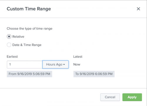
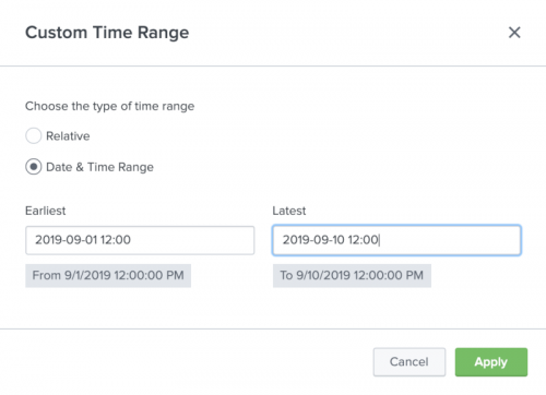
Custom time ranges
You can use the Relative option to specify a custom time range relative to the current time. You can use the Date & Time Range option to specify a specific custom time range.
- Click on the time range drop-down menu and select Custom....
- If you want to view metrics in a time range relative to "now", select Relative and enter the earliest date and time you want to view. Relative time must be entered as an integer value.
- If you want to view metrics in a specific time range, select Date & Time Range and enter the start and end dates and times. Date & Time Range supports all valid date and time formats. See Time modifiers for more information on the supported date and time formats.
- Click Apply.


See Specifying time ranges for more information on specifying time ranges.
Zoom in to a custom time range
Zoom in to a custom time range to analyze data from a specific time period.
- Select a chart in the workspace to zoom in on.
- Click and drag your cursor over the time period you want to view.
All charts show your selected time range.
To undo the zoom, click the back arrow in the top-left corner of the main panel. The time range reverts to the previous setting.
Recover workspace charts
Charts in the Analytics Workspace are automatically backed up to your local system. If you accidentally navigate away from the workspace, you have the option to restore your session in the same browser.
Disable automatic chart recovery
You also have the option to disable automatic chart recovery using the workspace.conf file.
- Navigate to the
packages/splunk_metrics_workspace/src/main/resources/splunk/defaultdirectory on your local file system. - Open
workspace.conf. - In the
featuresstanza, add the following line:state_restore = 0. - Restart Splunk Enterprise.
If you are using Splunk Cloud Platform, you cannot disable chart recovery.
For more information about saving charts as dashboard panels, see Dashboards in the Analytics Workspace.
For more information about saving charts as alerts, see Alerts in the Analytics Workspace.
| Types of data in the Analytics Workspace | Data sources in the Data panel in the Analytics Workspace |
This documentation applies to the following versions of Splunk® Enterprise: 8.1.0, 8.2.0, 8.2.1, 8.2.2, 8.2.3, 8.2.4, 8.2.5, 8.2.6, 8.2.7, 8.2.8, 8.2.9, 8.2.10, 8.2.11, 8.2.12, 9.0.0, 9.0.1, 9.0.2, 9.0.3, 9.0.4, 9.0.5, 9.0.6, 9.0.7, 9.0.8, 9.0.9, 9.0.10, 9.1.0, 9.1.1, 9.1.2, 9.1.3, 9.1.4, 9.1.5, 9.1.6, 9.1.7, 9.1.8, 9.1.9, 9.2.0, 9.2.1, 9.2.2, 9.2.3, 9.2.4, 9.2.5, 9.2.6, 9.3.0, 9.3.1, 9.3.2, 9.3.3, 9.3.4, 9.4.0, 9.4.1, 9.4.2
Feedback submitted, thanks!