Part 5 Add a column chart
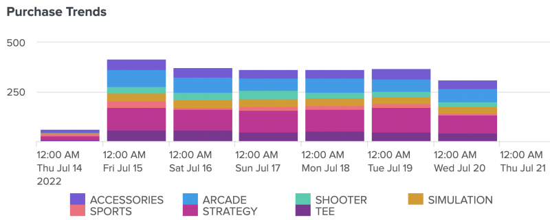
Let's say that you want to show how the number of purchases at Buttercup Games changes over a particular time. Similarly, you want to show this same metric, but broken down into game categories, such as arcade, shooter, and sports. In this part of the tutorial, create a column chart using a chain search.
- Select the add chart icon (
 ) in the editing toolbar, and then select Column.
 - In the New Data Source panel, name the source Purchase Trends.
- Add your search. For this tutorial, copy and paste the following search into the Search with SPL box:
index=main sourcetype=access_* status=200 action=purchase categoryId!=NULL
| fields _time categoryId clientip
| timechart count by categoryId
- Expand the Code section and change the Data Source ID to ds_purchase_trends.
- Select Apply & Close
- Title your chart Purchase Trends and leave the description box empty.
- In the General section of the Configuration panel, follow these steps:
- In the Legend section, change the Position option to Bottom.
- Expand the Code section and change the Visualization ID to viz_purchase_trends.
- Move and resize your column chart to the center of the bottom right gray rectangle.
After completing Part 5, your column chart will look similar to the following:

Next step
You've completed Part 5 of the Splunk Dashboard Studio tutorial.
Now your dashboard has a column chart. Next, add a single value visualization with a chain search. Continue to Part 6: Add a single value visualization using a chain search.
| Part 4 Add a pie chart visualization | Part 6 Add a single value visualization using a chain search |
This documentation applies to the following versions of Splunk® Enterprise: 9.0.0, 9.0.1, 9.0.2, 9.0.3, 9.0.4, 9.0.5, 9.0.6, 9.0.7, 9.0.8, 9.0.9, 9.0.10
 Download manual
Feedback submitted, thanks!