Modify and write dynamic options syntax
The following examples demonstrate how you can use dynamic options syntax (DOS) to dynamically update dashboards.
Add to existing DOS in the source code
You need to write your own DOS in the source code editor for advanced uses, but it is more efficient to start with pre-generated DOS in the source code editor before writing new DOS. By using dynamic options in the visual editor UI, the dynamic options you set populate the source code with DOS.
The following two examples apply dynamic coloring using DOS by starting with pre-generated DOS created from the visual editor UI and editing that DOS with manual adjustments.
Example of table column coloring
Using DOS, you can dynamically color a cell or column in a table based on values in another column. The following example represents a table with 2 columns: Game and Purchases. You want to dynamically update the text colors of the Game column based on values in the Purchases column.
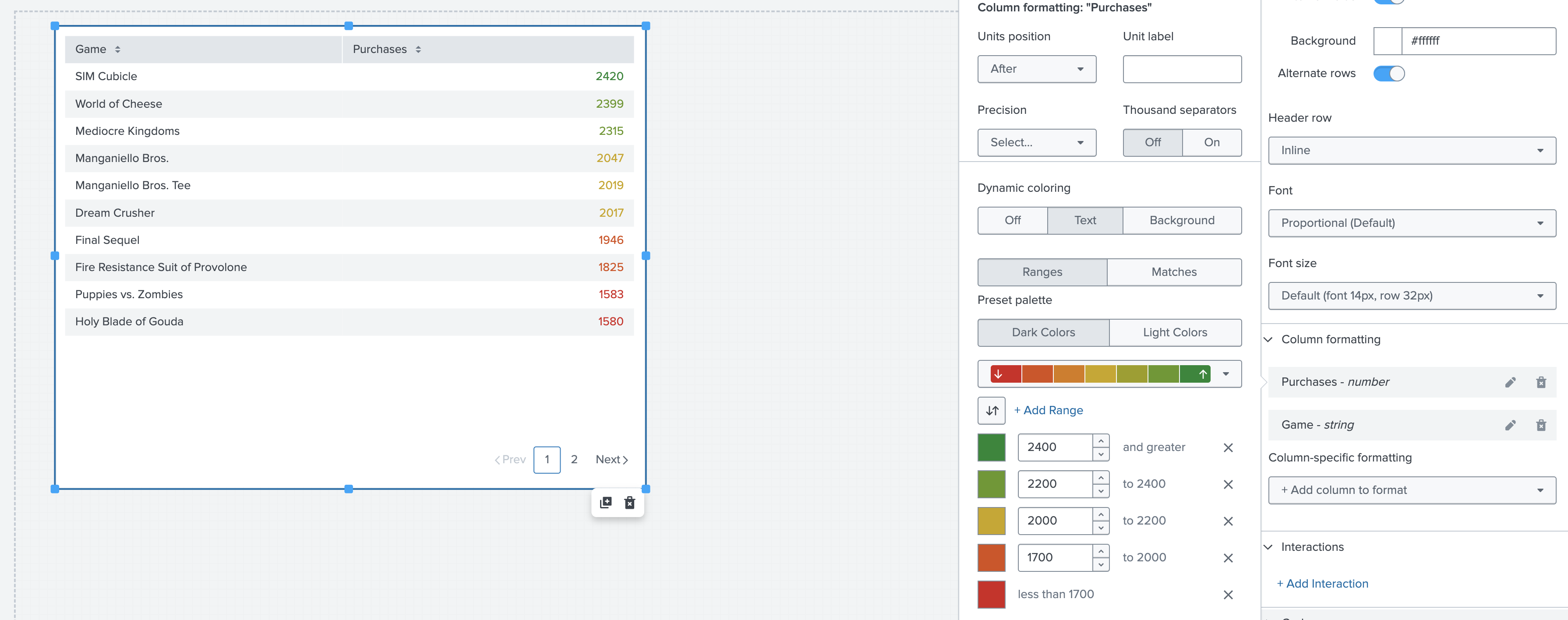
You use the visual editor UI to apply dynamic coloring based on Purchases, then you manually modify the DOS to apply the coloring to the Game column. First, set 5 color thresholds by selecting Column formatting and then selecting Purchases - number in the visual editor:
- Green: More than 2,400 purchases
- Light green: 2,200 to 2,400 purchases
- Yellow: 2,000 to 2,200 purchases
- Orange: 1,700 to 2,000 purchases
- Red: Less than 1,700 purchases
The following image shows the table you create after applying dynamic coloring based on the Purchases column.

Now, select Source code in the configuration panel to see the source code for the table visualization. The following code is within the options section of the source code:
"options": {
  "columnFormat": {
    "Purchases": {
       "data": "> table | seriesByName(\"Purchases\") | formatByType(PurchasesColumnFormatEditorConfig)",
        "rowColors": "> table | seriesByName(\"Purchases\") | rangeValue(PurchasesRowColorsEditorConfig)"
            },
     "Game": {
         "data": "> table | seriesByName(\"Game\") | formatByType(GameColumnFormatEditorConfig)| "
            }
        }
    },
In this example, the following line of DOS defines the rowColors value of the column Purchases:
"rowColors": "> table | seriesByName(\"Purchases\") | rangeValue(PurchasesRowColorsEditorConfig)"
The selector function in this line selects the Purchases column, and the formatting function is rangeValue. The rangeValue function uses the input PurchasesRowColorsEditorConfig to format the values in the column Purchases.
The definition of PurchasesRowColorsEditorConfig is in the context section of the source code:
"context": {
        "PurchasesColumnFormatEditorConfig": {
            "number": {
                "thousandSeparated": false,
                "unitPosition": "after"
            }
        },
        "GameColumnFormatEditorConfig": {
            "string": {
                "unitPosition": "after"
            }
        },
        "PurchasesRowColorsEditorConfig": [
            {
                "value": "#D41F1F",
                "to": 1700
            },
            {
                "value": "#D94E17",
                "from": 1700,
                "to": 2000
            },
            {
                "value": "#CBA700",
                "from": 2000,
                "to": 2200
            },
            {
                "value": "#669922",
                "from": 2200,
                "to": 2400
            },
            {
                "value": "#118832",
                "from": 2400
            }
        ]
    }
From the previous source code, the inputs into the visual editor UI populate the PurchasesRowColorsEditorConfig values in the source code.
However, the PurchasesRowColorsEditorConfig values dynamically color the Games column instead of the Purchases column. To update this coloring, you need to remove the line of DOS that defines rowColors from the Purchases section and paste it in the Game section.
These edits result in the following new code in the options section:
"options": {
  "columnFormat": {
    "Purchases": {
	"data": "> table | seriesByName(\"Purchases\") | formatByType(PurchasesColumnFormatEditorConfig)"
			   },
    "Game": {
	"data": "> table | seriesByName(\"Game\") | formatByType(GameColumnFormatEditorConfig)",
	"rowColors": "> table | seriesByName(\"Purchases\") | rangeValue(PurchasesRowColorsEditorConfig)"
			   }
			}
		},
In this new code, the rowColors of the Game column is defined by the following line of DOS:
"> table | seriesByName(\"Purchases\") | rangeValue(PurchasesRowColorsEditorConfig)"
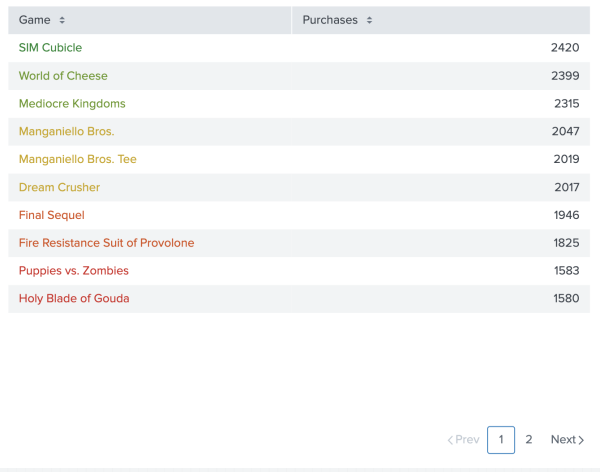
This line of DOS results in the correct dynamic coloring in the chart. Now, each individual game title in the Game column is colored by its corresponding value within the same row in the Purchases column. See the following screenshot for the table created as a result of editing the DOS for the table visualization.
Color a single value visualization sparkline
In Dashboard Studio, you can add a sparkline to a single value visualization using the timechart command in your search. See Single value visualizations to learn more about the timechart command and how to add sparklines to your visualizations.
Using DOS, you can dynamically color a sparkline based on the trend value in the single value visualization to which you attached the sparkline. The following example represents a single value visualization of all Buttercup Games purchases in the category Arcade within the past 2 days.
 You can start dynamically coloring a sparkline by setting dynamic options in the visual editor.
- Set color thresholds for the dynamic trend value in the single value visualization by selecting Coloring.
- Under Dynamic Elements, select Trend.
The visual editor automatically populates with the following color thresholds:
- Green: 0 and greater
- Red: less than 0
Now that the DOS in the visual editor is set, select Source code in the configuration panel to see the source code for the table visualization. The following code is within the options section of the source code:
"options": {
        "majorValue": "> sparklineValues | lastPoint()",
        "trendValue": "> sparklineValues | delta(-2)",
        "sparklineValues": "> primary | seriesByName('ARCADE')",
        "trendColor": "> trendValue | rangeValue(trendColorEditorConfig)"
    }
To color the sparkline, you need to set an option that defines the color of a sparkline. The option that defines the color of a sparkline is called sparklineStrokeColor. Since the trendColor option already contains all the formatting necessary for the sparkline's color, you can reference trendColor when defining the sparklineStrokeColor option. See Single value visualizations for a full list of source options for single value visualizations.
In the options section, the formatting function defining the trendColor value is rangeValue, and the input for that function is trendColorEditorConfig. The following code within the context section of the source code defines trendColorEditorConfig:
"context": {
        "trendColorEditorConfig": [
            {
                "to": 0,
                "value": "#9E2520"
            },
            {
                "from": 0,
                "value": "#1C6B2D"
            }
        ]
    }
To define the sparklineStrokeColor value, you only need to provide a data source, because trendColor already contains a selector function. Based on the definition of trendColor, add the line of code "sparklineStrokeColor": "> trendColor" to the start of the options section. This results in the following edited code under the options section:
"options": {
        "sparklineStrokeColor": "> trendColor",
        "majorValue": "> sparklineValues | lastPoint()",
        "trendValue": "> sparklineValues | delta(-2)",
        "sparklineValues": "> primary | seriesByName('ARCADE')",
        "trendColor": "> trendValue | rangeValue(trendColorEditorConfig)"
    }
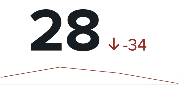
The line of DOS you added results in the correct dynamic coloring result. Now, the sparkline under the single value visualization is colored by its corresponding trend value. The following screenshot shows the sparkline after editing the DOS for the single value visualization.
Now that you can use the capabilities of DOS by writing your own DOS, see Escapes, quotation marks, and deltas in dynamic options syntax to learn more about formatting rules in DOS.
For a comprehensive table of DOS formators and selectors, see Selector and formatting functions.
| Using dynamic options in the visual editor | Escapes, quotation marks, and deltas in dynamic options syntax |
This documentation applies to the following versions of Splunk® Enterprise: 9.1.0, 9.1.1, 9.1.2, 9.1.3, 9.1.4, 9.1.5, 9.1.6, 9.1.7, 9.1.8, 9.1.9, 9.2.0, 9.2.1, 9.2.2, 9.2.3, 9.2.4, 9.2.5, 9.2.6, 9.3.0, 9.3.1, 9.3.2, 9.3.3, 9.3.4, 9.4.0, 9.4.1, 9.4.2


 Download manual
Feedback submitted, thanks!