Part 6: Add a map
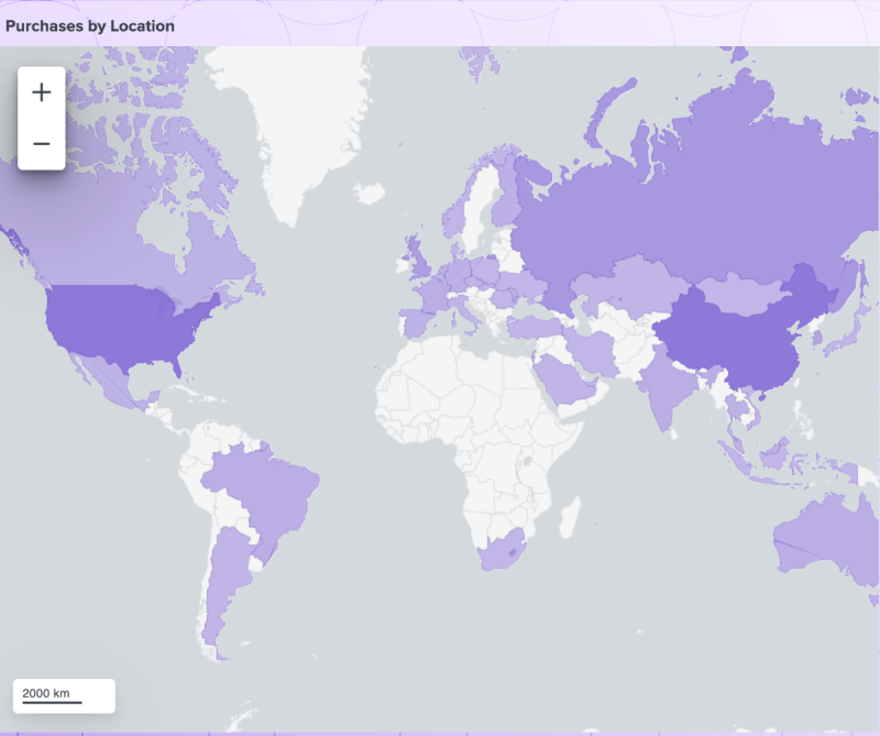
After adding all these visualizations, you decide that you want to show purchases of Buttercup Games across a world map categorized by game type. In this part of the tutorial, create an interactive map that uses colors to demonstrate purchase quantity by country.
- Select the add chart icon (
 ) in the editing toolbar, and then select Map.
 - In the Search section of the Select data source panel, select + Create search.
- In the New data source panel, name the source Purchases by Location.
- Add your search. For this tutorial, copy and paste the following search into the SPL query field:
This search finds the countries that customers are located in based on their IP address, and then adds up purchases by the country that the customer is from.
index=main sourcetype=access_* action=purchase status=200 productName="*"
| iplocation clientip
| lookup geo_countries latitude AS lat longitude AS lon OUTPUT featureId AS country
| stats count by country
| geom geo_countries featureIdField=country
- Select Apply & close. At this point, you've created a new data source and assigned it to the map. There will be no visible changes to the map.
- In the Data layer formatting section, change Layer type to Choropleth. A choropleth map is a type of map that uses color to show aggregate values. In this tutorial, the map uses color to show purchase amounts.
- Make sure that Region area IDs is set to country (string) and that Values is set to count (number).
- Use the drag handle to move and resize the map to the bottom left rectangle. If you select the map anywhere other than the drag handle, the map's position will not move. You would instead move the locations visible on the map.
- Add a title to the map visualization by selecting the add Markdown icon (
 ) in the editing toolbar.
 - Enter **Purchases by Location** in the text box. The asterisks bold the text using Markdown formatting.
- Resize and position the text box to fit above the map and inside the rectangle. Resize the map again if necessary to include the text.
After completing Part 6, your map looks similar to the following:
Next step
You've completed Part 6 of the Splunk Dashboard Studio tutorial and your dashboard has a map showing the connection between geographic locations and purchases. Next, you'll add a drop-down menu input to filter the visualizations you've added so far. Continue to Part 7: Add an input.
| Part 5: Add a single value visualization | Part 7: Add an input |
This documentation applies to the following versions of Splunk® Enterprise: 9.1.3, 9.1.4, 9.1.5, 9.1.6, 9.1.7, 9.1.8, 9.1.9, 9.2.1, 9.2.2, 9.2.3, 9.2.4, 9.2.5, 9.2.6, 9.3.0, 9.3.1, 9.3.2, 9.3.3, 9.3.4, 9.4.0, 9.4.1, 9.4.2

 Download manual
Feedback submitted, thanks!