Pie charts
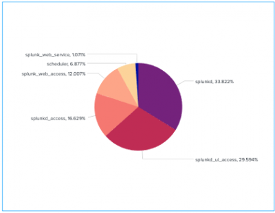
Use a pie chart to show how different field values combine over an entire data set. Each slice of a pie chart represents the relative importance or volume of a particular category.
Data formatting
Pie charts represent a single data series.
Use a transforming command in a search to generate the single series.
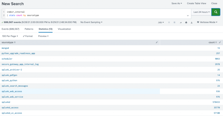
For example, count events in each sourcetype field category.
...| stats count by sourcetype
Check the Statistics table in Search & Reporting after running the search to make sure that a single series is generated. The table should have two columns.
The example search generates the following table.
The first table column contains labels for each pie slice. The second column contains the numerical values that correspond to each label. The numerical values determine the relative size of each slice.
If the search generates a table with more than two columns, the extra columns are ignored.
Generate a pie chart
- Select the Add chart button (
 ) in the editing toolbar and browse through the available charts. Choose the pie chart.
 - Select the chart on your dashboard to highlight it with the blue editing outline.
- Set up a new data source by selecting + Create search and adding a search to the SPL query window. Or, you can select an existing data source under the Search, Saved search, or Chain search sections.
- (Optional) You can also write a new ID that describes the search better than the default by changing the ID in Data source name.
- Select Apply and close.
Configuration Panel options
You can use the Configuration panel to configure the following pie chart components.
Title
Give your visualization a name. This is also helpful when searching for individual visualizations in the dashboard definitions. This name is not the same as the automatically assigned unique ID.
Description
Give your visualization a description to explain what the user is viewing.
Data Sources
Choose an existing ad hoc search or create a new one.
Position & Size
You can use your mouse to change the size of the panel, or the Position & Size section of the Configuration panel for pixel perfect sizing.
Appearance
Use this option to toggle between either the classic pie visualization, or a pie with a hole in the center.
Labels
- Toggle the Show Percent switch to show the percentage each slice of the pie takes up from the whole.
- Toggle the Show Labels switch to show the value of each slice.
Collapse Threshold
Specify the size threshold, as a percentage of the whole pie, at which point slices collapse into one consolidated slice. The number value must be between and including 1 and 0.01.
Collapse Slice Label
Name the collapsed slice.
Drilldown
Drilldown in a pie chart lets users click on a pie slice to open a secondary search using the clicked values. You can enable or disable drilldown in the Dashboard editor. See Use drilldown for dashboard interactivity for more details.
Code
Select your visualization or its search to view and edit the source code in real-time. You can also change the Visualization ID to a more readable ID to help identify this visualization in the source code.
Example
This search uses the bytes and sourcetype fields to generate a single series.
index = _internal | chart avg(bytes) over sourcetype
Here, the sourcetype column provides pie slice labels. The avg(bytes) column provides the relative size of each slice, as percentages of the sum of avg(bytes) returned by the search.
Source options for the pie chart
While some of these options can be set using the visual editor, there are additional options that can only be set in the source editor for splunk.pie. These options are added to the options field of the visualization stanza. For example, the following example shows the addition of background color settings using a hexadecimal code:
"viz_25NNIqLF": {
  "type": "splunk.pie",
  "options": {
    "backgroundColor": "#0000FF",
  },
  "dataSources": {
    "primary": "ds_gcEN4c7Q"
  }
}
Pie chart options
The following options are available for editing pie charts in the source editor:
| Property | Type | Default | Description |
|---|---|---|---|
| label | string | > primary | seriesByIndex(0) | List of string values to display the pie chart labels. |
| backgroundColor | string | > themes.defaultBackgroundColor | Specify the color for the background. You may use a dataSource to apply the color. The default for enterprise light is "#ffffff". The default for enterprise dark is "#000000". The default for prisma dark is "#0b0c0e". |
| collapseLabel | string | other | Specify the label for the consolidated slice. |
| collapseThreshold | number | 0.01 | Specify the size threshold as a number between 0 and 1 (inclusive), of the whole pie at which slices collapse into one consolidated slice. |
| label | string[] | > primary | seriesByIndex(0) | List of string values to display the pie chart labels. |
| labelField | string | > label | getField() | Specify the field that corresponds to the labels. |
| labelDisplay | ("values" | "valuesAndPercentage" | "off") | values | Specify whether to display the labels and/or slice percentages. |
| resultLimit | number | 50000 | Specify the number of data points rendered in a chart. |
| seriesColors | string[] | [#7B56DB,#009CEB,#00CDAF,#DD9900,#FF677B,#CB2196,#813193,#0051B5,#008C80,#99B100,#FFA476,#FF6ACE,#AE8CFF,#00689D,#00490A,#465D00,#9D6300,#F6540B,#FF969E,#E47BFE] | Specify the colors used for a series. For example, ["#FF0000", "#0000FF", "#008000"]. |
| seriesColorsByField | object | n/a | Specify the colors used for specific pie slice labels. For example: {"April": "#008000", "May": "#FFA500"}. |
| showDonutHole | boolean | FALSE | Specify whether the pie should be a donut. |
| value | number[] | > primary | seriesByIndex(1) | List of numerical values to power the pie chart. |
| valueField | string | > value | getField() | Specify the field that corresponds to the data powering values. |
| Parallel coordinates | Punchcard charts |
This documentation applies to the following versions of Splunk Cloud Platform™: 9.3.2411 (latest FedRAMP release), 9.1.2308, 9.1.2312, 9.2.2403, 9.2.2406, 9.3.2408, 9.0.2303


 Download manual
Feedback submitted, thanks!