Generate a single value
Learn how to write a query to generate a single value visualization.
Single value visualizations work best for queries that create a time series chart using the timechart command or aggregate data using the stats command.
Use timechart to generate a single value
This search and visualization use timechart to track daily errors for a Splunk deployment.
index=_internal source="*splunkd.log" log_level="error" | timechart count
To access sparklines and trend indicators, it is important that the search includes the timechart command. Using timechart means that time series data becomes available to sparkline and trend indicator processing.
If you use the stats command as part of a full timechart query, the visualization does not include a sparkline or trend indicator.
Use stats to generate a single value
If you use the stats command to generate a single value, the visualization shows the aggregated value without a trend indicator or sparkline. As an example, this query and visualization use stats to tally all errors in a given week.
index = _internal source = "*splunkd.log" log_level = "error" | stats count
Queries and time ranges for single values
It is important to set up the single value query that best drives the visualization that you expect.
- Search for a single value to avoid unexpected results in the visualization. In the Dashboard Editor, you can select single value visualizations even if a search returns multiple values. In this case, the single value visualization uses the value in the first cell of the results table.
- The time range picker and the query command work together to generate the results for a single value visualization. A query using
statsresults in a visualization showing the aggregated total of results in the time range. A query usingtimechartgenerates a visualization showing the most recent result within that range.
For details about the stats command, see stats in the Search Reference.
For details about the timechart command, see timechart in the Search Reference.
Queries to generate a sparkline and trend indicator
A sparkline appears by default below a single value generated with the timechart command. It shows increases and decreases in a metric over the time range you specify in a search.
This visualization shows results for a search over the past week's data. Using the time range picker to select Week to date means that the sparkline reflects the data changes over the last seven days.
This visualization shows results for the same search over the past day's data. Using the time range picker to select Today means that the sparkline shows data changes over the past twenty-four hours.
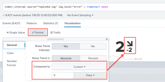
A trend indicator appears to the right of a single value generated with the timechart command. It shows recent data behavior over a customizable time range. The trend indicator is composed of a number and an arrow to represent what happened most recently in the data.
Depending on data behavior, the trend arrow can point up, down, or directly to the side to show no change. By default, the trend indicator value evaluates to the difference between the two most recent values in the results. You can change the trend time window in the Format menu's General settings panel or by adjusting the span parameter for timechart. if you use the Compared to field in the Format menu, it will override the span command you specified in the search string. For example:
index=_internal source="*splunkd.log" log_level="error" | timechart count
| Overview | Customize a single value |
This documentation applies to the following versions of Splunk Cloud Platform™: 9.3.2411 (latest FedRAMP release), 8.2.2112, 8.2.2201, 8.2.2203, 8.2.2202, 9.0.2205, 9.0.2208, 9.0.2209, 9.0.2303, 9.0.2305, 9.1.2308, 9.1.2312, 9.2.2403, 9.2.2406, 9.3.2408


 Download manual
Feedback submitted, thanks!