Dashboard examples
This topic shows the source simple XML code behind dashboards. After you become familiar with the simple XML source code, you can further customize the dashboard.
Basic dashboard
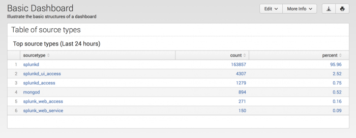
This example uses a few simple XML elements to create a basic dashboard.
<dashboard version="1.1">
  <!-- A title for the dashboard -->
  <label>Basic Dashboard</label>

  <!-- Provide a description -->
  <description>Illustrate the basic structures of a dashboard</description>

  <!-- Place panels within rows -->
  <row>

    <!-- This basic dashboard has only a single panel -->
    <panel>

      <table>
        <title>Top Sourcetypes (Last 24 hours)</title>

        <!-- A search powers the panel -->
        <search>
          <query>
          index=_internal | top limit=100 sourcetype | eval percent = round(percent,2)
          </query>
          <!-- Specify a time range for the search -->
          <earliest>-24h@h</earliest>
          <latest>now</latest>
        </search>

        <!-- Use options to further define how to display result data -->
        <option name="wrap">true</option>
        <option name="rowNumbers">true</option>
      </table>
    </panel>
  </row>

</dashboard>
Searches power panels
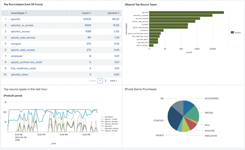
This dashboard illustrates the following searches:
- Inline search
- Search saved as a report
- Search from a prebuilt panel
- Inline search derived from a pivot
<dashboard version="1.1">
  <label>Searches power dashboards</label>
  <description>Show the various searches to power a panel.</description>
  <!-- This row contains three panels -->
  <row>
    <panel>
      <table>
        <title>(Inline Search) Top Source Types</title>
        <!-- Inline Search -->
        <search>
          <query>
          index=_internal | top limit=100 sourcetype
          | eval percent = round(percent,2)
          </query>
          <earliest>-24h@h</earliest>
          <latest>now</latest>
        </search>
        <option name="rowNumbers">true</option>
      </table>
    </panel>
    <panel>
      <chart>
        <title>(Report) Top Source Types</title>
        <!-- Reference to a search saved as a report -->
        <search ref="Top Source Types Report" />
      </chart>
    </panel>
  </row>
  <row>
    <panel ref="top_source_types_in_the_last_hour" app="search" />

    <panel>
      <chart>
        <title>(Pivot)  Game Purchases</title>

        <!-- Inline search derived from a pivot -->
        <search>
          <query>
          | pivot Buttercup_Games Successful_purchases count(Successful_purchases)
          AS "Count of Successful purchases" SPLITROW product_name
          AS "product name" SORT 100 product_name
          </query>
        </search>
        <option name="charting.chart">pie</option>
      </chart>
    </panel>
  </row>
</dashboard>
Use panels to visualize search results
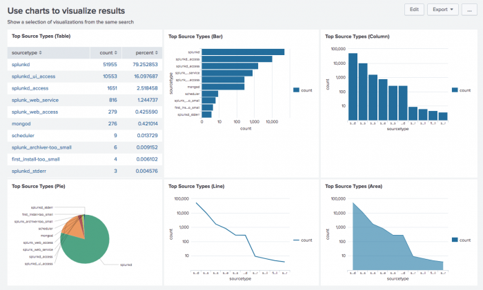
You can display search results in a table or event listing, but also specify various charts. Use the <chart> element, specifying the chart type with the <option> child element.
<dashboard version="1.1">
  <label>Use charts to visualize results</label>
  <description>Show a selection of visualizations from the same search</description>
  <row>
    <panel>
      <!-- Display results as a table. Uses an           -->
      <!-- inline search, equivalent to the <searchName> -->
      <!-- specified for the other panels                -->
      <table>
        <title>Top Source Types (Table)</title>
        <search>
          <query>
            index=_internal | top limit=10 sourcetype
          </query>
          <earliest>-24h</earliest>
        <latest>now</latest>
        </search>
      </table>
    </panel>
    <panel>
      <!-- display same search as various charts -->
      <chart>
        <title>Top Source Types (Bar)</title>
        <search>
          <query>
            index=_internal | top limit=10 sourcetype
          </query>
          <earliest>-24h</earliest>
        <latest>now</latest>
        </search>
        <!-- specify the chart type with this <option> to <chart> -->
        <option name="charting.chart">bar</option>
        <option name="charting.axisY.scale">log</option>
      </chart>
    </panel>
    <panel>
      <chart>
        <title>Top Source Types (Column)</title>
        <search>
          <query>
            index=_internal | top limit=10 sourcetype
          </query>
          <earliest>-24h</earliest>
        <latest>now</latest>
        </search>
        <option name="charting.chart">column</option>
        <option name="charting.axisY.scale">log</option>
      </chart>
    </panel>
  </row>
  <row>
    <panel>
      <chart>
        <title>Top Source Types (Pie)</title>
        <search>
          <query>
            index=_internal | top limit=10 sourcetype
          </query>
          <earliest>-24h</earliest>
        <latest>now</latest>
        </search>
        <option name="charting.chart">pie</option>
      </chart>
    </panel>
    <panel>
      <chart>
        <title>Top Source Types (Line)</title>
        <search>
          <query>
            index=_internal | top limit=10 sourcetype
          </query>
          <earliest>-24h</earliest>
        <latest>now</latest>
        </search>
        <option name="charting.chart">line</option>
        <option name="charting.axisY.scale">log</option>
      </chart>
    </panel>
    <panel>
      <chart>
        <title>Top Source Types (Area)</title>
        <search>
          <query>
            index=_internal | top limit=10 sourcetype
          </query>
          <earliest>-24h</earliest>
        <latest>now</latest>
        </search>
        <option name="charting.chart">area</option>
        <option name="charting.axisY.scale">log</option>
      </chart>
    </panel>
  </row>
</dashboard>
Dashboard with real time search
You can build a real-time dashboard using the Splunk Dashboard Editor or coding the dashboard using simple XML. This example shows how to code the simple XML.
To enable real-time searching, use the <earliest> and <latest> child elements to the <search> element. For example, if you want to enable real-time searching and display the data in a table, specify the following:
<table>
    <title>Look here for errors</title>
    <search>
      <query>
      error OR failed OR severe
      OR ( sourcetype=access_* ( 404 OR 500 OR 503 ) )
      </query>
    '''<earliest>rt</earliest>'''
    '''<latest>rt</latest>'''
    </search>
    <fields>host, source, errorNumber</fields>
</table>
You can also set a window for the real-time dashboard. For example, if you want to show real-time events but only from the last 5 minutes.
<table>
    <title>Look here for errors during the last 5 minutes</title>
    <search>
      <query>
        error OR failed OR severe OR ( sourcetype=access_* ( 404 OR 500 OR 503 ) )
      </query>
      '''<earliest>rt-5m</earliest>'''
      '''<latest>rt</latest>'''
    </search>
    <fields>host, source, errorNumber</fields>
</table>
For more information on setting a search window, see Specify real-time time range windows in your search in the Search Manual.
Specify custom colors for fields in charts
Use the charting.fieldColors Simple XML property to customize field colors in a chart. The colors you select are the same each time the chart displays, regardless of other charts or color specifications in the dashboard.
For more details about this property, see charting.fieldColors in the Chart Configuration Reference.
Example
The following example shows how to specify colors for a chart showing error counts per sourcetype. The example uses this search.
index = _internal log_level=* | stats count(eval(log_level="ERROR")) as ERROR count(eval(log_level="WARN")) as WARN count(eval(log_level="INFO")) as INFO by sourcetype
Without charting.fieldColors, the visualization uses default field color mapping based on the order of values returned. Here, ERROR appears blue.
To change the field color mapping, add the charting.fieldColors property to the dashboard's Simple XML source code. For example, the charting.fieldColors configuration below defines these colors for each log level.
- INFO: green
- WARN: orange
- ERROR: red
<option name="charting.fieldColors">
  {"ERROR": 0xFF0000, "WARN": 0xFF9900, "INFO":0x009900, "NULL":0xC4C4C0}
</option>
After adding charting.fieldColors, the chart now looks like this.
The following code implements a similar chart with custom field colors.
<panel>
  <html>
    Use <tt>eval</tt> function in the search to transpose
    the value of the log_level field into individual fields
    for <tt>charting.fieldcolors</tt>.
  </html>
  <chart>
    <title>Field colors example</title>
    <search>
      <query>
        index = _internal log_level=* | stats
        count(eval(log_level="ERROR")) as ERROR
        count(eval(log_level="WARN")) as WARN
        count(eval(log_level="INFO")) as INFO
        by sourcetype
      </query>
      <earliest>-7d@h</earliest>
      <latest>now</latest>
    </search>
    <option name="charting.axisY.scale">log</option>
    <option name="charting.chart">column</option>
    <option name="charting.fieldColors">
      {"ERROR": 0xFF0000, "WARN": 0xFF9900, "INFO":0x009900, "NULL":0xC4C4C0}
    </option>
    <option name="charting.legend.placement">right</option>
  </chart>
</panel>
Specify properties for visualizations
Simple XML provides a set of simple XML elements that define properties that can be applied to all visualizations. For properties specific to certain types of visualizations, such as <chart> or <map>, use the <option> element to specify a property.
The use of a specific element or the <option> element varies. Consult the Simple XML Reference and Chart Configuration Reference for details on specifying panel properties.
The following table summarizes some of the elements available for all visualizations.
| Tag | Description |
|---|---|
<title>
|
String
Add a title to your panel, such as Failed logins. The title displays at the top of the panel. |
<earliest><latest>
|
Splunk time format
Restrict search results to a specific time window, starting with the earliest time and ending with the latest time. Specify "rt" to enable real-time searches. |
The following example of a panel with a <chart> element shows how to specify a title and an inline search. It restricts search results to a 5 hour window and to three fields:
<dashboard version="1.1">
 <label>My dashboard</label>
  <row>
    <panel>

      <table>
        <title>Top users, five hours ago</title>
        <search>
          <query>
            host=production | top users
          </query>
        <earliest>-10h</earliest>
        <latest>-5h</latest>
        </search>
        <fields>host,ip,username</fields>
       </table>

    </panel>
  </row>
</dashboard>
The following example specifies various properties with the <option> element for a <table>.
<dashboard version="1.1">
  <label>My dashboard</label>
  <row>
    <panel>

      <table>
        <title>Errors in the last 24 hours</title>
        <search>
          <query>
            Errors in the last 24 hours
          </query>
        </search>
        <option name="count">15</option>
        <option name="displayRowNumbers">true</option>
        <option name="maxLines">10</option>
        <option name="segmentation">outer</option>
        <option name="softWrap">true</option>
      </table>

    </panel>
  </row>
</dashboard>
The following example specifies a column chart visualization, with display names for the X and Y axes.
<dashboard version="1.1">
  <label>My dashboard</label>
  <row>
    <panel>
      <chart>
        <search>
          <query>
            sourcetype=access_* method=GET | timechart count by categoryId
            | fields _time BOUQUETS FLOWERS
           </query>
           <earliest>-7d</earliest>
           <latest>now</latest>
        </search>
        <title>Views by product category, past week (Stacked)</title>
        <option name="charting.axisTitleX.text">Views</option>
        <option name="charting.axisTitleY.text">Date</option>
        <option name="charting.chart">column</option>
      </chart>
    </panel>
  </row>
</dashboard>
Use the HTML panel to display static text
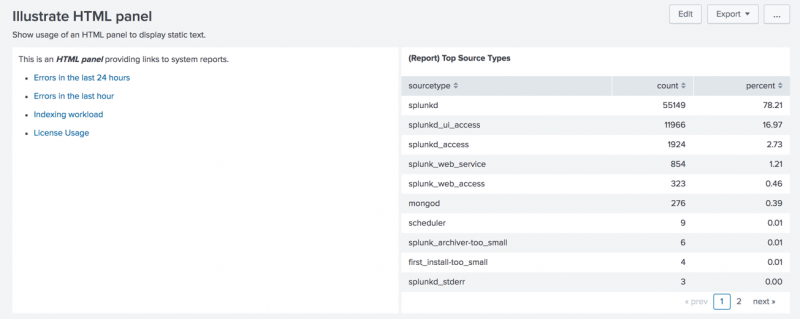
The HTML panel displays inline HTML. Use the HTML panel to add documentation, links, images, and other Web content to a dashboard.
Content between the HTML tags is displayed according to the specified HTML formatting. Relative link references are relative to the current view location. The HTML panel does not use any of the other general panel options and there are no specific options to set for HTML.
For details on using HTML panels, refer to the HTML element entry in the Simple XML Reference.
In the example, the anchor tag accesses system reports using the special Splunk locator: @go?s=
. . .
<row>
  <panel>
    <html>
      <p>This is an <i><b>HTML panel</b></i> providing links to system reports.</p>
      <ul>
        <li>
          <p><a href="@go?s=Errors in the last 24 hours">Errors in the last 24 hours</a></p>
        </li>
        <li>
          <p><a href="@go?s=Errors in the last hour">Errors in the last hour</a></p>
        </li>
        <li>
          <p><a href="@go?s=Indexing workload">Indexing workload</a></p>
        </li>
        <li>
          <p><a href="@go?s=License Usage Data Cube">License Usage</a></p>
        </li>
      </ul>
    </html>
  </panel>
    . . .
</row>
Configure drilldown
Use drilldown to link to a search, another dashboard, or an external website. You can also use drilldown to trigger contextual changes in the same dashboard.
See Use drilldown for dashboard interactivity for more information.
| Dashboards and forms | Form examples |
This documentation applies to the following versions of Splunk Cloud Platform™: 9.3.2411 (latest FedRAMP release), 8.2.2203, 9.0.2205, 9.0.2208, 8.2.2112, 8.2.2201, 8.2.2202, 9.0.2209, 9.0.2303, 9.0.2305, 9.1.2308, 9.1.2312, 9.2.2403, 9.2.2406, 9.3.2408


 Download manual
Feedback submitted, thanks!