Use the Home dashboard
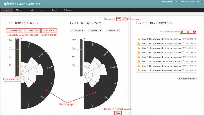
The Home dashboard is the main dashboard for the Splunk App for Unix and Linux. It displays performance statistics on two radial graphs that you can configure as well as an alert "ticker" that displays the most recent alerts that have triggered within the app.
Performance radial graphs
On the left side of the screen are two performance radial graphs - half-circle shaped controls which display information about real-time performance for a category or group of hosts. Each radial graph operates independently of the other, and updates once every five seconds.
Each radial graph divides into "slices" depending on which category and groups you have selected for that radial graph. If you have configured more than one host in a group, the graph displays the metric averaged across all machines within the group.
As performance levels increase or decrease for a certain category or group of hosts, individual slices of the radial graph fill in with white, beginning at the center and extending out to their edges. The higher the performance metric, the more the slices fill up.
You can configure these radial graphs to display information on any single host or group of hosts that the Splunk App for Unix and Linux has collected data for, based on categories and groups you have defined in the Splunk App for Unix and Linux's Settings page. To learn how to define categories and groups of hosts, read "Configure the Splunk App for Unix and Linux" in this manual.
Change radial graph display stats
To change which statistics that a radial graph displays:
1. Click the Category button underneath the title for a particular radial graph.
The radial graph refreshes to load groups and hosts contained by the chosen category.
2. Click the Group button. A window pops up that displays the groups in that category.
3. Activate one or more groups by clicking the checkbox next to the desired group.
The radial graph updates to show statistics for the selected host groups.
4. Click the performance metric button next to the Group. button. A window pops up and displays the available performance statistics.
5. Choose the desired performance metric from the items in the pop-up window.
The radial graph updates to display the desired performance metrics for the chosen category and group(s).
Change radial graph threshold colors
You can give your radial graphs color by editing the threshold bars placed next to each radial graph.
Each radial graph has a "threshold bar" next to it that divides into sections. Clicking on the threshold bar adds a slider at the point where you clicked and brings up a color palette where you can choose a color for a specific level of performance metric.
Once you have added a slider, you can change what threshold that slider represents by moving it up or down on the threshold bar. The radial graph updates to show your changes immediately.
To remove a slider, drag it off of the threshold bar. The radial graph updates again to reflect the color changes.
On the upper right side of the dashboard, the Share link button (a square with an arrow coming out of it) opens a pop-up window with a link that you can copy and paste into a browser or e-mail message to share a copy of the current dashboard layout (with updated radial graphs and alerts). The link you share retains the dashboard colors, threshold settings, and display choices you have made.
The Full screen button expands the Home window to full-screen mode. In full-screen mode, the number of radial graphs increases from two to four. This mode supports wide-screen monitors only.
In the lower right hand corner of the Home dashboard, the Clear button resets the radial graphs to their defaults, removing all color and sliders in their threshold bars.
Triggered alerts window
The Recent Unix headlines window displays the most recent alerts triggered by the Splunk App for Unix and Linux.
You can see the alerts that have triggered recently, as well as their severity, which is also configurable (see Configure the Splunk App for Unix and Linux.)
You can limit the alerts that the app displays by clicking on the green circle, yellow triangle, and red circle on the right, above the list of triggered alerts.
You can find out more about an alert by clicking on it in the list.
The Manage headlines button takes you to the Manage Headlines page where you can edit the headlines you see when an alert triggers. You can create headlines which you can then link to alerts. When the alerts trigger, the headlines show up in the Recent headlines pane.
| Dashboard reference | Use the Metrics dashboard |
This documentation applies to the following versions of Splunk® App for Unix and Linux (EOL): 5.2.2, 5.2.3, 5.2.4, 5.2.5

 Download manual
Feedback submitted, thanks!