TextInputView
Description
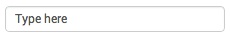
The TextInput view displays an editable text box.
Library path
splunkjs/mvc/textinputview
Simple XML wrapper
Properties
Name | Default value | Description |
| id | | Required. The unique ID for this control. |
| default | | The value to display on startup. |
| disabled | false | Indicates whether to disable the view. |
| initialValue | | The initial value of the input. If defaultis specified, it overrides this value. |
| settings | | The properties of the view. See the methods below to get and set values. |
| type | "text" | The type of text field. To display characters as asterisks (*), set this value to "password". |
| value | | The value of the text field. |
Methods
Name | Description |
| render | Draws the view to the screen. Called only when you create the view manually. |
| settings.get( property ) | Returns the value of property for the current component. |
| settings.set( property, value ) | Sets the value of property to the specified value for the current component. |
| val | Returns the view's value if passed no parameters. Sets the view's value if passed a single parameter. |
Event
Name | Description |
| change | Fired when the text value changes. |
Example
require([
    "splunkjs/mvc",
    "splunkjs/mvc/textinputview",
    "splunkjs/mvc/simplexml/ready!"
], function(mvc, TextInputView) {

    // Instantiate components
    new TextInputView({
        id: "example-textinput",
        value: mvc.tokenSafe("$myTextValue$"),
        default: "type here",
        el: $("#mytextinputview")
    }).render();

});