Mapping data
There are several options for visualizing data that includes geographic information.
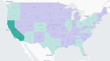
A Choropleth map uses shading to show relative metrics, such as population or election results, for predefined geographic regions. For example, this image shows a map of the United States. States have lighter or darker shades of two different colors. One color represents low values for a particular metric. The darkest shading in this color represents the lowest values. The other color represents high values for the same metric. The darkest shading in this color represents the highest values. Shading fades as the values approach the middle of this range.
You can also create other visualizations with geographic data, such as cluster maps or charts.
Getting started
Use the following topics to learn about creating Choropleth maps and other geographic visualizations.
See also
To learn about geospatial lookups, see Configure geospatial lookups in the Knowledge Manager Manual.
| Using gauges | Generate a choropleth map |
This documentation applies to the following versions of Splunk Cloud Platform™: 9.3.2411, 8.2.2112, 8.2.2201, 8.2.2203, 8.2.2202, 9.0.2205, 9.0.2208, 9.0.2209, 9.0.2303, 9.0.2305, 9.1.2308, 9.1.2312, 9.2.2403, 9.2.2406, 9.3.2408 (latest FedRAMP release)

 Download manual
Feedback submitted, thanks!