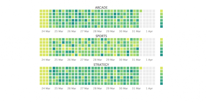
Calendar heat map components
Learn how to interpret a calendar heat map.
Visual elements
Calendar
The query time range determines calendar format. Depending on the time range selected, the calendar groups cells into hours, days, months, or years.
Rows
Each resource in the metric category that you are tracking appears in a separate row.
Cells
Each cell represents data for one increment of the specified time span. For example, if the query uses a one hour span, each cell represents one hour of data.
Cell color indicates relative metric density. The heat map color scale can be applied independently to each row or to all cells uniformly.
Interactive elements
Drilldown
Click on a calendar cell to open a search for events in the time range that the cell represents.
Tooltips
Hover over a cell to display a tooltip with data details for the cell.
| Create a calendar heat map query | Customize a calendar heat map |
This documentation applies to the following versions of Calendar Heat Map (EOL): 1.0.0, 1.1.0, 1.2.0, 1.3.0, 1.4.0, 1.5.0, 1.5.1

 Download manual
Feedback submitted, thanks!