ITSI module visualizations
Module visualizations let you monitor the overall performance of your deployment, and easily share issues with other analysts on your team.
There are multiple visualization tools used for monitoring ITSI modules:
- Service analyzers can use module KPIs to give a top view to managers.
- Glass tables can quickly show data from one or more of your services, as well as share incidents with other users.
- Deep dives help you view KPI search results over time, zoom-in on KPI metrics and log events, and visually correlate root cause.
Entity Details
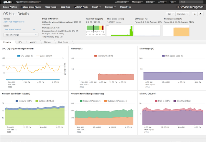
ITSI modules display information about an entity when you drill down from a deep dive lane in ITSI. The Entity Details page provides key metrics on entities that comprise a service.
In the context of ITSI modules, a drilldown is an action that lets you view entity inventory information (for example, vendornumber of CPU cores, total amount of RAM, OS version, etc.), entity performance metrics (for example, failover status, CPU usage, memory used, and disk space usage, etc.) and other entity-related events. You can access this information by "drilling down" from the Service Analyzer page to the Deep Dive page.
Access Entity Details page
ITSI provides a visualizations page that displays information about an entity when you drill down from a deep dive lane in ITSI. The Entity Details page provides key metrics on entities that comprise a service. The following example is from the OS Module Host Details page.
Before you can use the Details page:
- Define at least one service and the entities that comprise the service.
- From the Service Analyzer page, click a service or a KPI.
- You must enable lane overlays in the service deep dive page for each KPI.
- In the Deep Dive page, click on a point in any of the lanes. If "No drill down option available" appears, enable overlays for the lane.
- Click <Entity> Details in the pop-up menu that appears.
The Details page appears.
- Review the charts on the page.
- Click the CPU, Memory, Storage, or Entity events tabs to see charts for each of these categories for the selected host entity.
- To see metrics for a different entity, select that entity under the Entity: menu on the left side of the page.
- To change the default time range (24 hours), select the time range picker under the Entity: menu and choose the time range that you want.
- To see the events that produced the plot in a dashboard panel, select a plot in the panel. The Search page loads and displays the events.
Modify 'mini_chart' vizualizations to work with Highcharts
In versions 2.5.0 and above of ITSI, SA-ITSI-CustomModuleViz XML files work with Highcharts. Your deployment's mini_chart will, by default, have only one color and no thresholds.
Before example
      <viz type="SA-ITSI-CustomModuleViz.mini_chart">
        <option name="SA-ITSI-CustomModuleViz.mini_chart.app">DA-ITSI-OS</option>
        <option name="SA-ITSI-CustomModuleViz.mini_chart.id">os-disk-usage</option>
        <option name="SA-ITSI-CustomModuleViz.mini_chart.title">Total Storage Used (%)</option>
        <option name="SA-ITSI-CustomModuleViz.mini_chart.subtitleField">used_space</option>
        <option name="SA-ITSI-CustomModuleViz.mini_chart.chartType">markerGauge</option>
        <option name="SA-ITSI-CustomModuleViz.mini_chart.search">
            <![CDATA[
            | savedsearch DA-ITSI-OS-Context_Chart_Disk_Usage_Search host="$host$"
            ]]>
        </option>
        <option name="SA-ITSI-CustomModuleViz.mini_chart.charting_chart_rangeValues">[0,75,90,100]</option>
        <option name="SA-ITSI-CustomModuleViz.mini_chart.charting_gaugeColors">["0x81CE70","0xFFEB68","0xAC0000"]</option>
        <search>
          <query>|noop | stats count</query>
        </search>
      </viz>
After example
      <viz type="SA-ITSI-CustomModuleViz.mini_chart">
        <option name="SA-ITSI-CustomModuleViz.mini_chart.app">DA-ITSI-OS</option>
        <option name="SA-ITSI-CustomModuleViz.mini_chart.id">os-disk-usage</option>
        <option name="SA-ITSI-CustomModuleViz.mini_chart.title">Total Storage Used (%)</option>
        <option name="SA-ITSI-CustomModuleViz.mini_chart.subtitleField">used_space</option>
        <option name="SA-ITSI-CustomModuleViz.mini_chart.chartType">solidgague</option>
        <search>
		  <query>| savedsearch DA-ITSI-OS-Context_Chart_Disk_Usage_Search host="$host$"</query>
        </search>
      </viz>
Customize your mini_chart visualizations using Highchart
Use the <option name="SA-ITSI-CustomModuleViz.mini_chart.charting_ to customize your mini_chart visualizations to any option that is valid in Highcharts.
- To change your background color, add the
<option name="SA-ITSI-CustomModuleViz.mini_chart.charting_chart_backgroundColor">COLOR</option>line to your XML file. - Change the
COLORcolor to your preferred color. Example:<option name="SA-ITSI-CustomModuleViz.mini_chart.charting_chart_backgroundColor">#FFFFE0</option> - To change your x-axis line color, add the
<option name="SA-ITSI-CustomModuleViz.mini_chart.charting_xAxis_lineColor">COLOR</option> - Change the
COLORto your preferred color. Example:<option name="SA-ITSI-CustomModuleViz.mini_chart.charting_xAxis_lineColor">black</option>
See the below example to view a visualization with a defined background color and x-axis color.
Note: The chart will not render if you add an invalid value to your option line. See the list of visualization options in the Highchart API documentation for more information.
Set color ranges based on data value
Use Highcharts to add colors to your charts, or build a multi-colored chart based on data values.
Add color ranges for solidgauge or gauge charts
- Identify the stops in your chart.
Identify the stops in your chart by assigning a float between 0 and 1 for each tuple in your array. This assigns a relative position in each gradient.
Examples in bold:
<option name="SA-ITSI-CustomModuleViz.mini_chart.charting_yAxis_stops">[["0.2", "green"], ["0.5", "yellow"], ["0.85", "red"]]</option>The above example will set three stops at 20%, 50% and 85% of the range of solidgauge. - Assign a color to each tuple in your array.
Examples in bold:
<option name="SA-ITSI-CustomModuleViz.mini_chart.charting_yAxis_stops">[["0.2", "green"], ["0.5", "yellow"], ["0.85", "red"]]</option> - Review the completed example:
<option name="SA-ITSI-CustomModuleViz.mini_chart.charting_yAxis_stops">[["0.2", "green"], ["0.5", "yellow"], ["0.85", "red"]]</option>
Add color ranges for column, line, or area charts
- Identify the color ranges for your chart. Identify which colors you want to apply to your chart, and in what order.
- Add the following
optionfor color ranges:<option name="SA-ITSI-CustomModuleViz.mini_chart.charting_plotOptions_series_zones">[{"value": "200","color": "red"},{"color": "green"}]</option>. The above value is an array of zones. It will make all the part of the chart up to 200 the color red, while all higher values will be green.
| Install and configure ITSI modules | ITSI module performance and sizing guidelines |
This documentation applies to the following versions of Splunk® IT Service Intelligence: 4.11.0, 4.11.1, 4.11.2, 4.11.3, 4.11.4, 4.11.5, 4.11.6, 4.12.0 Cloud only, 4.12.1 Cloud only, 4.12.2 Cloud only, 4.13.0, 4.13.1, 4.13.2, 4.13.3, 4.14.0 Cloud only, 4.14.1 Cloud only, 4.14.2 Cloud only, 4.15.0, 4.15.1, 4.15.2, 4.15.3, 4.16.0 Cloud only, 4.17.0, 4.17.1, 4.18.0, 4.18.1


 Download manual
Feedback submitted, thanks!