About Analytics in the Analysis Workspace in Splunk App for Infrastructure
Configure analytic functions and operations in the Analysis panel in the Analysis Workspace. These options help you gain insight from your charts.
Aggregations
Aggregations are groups of data points within the same approximate time frame. Charts in the Analysis Workspace contain time series based on aggregated data. Select one or more aggregations in the Analysis panel to generate a time series on the chart.
The following aggregations are available:
| Aggregation | Use | Description |
|---|---|---|
| Average (Avg) | Numeric data | Aggregated averages of the values in your data. Default aggregation for numeric data. |
| Maximum (Max) | Numeric data | Aggregated maximum values in your data. |
| Minimum (Min) | Numeric data | Aggregated minimum values in your data. |
| Standard deviation (Std dev) | Numeric data | Standard deviation of each time bucket in your data. |
| Sum | Numeric data | Aggregated sum of values in your data. |
| Percentiles | Numeric data | Aggregated percentile values in your data. View a maximum of five percentiles. Default percentiles are 90, 75, 50, 25, and 15. To remove a percentile, click the X icon next to the percentile you want to remove. To configure additional percentiles, enter a number between 1 and 100 in the box under the percentiles option. |
To configure aggregations:
- In the Main panel, select the chart you want to modify.
- In the Analysis panel, select the aggregations to apply.
Examples
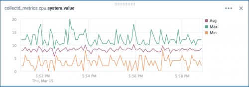
The following chart shows the Average, Maximum, and Minimum aggregations of system.cpu values for collectd metrics.
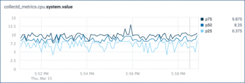
The following chart shows the 25th, 50th, and 75th Percentile aggregations of system.cpu values for collectd metrics.
Time comparisons
Time comparisons overlay a previous time period on a chart to investigate whether a time series has changed significantly between two related time ranges.
Time comparisons are not available for datasets or when splitting charts by dimension.
Add a time comparison to a chart
Add a time comparison to a chart to investigate changes in your data over time.
- From the Main panel of the Analysis Workspace, select a chart to add the time overlay to.
- In the Analysis panel of the Analysis Workspace, click the Compare to list under Time Comparison.
- Select from the list of preset time overlays, or select custom.
- (Optional) If you selected custom, enter the time comparison you want to use.
Time comparisons appear as dotted lines on the chart.
Remove a time comparison from a chart
Remove a time comparison from a chart to show data from only the current time range.
- In the Analysis panel of the Analysis Workspace, click the Compare to list.
- Select None.
Examples
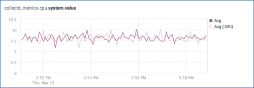
The following chart compares current average system.cpu values to the values from 24 hours before.
Splitting and stacking
Split a chart by a dimension to view a separate time series for each dimension value. Splitting a chart by a dimension shows the values with the highest or lowest values in data for the selected time range.
Stack the series to show the sum of dimension values on the chart. In a stacked series, each series appears as a colored area of the stacked chart.
Splitting by dimension is not supported for charts with multiple aggregations or time comparisons.
Split a chart by dimension
Split a chart by a dimension to show a separate time series for each dimension value.
- From the Main panel of the Analysis Workspace, select the chart you want to split by dimension.
- In the Analysis panel, click the Split by list.
- Select the dimension that you want to split.
- For Display, select either the Highest or Lowest spikes in data.
- Select the number of values to display.
- (Optional) Select Stack Series.
The chart shows a new time series for each value of the split dimension.
Remove a dimension split
Remove a dimension split to view data for all dimensions in a single time series.
- In the Analysis panel of the Analysis Workspace, click the Split by list.
- Select None.
Split all charts in the workspace
Split all charts by a single dimension to view the top five values of that dimension for each chart in the workspace. Splitting all charts by a dimension overrides any other splits you have in place. New charts that you add to the workspace will automatically apply the split.
Split all charts by a dimension:
- Click the Split all by drop-down list in the global actions bar of the Analysis Workspace.
- Select a dimension from the list.
All charts appear split by your selected dimension. If a chart does not apply the split, it is because that dimension is not present in your data.
Splitting all charts only applies the split once. If you split by a different dimension for one or more charts in the workspace, this overrides the global split.
Remove dimension splitting from all charts:
- Click the Split all by drop-down list in the global actions bar of the Analysis Workspace.
- Select None.
Examples
The following chart shows the apache.response_time metric split by the top five pages.
The following chart shows the apache.active_connections metric split by the top three extracted hosts. The series is stacked to show the total number of active connections.
Filters
Filter data to view specific dimension values on the chart. If a chart is already split by a dimension, use filters to add or remove time series for selected dimension values.
To filter for a dimension with a high number of values, use wildcard searches from within the Filter panel. For more information about wildcard searches in the Splunk platform, see Wildcards in the Splunk Enterprise Search Manual.
Filter by dimension value from the Analysis panel
Filter chart data to view a specific subset of dimension values.
- From the Main panel of the Analysis Workspace, select the chart you want to filter by dimension value.
- In the Analysis panel under Filters, click the name of the dimension you want to filter by.
- Select whether to Include or Exclude the specified dimension values.
- (Optional) For dimensions with a high number of values, type part or all of the dimension value name into the search bar on the Filter panel.
- From the list of dimension value names, select the dimension values you want to filter on the chart.
The chart shows data for the dimension values that you selected.
Filter by dimension value from the chart legend
If a chart is already split by a dimension, filter by dimension value using the chart legend.
Prerequisites
Split the chart by a dimension. See Splitting and stacking.
Steps
- From the Main panel of the Analysis Workspace, select the chart you want to filter by dimension value.
- In the chart legend, click the the name of the dimension value that you want to filter.
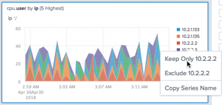
- From the options that appear, click either Keep Only or Exclude.
The chart shows data for the dimension values that you selected.
Example
Filter a group by entity and dimension value from the chart legend
Filter group chart data to view a specific entity based on dimension values.
Prerequisites
Split the group chart by a dimension. See Splitting and stacking.
Steps
- From the Main panel of a Group Analysis Workspace, select the chart you want to filter to view an entity based on a dimension value.
- Select Split all by… and select the dimension you want to filter the chart by. For example, host.
- In the chart, click the entity from the chart legend to display the action menu.
- Select the action to Investigate Entity to open a separate analysis workspace for that entity, or select to Keep Only, Exclude, or Copy Series Name for the chart you are viewing.
Example
Clear all dimension value filters
Clear all dimension value filters to view data from all values of a dimension on the chart.
- From the Main panel of the Analysis Workspace, select the chart you want to clear filters for.
- In the Analysis panel under Filters, click the name of the dimension you want to clear filters for.
- In the top-right corner of the list of dimension values, click the
 icon.
icon.
The chart shows data for all values of that dimension.
Examples
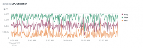
The following chart shows the average, maximum, and minimum aggregations for the aws.ec2.CPUUtilization metric filtered by IP address.
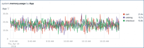
The following chart shows the system.memory.usage metric split by App and filtered to show time series for the cart, catalog, and checkout dimension values.
| Using the Entity Overview in Splunk App for Infrastructure | Using Groups in Splunk App for Infrastructure |
This documentation applies to the following versions of Splunk® App for Infrastructure (EOL): 1.2.0, 1.2.1, 1.2.2, 1.2.3



 Download manual
Feedback submitted, thanks!