Custom visualizations
The Machine Learning Toolkit and Showcase app includes several reusable custom visualizations that you can use in your own dashboards. Each visualization expects data in a certain format with certain fields, indicated by the search fragment in the descriptions below.
To apply a custom visualization to your data:
1. In Splunk Enterprise, run a search from the Search page in the Machine Learning Toolkit and Showcase app or the default Search & Reporting app.
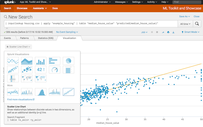
2. Click the Visualization tab, then click the menu at the top left to display available visualizations.
3. Select a visualization.
You can use these custom visualizations on any Splunk Enterprise instance on which the Machine Learning Toolkit and Showcase app is installed.
Outliers Chart (OutliersViz)
Shows the acceptable range for a value and highlights the points that are outside this range.
For an example, see the Outliers chart in the Detect Numeric Outliers assistant.
search_fragment = | table _time, outlier_variable, lowerBound, upperBound
Example: ... | table _time, quantity, lowerBound, upperBound, isOutlier ...
Forecast Chart (ForecastViz)
Shows the forecast value for time series data. For an example, see the Forecast chart in the Forecast Time Series assistant.
search_fragment = | timechart count [by comparison_category] | `modvizpredict(<field>, <algorithm>, <futuretimespan>, <holdback>, <confidenceInterval>)`
Example: ... | `modvizpredict("bits_transferred", "LLP5", "224", "112", "95")` ...
Scatter Line Chart (ScatterLineViz)
Shows relationships between discrete values in two dimensions, as well as an additional identity (x=y) line. For an example, see the Actual vs. Predicted Scatter Plot chart in the Predict Numeric Fields assistant.
search_fragment = | table <xAxis> <yAxis>
Example: ... | table "median_house_value" "predicted(median_house_value)" ...
Histogram Chart (HistogramViz)
Shows continuous data bucketed by the bucket/bin command. For an example, see the Residuals Histogram chart in the Predict Numeric Fields assistant.
search_fragment = | bin <field> bins=<number>
Example: ... | bin residual bins=100 ...
Downsampled Line Chart (LinesViz)
Shows values and trends over time, using downsampling to show large numbers of points. For examples, see the Actual vs. Predicted Overlay and Residuals charts in the Predict Numeric Fields assistant.
search_fragment = | table <xAxis> <yAxis1> <yAxis2> ...
Example: ... | table _time, "median_house_value", "predicted(median_house_value)" ...
| Algorithms | Predict Numeric Fields |
This documentation applies to the following versions of Splunk® Machine Learning Toolkit: 1.0.0, 1.1.0, 1.2.0, 1.3.0


 Download manual
Feedback submitted, thanks!