Forecast Time Series
The Forecast Time Series assistant predicts the next value in a sequence of time series data. The result includes both the predicted value and a measure of the uncertainty of that prediction. Forecasting is one type of prediction. Forecasting refers to the use of past time series data to make predictions. The visualization below shows a time series and the split between the training and testing data.
Algorithms
The Forecast Time Series assistant can use the following algorithms:
- State-space method using Kalman filter
- AutoRegressive Integrated Moving Average (ARIMA)
Workflow
Follow the steps below to forecast a time series.
- Run a search.
- From the Algorithms menu, select an algorithm.
- From the Field to Forecast list, select the field you want to forecast.
- Select the parameters.
- If you chose the Kalman filter algorithm in step 2, select a forecasting method. These methods consider subsets of features such as local level (an average of recent values), trend (a slope of line that fits through recent values), and seasonality (repeating patterns).
- If you chose the ARIMA algorithm in step 2, specify the values for AR (autoregressive) - p, I (integrated) - d, MA (moving average) - q parameters.
For example, AR(1) means you would forecast future values by looking at 1 past value. I(1) means it took 1 difference, where each data point was subtracted from the one that follows it, to make the time series stationary. MA(1) means you would forecast future values using 1 previous prediction error.
- Specify the future timespan, which indicates how far beyond the data you want to forecast.
- Specify the number of values to withhold, which indicates how many search results to use for validating the quality of the forecast.
- Select the confidence interval, which is the percentage of the future data you expect to fall inside of the confidence envelope.
- For the Kalman algorithm, select the period, which indicates the period of any known repeating patterns in the data to assist the algorithm.
- Click Forecast.
If you are not sure which algorithm to choose, start with the default algorithm, the Kalman filter.
The Field to Forecast list is populated with fields from the search.
The size of the confidence interval is used to gauge how confident the algorithm is in its forecast.
The larger the withholding, the less is available to train your model.
For example, if your data includes monthly sales data that follows annual patterns, specify 12 for the period.
Interpret and validate
After you forecast a time series, review your results in the following tables and visualizations.
| Result | Definition |
|---|---|
| Raw Data Preview | This displays the raw data from the search. |
| Forecast | This graphs displays the actual value as a solid line and the predicted value as a dotted line, surrounded by a confidence envelope.
Values that fall outside the confidence envelope are outliers. A vertical line indicates where training data stops and test data begins. When the real data ends, forecasted values are displayed in shades of green. The larger the envelope, the less confidence we have about forecasts around that time. The size of the envelope is directly related to the specified confidence interval percentage. |
| R2 Statistic | This statistic explains how well the model explains the variability of the result. 100% (a value of 1) means the model fits perfectly. The closer the value is to 1 (100%), the better the result. |
| Root Mean Squared Error | This statistic explains the variability of the result, essentially the standard deviation of the residual. The formula takes the difference between actual and predicted values, squares this value, takes an average, and then takes a square root. The result is an absolute measure of fit, the smaller the number the better the fit. These values only apply to one dataset and are not comparable to values outside of it. |
| Prediction Outliers | This result shows the total number of outliers detected. |
Predicting with the ARIMA algorithm
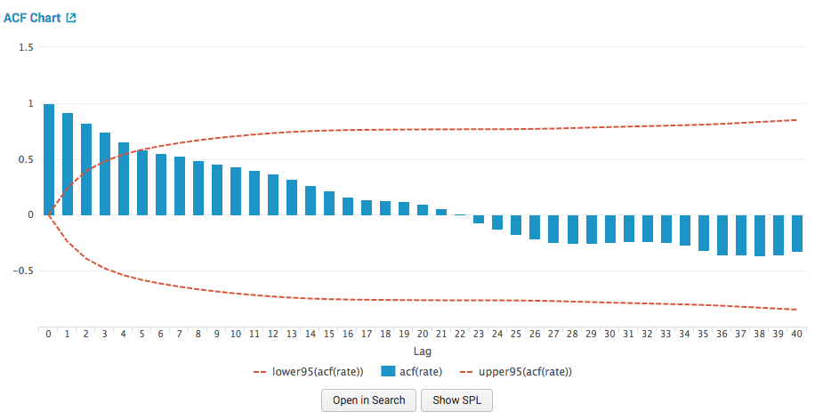
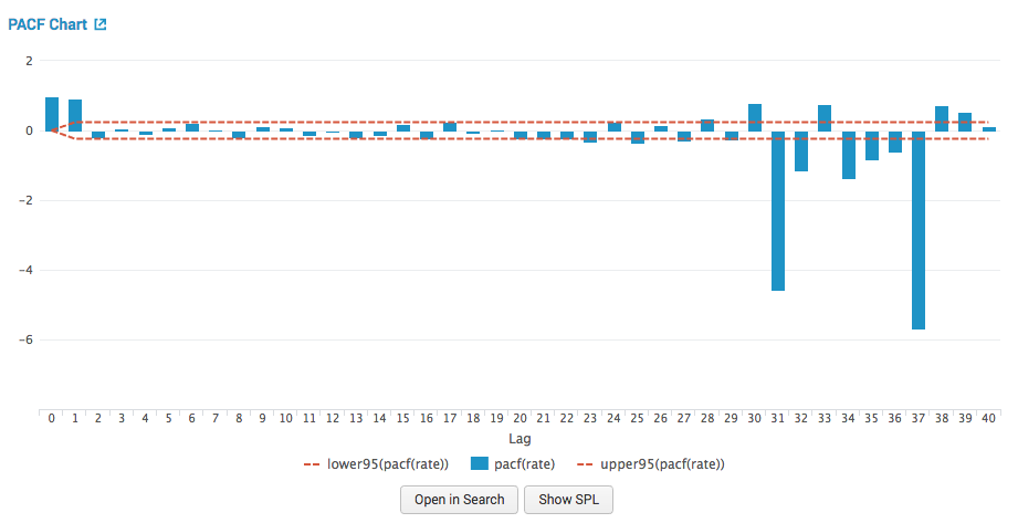
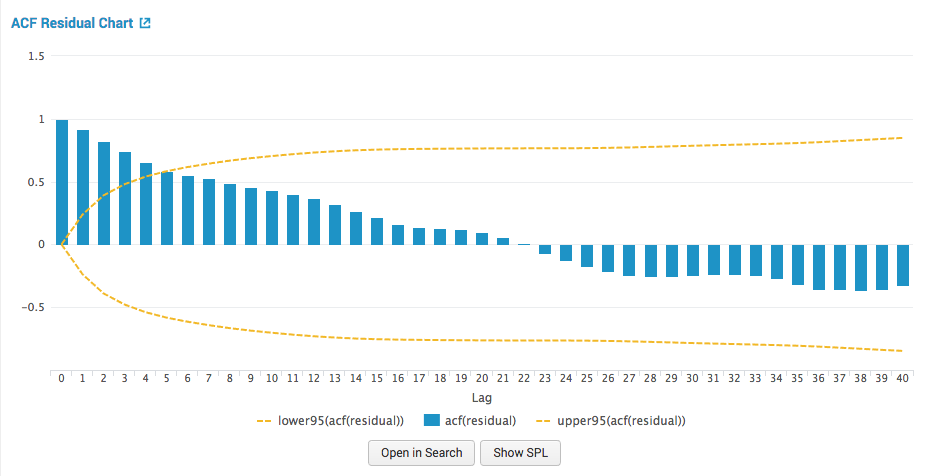
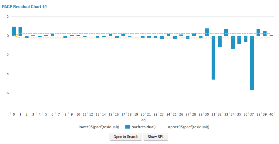
When predicting using the ARIMA algorithm, additional autocorrelation panels are present. Autocorrelation charts can be used to estimate and identify the three main parameters for the model:
- the autoregressive component
p - the integrated component or order of differencing
d - the moving average component
q
ACF: Autocorrelation function chart
The autocorrelation function chart shows the predicted field's autocorrelations at various lags, surrounded by confidence interval lines. For example, the column at lag 1 shows the amount of correlation between the time series and a lagged version of itself.

PACF: Partial autocorrelation function chart
The partial autocorrelation function chart shows the predicted field's autocorrelations at various lags while controlling for the amount of correlation contributed by earlier lag points. This chart is also surrounded by confidence interval lines. For example, the column at lag 2 shows the amount of correlation between the time series and a lagged version of itself, while removing the correlation contributed by the lag 1 data points.

ACF Residual: Autocorrelation function residual chart
The autocorrelation function residual chart shows prediction errors. The errors are the difference between the series and the predictions. The ACF of the residuals should be close to zero. If the errors are highly correlated, the model might be poorly parameterized, or the series might not be stationary.

PACF Residual: partial autocorrelation function residual chart
The partial autocorrelation function chart shows prediction errors. The errors are the difference between the series and the predictions. The PACF of the residuals should be close to zero. If the errors are highly correlated, the model might be poorly parameterized or the series might not be stationary.

Refine the forecast
After you create a forecast, you can select a different algorithm to see whether a different choice yields better results, but the quality of the forecast mostly depends on how predictable the data is.
Deploy the forecast
- Next to Forecast, click Open in Search to open a new search tab with the search query.
- Next to Open in Search, click the Show SPL to see the search query that was used to calculate the forecast.
- Click Schedule Alert to create an alert for when a prediction meets criteria you set.
- After you save the alert, you can access it from the Scheduled Jobs > Alerts menu.
- Click any title to go to a new Search tab, populated with the search query used for the visualization.
You can use this same query on a different data set.
| Detect Categorical Outliers | Cluster Numeric Events |
This documentation applies to the following versions of Splunk® Machine Learning Toolkit: 2.4.0, 3.0.0, 3.1.0

 Download manual
Feedback submitted, thanks!