Using Sankey diagrams
| This feature is deprecated. |
|---|
| The Sankey diagram is deprecated as of version 1.5.0. It will be archived and removed from Splunkbase on December 21, 2024. After removal, visualizations previously installed in environments will remain available but unsupported.
As an alternative, you can create Sankey diagrams with Dashboard Studio. For more details, see Sankey diagrams in the Dashboard Studio manual. |
Learn how to visualize data in a Sankey diagram.
What Sankey diagrams visualize
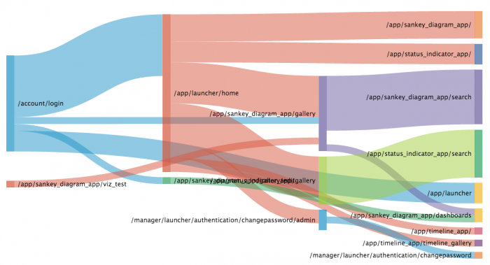
Sankey diagrams show metric flows and category relationships. You can use a Sankey diagram to visualize relationship density and trends.
A Sankey diagram shows category nodes on vertical axes. Fluid lines show links between source and target categories. Link width indicates relationship strength between a source and target.
Use cases
Use a Sankey diagram to visualize activity patterns like the following.
- User activity flows on a website
- Purchasing trends
- Data or financial transfers
- Energy use
Data for Sankey diagrams
To build a Sankey diagram, use data that includes source and target category fields and a metric that you are tracking between them.
| Sankey diagram installation |
This documentation applies to the following versions of Sankey Diagram (EOL): 1.0.0, 1.1.0, 1.2.0, 1.3.0, 1.5.0, 1.6.0

 Download manual
Feedback submitted, thanks!