Add sparklines to search results
If you are working with stats and chart searches, you can increase their usefulness and overall information density by adding sparklines to their result tables. Sparklines are inline charts that appear within table cells in search results, and are designed to display time-based trends associated with the primary key of each row.
For example, say you have this search, set to run over events from the past 15 minutes:
index=_internal | chart count by sourcetype
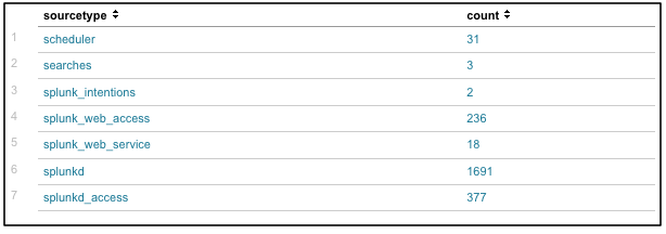
This search returns a two-column results table that shows event counts for the source types that have been indexed to _internal in the last 15 minutes. The first column lists each sourcetype found in the past hour's set of _internal index events; this is the primary key for the table. The second column, count, displays the event counts for each listed source type:
You can add sparklines to the results of this search by adding the sparkline function to the search itself:
index=_internal | chart sparkline count by sourcetype
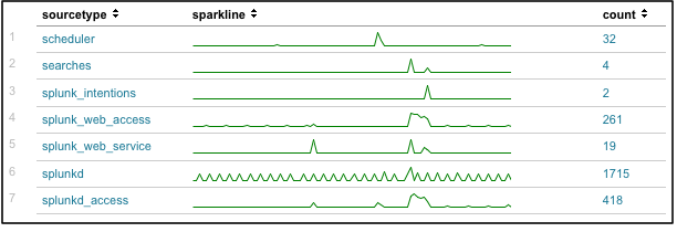
This results in a table that is almost the same as the preceding one, except that now, for each row you have a sparkline chart that shows the event count trend for each listed source type over the past 15 minutes.
Now you can easily see patterns in your data that may have been invisible before. Some search activity apparently caused a bump in most index=_internal source types about three quarters into the 15 minute span. And splunkd has what almost looks like a regular heartbeat running over the entire span of time.
Note: Each sparkline in a table displays information in relation to the other events represented in that sparkline, but not in relation to the other sparklines. A peak in one sparkline does not necessarily have the same value as a peak in another sparkline.
Using sparklines with the stats and chart commands
You always use the sparklines feature in conjunction with chart and stats searches, because it is a function of those two search commands. It is not a command by itself. The functionality of sparklines is the same for both search commands.
Note: Sparklines are not available as a dashboard chart visualization by themselves, but you can set up a dashboard panel with a table visualization that displays sparklines. For more information, see the "Visualization reference" topic in the Splunk Data Visualizations Manual.
For more information about the chart and stats commands, including details on the syntax around the sparkline function, see "chart" and "stats" in the Search Reference.
Example: Stats, sparklines, and earthquake data
Here are some examples of stats searches that use sparklines to provide additional information about earthquake data.
| This example uses earthquake data downloaded from the USGS Earthquakes website. You can download a current CSV file from the USGS Earthquake Feeds and add it to your Splunk deployment as an input, but the field names and format will be slightly different from the example shown here. |
Let's say you want to use the USGS Earthquakes data to show the regions that had the most earthquakes over the past week, with a column that shows the average quake magnitude for each region. You could use the following search:
source=usgs | stats sparkline count, avg(Magnitude) by Region | sort count
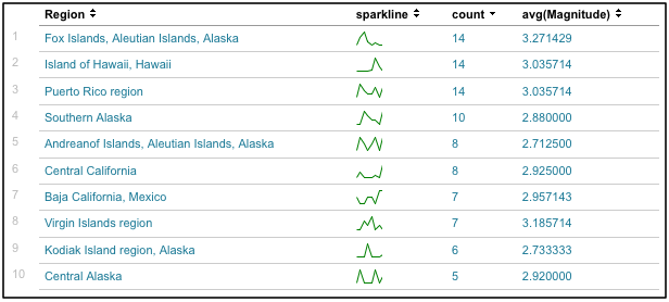
This search returns the following table, with sparklines that illustrate the quake count over the course of the week for each of the top earthquake regions (in this case, Region is the table's primary key):
Right away you can see differences in quake distribution between the top 10 quake regions. Some areas, like Southern Alaska and the Virgin Islands, had a pretty steady series of quakes, while the Fox Islands and Vanuatu experienced their seismic activity all at one point.
You can easily get the minimum and maximum count for a particular region by mousing over the sparkline; in this example you can see that in Southern Alaska, the minimum count of quakes experienced in a single day during the 7-day period was 1, while the maximum count per day was 6.
But what if you want your sparkline to represent not only the earthquake count, but also the relative average magnitude of the quakes affecting each region? In other words, how can you make the sparkline line chart represent average quake magnitude for each "time bucket" (segment) of the chart?
Try a search like this:
source=usgs | stats sparkline(avg(Magnitude),6h) as magnitude_trend, count, avg(Magnitude) by Region | sort count
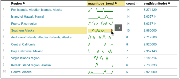
This search produces a sparkline for each region that shows the average quake magnitude for the quake events that fall into each segment of the sparkline..
But it does a bit more than that. It also asks that the sparkline divide itself up into smaller chunks of time. The preceding table had a sparkline that was divided up by day, so each data point in the sparkline represented an event count for a full 24 hour period. This is why those sparklines were so short.
The addition of the 6h to the search language overrides this default and displays sparklines that are broken up into discrete six-hour chunks, which makes it easier to see the distribution of events along the sparkline for the chosen time range.
The search also renames the sparkline column as "magnitude_trend" to make it easier to understand.
Now you can see that the quakes off the Andreanof Islands were all of roughly similar magnitude, while the quakes in Puerto Rico varied in intensity. And it's now easier to see that central California's relatively mild quakes hit at the start and end of the 7-day period. You can also discern that the quakes in the Virgin Islands didn't occur with the steady frequency that the previous search suggested, while the quakes off Southern Alaska were slightly more regular than previously indicated.
| Use stats with eval expressions and functions | About advanced statistics |
This documentation applies to the following versions of Splunk® Enterprise: 7.0.0, 7.0.1, 7.0.2, 7.0.3, 7.0.4, 7.0.5, 7.0.6, 7.0.7, 7.0.8, 7.0.9, 7.0.10, 7.0.11, 7.0.13


 Download manual
Feedback submitted, thanks!