Create a report from a custom chart
In this example, you create a report that charts which products were purchased over a period of time.
This example uses the timechart command and chart options to create and customize a chart.
Prerequisite
This example requires the productName field from the Enabling field lookups section. You must complete all of those steps before continuing with this section.
Steps
- Start a new search.
- Run the following search.
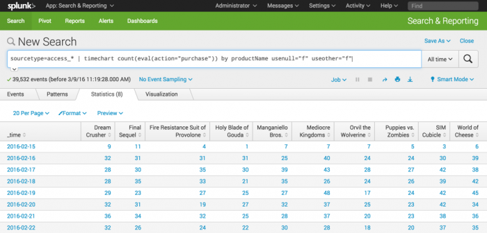
sourcetype=access_* | timechart count(eval(action="purchase")) by productName usenull="f" useother="f"This search uses the
count()function to count the number of events that have the fieldaction=purchase.The search also uses the
usenullanduseotherarguments to ensure that thetimechartcommand counts events that have a value forproductName.The following table appears on the Statistics tab.
- Click the Visualization tab.
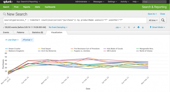
- In the Format drop-down list, format the X-Axis, Y-Axis, and Legend to produce the following Line chart.
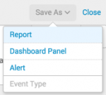
- Click Save As and select Report.

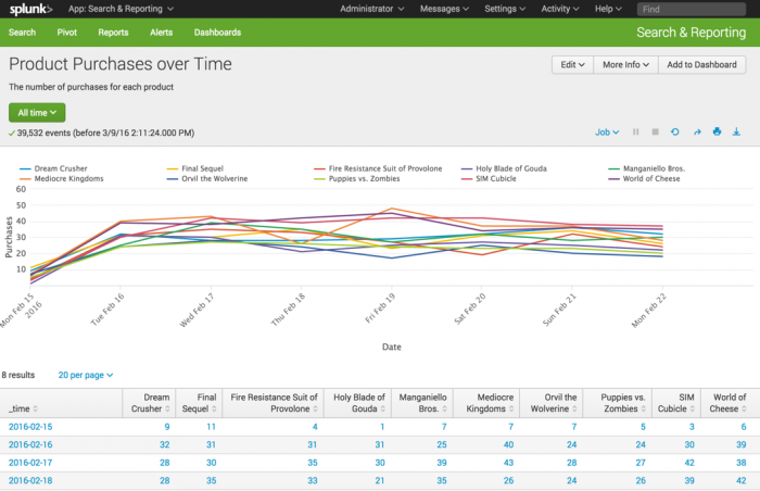
- In the Save Report As dialog box, for Title type
Product Purchases over Time. - For Description, type
The number of purchases for each product. - For Content, select Line Chart and Statistics Table.
- For Time Range Picker, keep the default setting Yes.
- In the Save Report As dialog box, for Title type
- Click Save.
- In the confirmation dialog box, click View to see the report.


This table lists the changes made to the chart.
| Chart changes | Setting or value |
|---|---|
| Chart type | Line |
| X-Axis CustomTitle | Date |
| X-Axis Labels | -45 degree angle |
| Y-Axis Custom Title | Purchases |
| Y-Axis Interval | 10 |
| Legend Position | Top |
Next step
Create a report from a sparkline chart
See also
timechart command in the Search Reference
Chart overview in Dashboards and Visualizations
About reports in the Reporting Manual
| Create an overlay chart and explore visualization options | Create a report from a sparkline chart |
This documentation applies to the following versions of Splunk® Enterprise: 7.0.0, 7.0.1, 7.0.2, 7.0.3, 7.0.4, 7.0.5, 7.0.6, 7.0.7, 7.0.8, 7.0.9, 7.0.10, 7.0.11, 7.0.13

 Download manual
Feedback submitted, thanks!