chart
Description
The chart command is a transforming command that returns your results in a table format. The results can then be used to display the data as a chart, such as a column, line, area, or pie chart. See the Visualization Reference in the Dashboards and Visualizations manual.
You must specify a statistical function when you use the chart command. See Statistical and charting functions.
Syntax
- chart [<chart-options>] [agg=<stats-agg-term>]
- ( <stats-agg-term> | <sparkline-agg-term> | "("<eval-expression>")" )...
- [ BY <row-split> <column-split> ] | [ OVER <row-split> ] [BY <column-split>] ]
Required arguments
You must include one of the following arguments when you use the chart command.
- stats-agg-term
- Syntax: <stats-func> ( <evaled-field> | <wc-field> ) [AS <wc-field>]
- Description: A statistical aggregation function. See Stats function options. The function can be applied to an eval expression, or to a field or set of fields. Use the AS clause to place the result into a new field with a name that you specify. You can use wild card characters in field names.
- sparkline-agg-term
- Syntax: <sparkline-agg> [AS <wc-field>]
- Description: A sparkline aggregation function. Use the AS clause to place the result into a new field with a name that you specify. You can use wild card characters in field names. See Sparkline options.
- eval-expression
- Syntax: <eval-math-exp> | <eval-concat-exp> | <eval-compare-exp> | <eval-bool-exp> | <eval-function-call>
- Description: A combination of literals, fields, operators, and functions that represent the value of your destination field. For more information, see the Evaluation functions. See Usage.
For these evaluations to work, your values need to be valid for the type of operation. For example, with the exception of addition, arithmetic operations might not produce valid results if the values are not numerical. If both operands are strings, they can be concatenated. When concatenating values with a period, the search treats both values as strings regardless of their actual type.
Optional arguments
- agg
- Syntax: agg=<stats-agg-term>
- Description: Specify an aggregator or function. For a list of stats functions with descriptions and examples, see Statistical and charting functions.
- chart-options
- Syntax: cont | format | limit | sep
- Description: Options that you can specify to refine the result. See the Chart options section in this topic.
- Default:
- column-split
- Syntax: <field> [<tc-options>]... [<where-clause>]
- Description: Specifies a field to use as the columns in the result table. By default, when the result are visualized, the columns become the data series in the chart. If the field is numerical, default discretization is applied as defined with the
tc-optionsargument. See the tc options and the where clause sections in this topic. - Default: The number of columns included is limited to 10 by default. You can change the number of columns by including a <where-clause>.
- Note: When a column-split field is included, the output is a table where each column represents a distinct value of the split-by field. This is in contrast with the
by-clause, where each row represents a single unique combination of values of the group-by fields. For additional information see the Usage section in this topic.
- row-split
- Syntax: <field> [<bin-options>]...
- Description: The field that you specify becomes the first column in the results table. The field values become the row labels in the results table. In a chart, the field name is used to label the X-axis. The field values become the X-axis values. See the Bin options section in this topic.
- Default: None.
Chart options
- cont
- Syntax: cont=<bool>
- Description: Specifies if the bins are continuous. If cont=false, replots the x-axis so that a noncontinuous sequence of x-value bins show up adjacently in the output. If cont=true, bins that have no values will display with a count of 0 or null values.
- Default: true
- format
- Syntax: format=<string>
- Description: Used to construct output field names when multiple data series are used in conjunction with a split-by-field.
formattakes precedence oversepand allows you to specify a parameterized expression with the stats aggregator and function ($AGG$) and the value of the split-by-field ($VAL$).
- limit
- Syntax: limit=<int>
- Description: Only valid when a column-split is specified. Use the
limitoption to specify the number of results that should appear in the output. When you setlimit=Nthe top N values are retained, based on the sum of each series. Iflimit=0, all results are returned.
- sep
- Syntax: sep=<string>
- Description: Used to construct output field names when multiple data series are used in conjunctions with a split-by field. This is equivalent to setting
formatto$AGG$<sep>$VAL$.
Stats function options
- stats-func
- Syntax: The syntax depends on the function you use. Refer to the table below.
- Description: Statistical and charting functions that you can use with the
chartcommand. Each time you invoke thechartcommand, you can use one or more functions. However, you can only use oneBYclause. See Usage.
- The following table lists the supported functions by type of function. Use the links in the table to see descriptions and examples for each function. For an overview about using functions with commands, see Statistical and charting functions.
Type of function Supported functions and syntax Aggregate functions avg()
count()
distinct_count()
estdc()
estdc_error()
exactperc<int>()
max()
median()
min()
mode()
perc<int>()
range()
stdev()
stdevp()
sum()
sumsq()
upperperc<int>()
var()
varp()
Event order functions earliest()
first()
last()
latest()
Multivalue stats and chart functions list(X)
values(X)
Sparkline options
Sparklines are inline charts that appear within table cells in search results and display time-based trends associated with the primary key of each row.
- sparkline-agg
- Syntax: sparkline (count(<wc-field>), <span-length>) | sparkline (<sparkline-func>(<wc-field>), <span-length>)
- Description: A sparkline specifier, which takes the first argument of an aggregation function on a field and an optional timespan specifier. If no timespan specifier is used, an appropriate timespan is chosen based on the time range of the search. If the sparkline is not scoped to a field, only the count aggregate function is permitted. You can use wild card characters in field names.
- span-length
- See the Span options section in this topic.
- sparkline-func
- Syntax: c() | count() | dc() | mean() | avg() | stdev() | stdevp() | var() | varp() | sum() | sumsq() | min() | max() | range()
- Description: Aggregation function to use to generate sparkline values. Each sparkline value is produced by applying this aggregation to the events that fall into each particular time bin.
For more information see Add sparklines to your search results in the Search Manual.
Bin options
- Syntax: bins | span | <start-end>
- Description: Discretization options.
- Default:
bins=300
- bins
- Syntax: bins=<int>
- Description: Sets the maximum number of bins to discretize into. For example, if bin=300, the search finds the smallest bin size that results in no more than 300 distinct bins.
- Default: 300
- span
- Syntax: span=<log-span> | span=<span-length>
- Description: Sets the size of each bin, using a span length based on time or log-based span. See the Span options section in this topic.
- <start-end>
- Syntax: end=<num> | start=<num>
- Description: Sets the minimum and maximum extents for numerical bins. Data outside of the [start, end] range is discarded.
Span options
- <log-span>
- Syntax: [<num>]log[<num>]
- Description: Sets to a logarithm-based span. The first number is a coefficient. The second number is the base. If the first number is supplied, it must be a real number >= 1.0 and < base. Base, if supplied, must be real number > 1.0 (strictly greater than 1).
- span-length
- Syntax: <span>[<timescale>]
- Description: A span length based on time.
- <span>
- Syntax: <int>
- Description: The span of each bin. If using a timescale, this is used as a time range. If not, this is an absolute bucket "length."
- <timescale>
- Syntax: <sec> | <min> | <hr> | <day> | <month> | <subseconds>
- Description: Time scale units.
| Time scale | Syntax | Description |
|---|---|---|
| <sec> | s | sec | secs | second | seconds | Time scale in seconds. |
| <min> | m | min | mins | minute | minutes | Time scale in minutes. |
| <hr> | h | hr | hrs | hour | hours | Time scale in hours. |
| <day> | d | day | days | Time scale in days. |
| <month> | mon | month | months | Time scale in months. |
| <subseconds> | us | ms | cs | ds | Time scale in microseconds (us), milliseconds (ms), centiseconds (cs), or deciseconds (ds) |
tc options
The tc-options is part of the <column-split> argument.
- tc-options
- Syntax: <bin-options> | usenull=<bool> | useother=<bool> | nullstr=<string> | otherstr=<string>
- Description: Options for controlling the behavior of splitting by a field.
- bin-options
- See the Bin options section in this topic.
- nullstr
- Syntax: nullstr=<string>
- Description: If usenull is true, this series is labeled by the value of the nullstr option, and defaults to NULL.
- otherstr
- String: otherstr=<string>
- Description: If useother is true, this series is labeled by the value of the otherstr option, and defaults to OTHER.
- usenull
- Syntax: usenull=<bool>
- Description: Controls whether or not a series is created for events that do not contain the split-by field.
- useother
- Syntax: useother=<bool>
- Description: Specifies if a series should be added for data series not included in the graph because they did not meet the criteria of the <where-clause>.
where clause
The <where-clause> is part of the <column-split> argument.
- where clause
- Syntax: <single-agg> <where-comp>
- Description: Specifies the criteria for including particular data series when a field is given in the
tc-by-clause. The most common use of this option is to select for spikes rather than overall mass of distribution in series selection. The default value finds the top ten series by area under the curve. Alternately one could replace sum with max to find the series with the ten highest spikes. This has no relation to the where command.
- single-agg
- Syntax: count | <stats-func>(<field>)
- Description: A single aggregation applied to a single field, including an evaluated field. No wildcards are allowed. The field must be specified, except when using the
countaggregate function, which applies to events as a whole.
- <stats-func>
- See the Statistical functions section in this topic.
- <where-comp>
- Syntax: <wherein-comp> | <wherethresh-comp>
- Description: The criteria for the <where-clause>.
- <wherein-comp>
- Syntax: (in | notin) (top | bottom)<int>
- Description: A grouping criteria for the <where-clause>. The aggregated series value be in or not in some top or bottom grouping.
- <wherethresh-comp>
- Syntax: ( < | > ) <num>
- Description: A threshold for the <where-clause>. The aggregated series value must be greater than or less than the specified numeric threshold.
Usage
Evaluation expressions
You can use the chart command with an eval expression. Unless you specify a split-by clause, the eval expression must be renamed.
Functions and memory usage
Some functions are inherently more expensive, from a memory standpoint, than other functions. For example, the distinct_count function requires far more memory than the count function. The values and list functions also can consume a lot of memory.
If you are using the distinct_count function without a split-by field or with a low-cardinality split-by by field, consider replacing the distinct_count function with the the estdc function (estimated distinct count). The estdc function might result in significantly lower memory usage and run times.
X-axis
You can specify which field is tracked on the x-axis of the chart. The x-axis variable is specified with a by field and is discretized if necessary. Charted fields are converted to numerical quantities if necessary.
Unlike the timechart command which generates a chart with the _time field as the x-axis, the chart command produces a table with an arbitrary field as the x-axis.
You can also specify the x-axis field after the over keyword, before any by and subsequent split-by clause. The limit and agg options allow easier specification of series filtering. The limit and agg options are ignored if an explicit where-clause is provided.
Using row-split and column-split fields
When a column-split field is included, the output is a table where each column represents a distinct value of the column-split field.
This is in contrast with the stats command, where each row represents a single unique combination of values of the group-by fields. The number of columns included is limited to 10 by default. You can change the number of columns by including a where-clause.
With the chart and timechart commands, you cannot specify the same field in a function and as the row-split field.
For example, you cannot run this search. The field A is specified in the sum function and the row-split argument.
... | chart sum(A) by A span=log2
You must specify a different field as in the row-split argument.
Alternatively, you can work around this problem by using an eval expression. For example:
... | eval A1=A | chart sum(A) by A1 span=log2
Basic Examples
1: Chart the max(delay) for each value of foo
Return max(delay) for each value of foo.
... | chart max(delay) OVER foo
2: Chart the max(delay) for each value of foo, split by the value of bar
Return max( delay) for each value of foo split by the value of bar.
... | chart max(delay) OVER foo BY bar
3: Chart the ratio of the average to the maximum "delay" for each distinct "host" and "user" pair
Return the ratio of the average (mean) "size" to the maximum "delay" for each distinct "host" and "user" pair.
... | chart eval(avg(size)/max(delay)) AS ratio BY host user
4: Chart the maximum "delay" by "size" and separate "size" into bins
Return the maximum "delay" by "size", where "size" is broken down into a maximum of 10 equal sized bins.
... | chart max(delay) BY size bins=10
5: Chart the average size for each distinct host
Return the average (mean) "size" for each distinct "host".
... | chart avg(size) BY host
6: Chart the number of events, grouped by date and hour
Return the number of events, grouped by date and hour of the day, using span to group per 7 days and 24 hours per half days. The span applies to the field immediately prior to the command.
... | chart count BY date_mday span=3 date_hour span=12
Extended Examples
7. Specify <row-split> and <column-split> values with the chart command
This example uses events that list the numeric sales for each product and quarter, for example:
| products | quarter | sales | quota |
|---|---|---|---|
| ProductA | QTR1 | 1200 | 1000 |
| ProductB | QTR1 | 1400 | 1550 |
| ProductC | QTR1 | 1650 | 1275 |
| ProductA | QTR2 | 1425 | 1300 |
| ProductB | QTR2 | 1175 | 1425 |
| ProductC | QTR2 | 1550 | 1450 |
| ProductA | QTR3 | 1300 | 1400 |
| ProductB | QTR3 | 1250 | 1125 |
| ProductC | QTR3 | 1375 | 1475 |
| ProductA | QTR4 | 1550 | 1300 |
| ProductB | QTR4 | 1700 | 1225 |
| ProductC | QTR4 | 1625 | 1350 |
To summarize the data by product for each quarter, run this search:
source="addtotalsData.csv" | chart sum(sales) BY products quarter
In this example, there are two fields specified in the BY clause with the chart command.
- The
productsfield is referred to as the <row-split> field. In the chart, this field forms the X-axis. - The
quarterfield is referred to as the <column-split> field. In the chart, this field forms the data series.
The results appear on the Statistics tab and look something like this:
| products | QTR1 | QTR2 | QTR3 | QTR4 |
|---|---|---|---|---|
| ProductA | 1200 | 1425 | 1300 | 1550 |
| ProductB | 1400 | 1175 | 1250 | 1700 |
| ProductC | 1650 | 1550 | 1375 | 1625 |
Click on the Visualization tab to see the results as a chart.
See the addtotals command for an example that adds a total column for each product.
8. Chart the number of different page requests for each Web server
| This example uses the sample data from the Search Tutorial but should work with any format of Apache web access log. To try this example on your own Splunk instance, you must download the sample data and follow the instructions to get the tutorial data into Splunk. Use the time range All time when you run the search. |
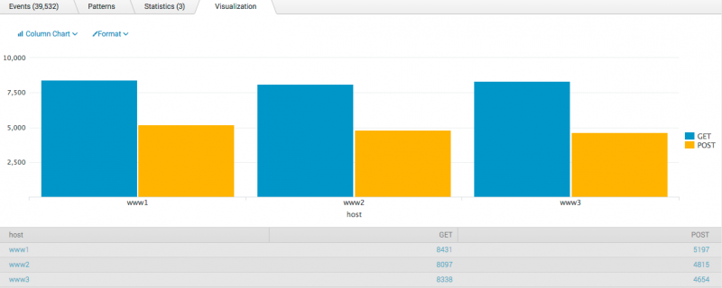
Chart the number of different page requests, GET and POST, that occurred for each Web server.
sourcetype=access_* | chart count(eval(method="GET")) AS GET, count(eval(method="POST")) AS POST by host
This example uses eval expressions to specify the different field values for the stats command to count. The first clause uses the count() function to count the Web access events that contain the method field value GET. Then, using the AS keyword, the field that represents these results is renamed GET.
The second clause does the same for POST events. The counts of both types of events are then separated by the web server, using the BY clause with the host field.
The results appear on the Statistics tab and look something like this:
| host | GET | POST |
|---|---|---|
| www1 | 8431 | 5197 |
| www2 | 8097 | 4815 |
| www3 | 8338 | 4654 |
Click the Visualization tab to format the report as a column chart. This chart displays the total count of events for each event type, GET or POST, based on the host value.
9. Chart the number of transactions by duration
| This example uses the sample dataset from the Search Tutorial. Download the data set from this topic in the Search Tutorial and follow the instructions to upload it your Splunk deployment. Then, run this search using the time range, All time. |
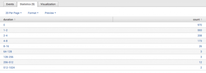
Create a chart to show the number of transactions based on their duration (in seconds).
sourcetype=access_* status=200 action=purchase | transaction clientip maxspan=10m | chart count BY duration span=log2
This search uses the transaction command to define a transaction as events that share the clientip field and fit within a ten minute time span. The transaction command creates a new field called duration, which is the difference between the timestamps for the first and last events in the transaction. (Because maxspan=10s, the duration value should not be greater than this.)
The transactions are then piped into the chart command. The count() function is used to count the number of transactions and separate the count by the duration of each transaction. Because the duration is in seconds and you expect there to be many values, the search uses the span argument to bucket the duration into bins of log2 (span=log2). This produces the following table:
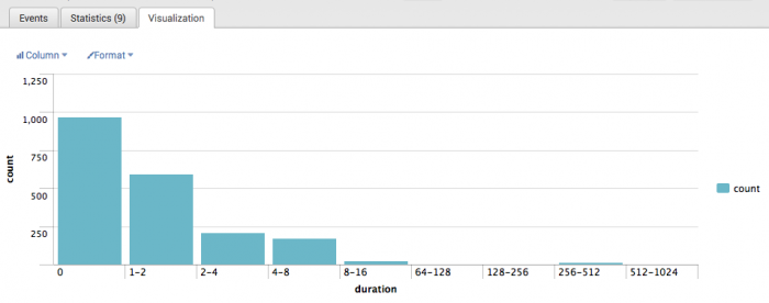
Click the Visualization tab to format the report as a column chart:
As you would expect, most transactions take between 0 and 2 seconds to complete. Here, it looks like the next greater number of transactions spanned between 256 and 512 seconds (approximately, 4-8 minutes). (In this case however, the numbers may be a bit extreme because of the way that the data was generated.)
10. Chart the average number of events in a transaction, based on transaction duration
| This example uses the sample dataset from the Search Tutorial. Download the data set from this topic in the Search Tutorial and follow the instructions to upload it to your Splunk deployment Then, run this search using the time range, All time. |
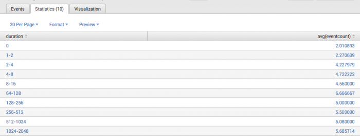
Create a chart to show the average number of events in a transaction based on the duration of the transaction.
sourcetype=access_* status=200 action=purchase | transaction clientip maxspan=30m | chart avg(eventcount) by duration span=log2
This example uses the same transaction defined in Example 2. The transaction command also creates a new field called eventcount, which is the number of events in a single transaction.
The transactions are then piped into the chart command and the avg() function is used to calculate the average number of events for each duration. Because the duration is in seconds and you expect there to be many values, the search uses the span argument to bucket the duration into bins of log2 (span=log2). This produces the following table:
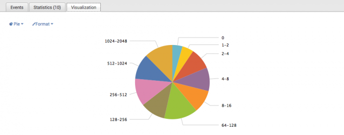
Click the Visualization tab to format the report as a pie chart:
Each wedge of the pie chart represents the average number of events in the transactions of the corresponding duration. After you create the pie chart, you can mouseover each of the sections to see these values (in Splunk Web).
11. Chart customer purchases
| This example uses the sample dataset from the Search Tutorial. Download the data set from this topic in the Search Tutorial and follow the instructions to upload it to your Splunk deployment. Then, run this search using the time range, Other > Yesterday. |
Chart how many different people bought something and what they bought at the Buttercup Games online store Yesterday.
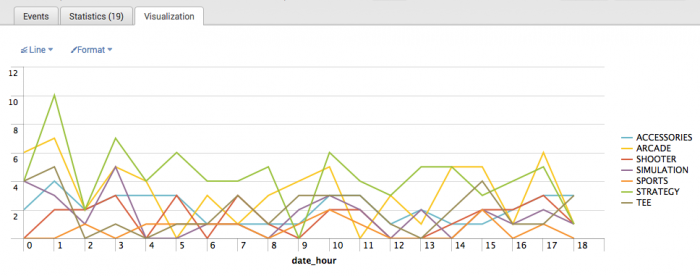
sourcetype=access_* status=200 action=purchase | chart dc(clientip) OVER date_hour BY categoryId usenull=f
This search takes the purchase events and pipes it into the chart command. The dc() or distinct_count() function is used to count the number of unique visitors (characterized by the clientip field). This number is then charted over each hour of the day and broken out based on the category_id of the purchase. Also, because these are numeric values, the search uses the usenull=f argument to exclude fields that don't have a value.
This produces the following table:
Click the Visualization tab to format the report as a line chart:
Each line represents a different type of product that is sold at the Buttercup Games online store. The height of each line shows the number of different people who bought the product during that hour. In general, it looks like the most popular items at the online shop were Strategy games.
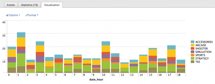
You can format the report as a stacked column chart, which will show you the total purchases at each hour of day:
12. Chart the number of earthquakes and the magnitude of each earthquake
| This example uses recent earthquake data downloaded from the USGS Earthquakes website. The data is a comma separated ASCII text file that contains magnitude (mag), coordinates (latitude, longitude), region (place), etc., for each earthquake recorded.
You can download a current CSV file from the USGS Earthquake Feeds and add it as an input. |
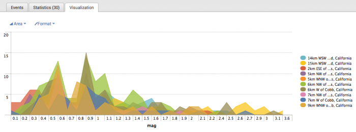
Create a chart that shows the number of earthquakes and the magnitude of each one that occurred in and around California.
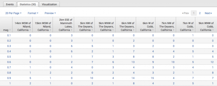
source=usgs place=*California* | chart count OVER mag BY place useother=f
This search counts the number of earthquakes that occurred in the California regions. The count is then broken down for each place based on the magnitude of the quake. Because the place value is non-numeric, the search uses the useother=f argument to exclude events that don't match.
This produces the following table:
Click on the Visualization tab to view the report as a chart:
See also
Answers
Have questions? Visit Splunk Answers and see what questions and answers the Splunk community has using the chart command.
| bucketdir | cluster |
This documentation applies to the following versions of Splunk® Enterprise: 7.0.0, 7.0.1, 7.0.2, 7.0.3, 7.0.4, 7.0.5, 7.0.6, 7.0.7, 7.0.8, 7.0.9, 7.0.10, 7.0.11, 7.0.13

 Download manual
Feedback submitted, thanks!