Create and edit forms
Let users select or filter content by converting a dashboard to a form. A form is a dashboard that includes one or more inputs, such as radio buttons or a checkbox.
Workflow for creating forms
The typical workflow for creating forms includes the following steps. Some steps are optional and you do not have to complete them in this order.
- Create a dashboard and add one or more inputs to convert it to form.
- Configure the inputs by specifying options available to users, default behavior, and how to handle user selections.
- Work with tokens that capture selected values from the input. Modify searches and other content to use the token values.
- Make any additional input configurations depending on the input type.
- Adjust input and panel layout.
Add inputs to convert a dashboard to a form
Forms are dashboards with interactive user inputs for selecting or filtering content. When you add an input to a dashboard, the top-level source code element changes from <dashboard> to <form>.
Steps
- From the Dashboards listing page, open the dashboard that you want to convert.
- Click Edit to open the dashboard editor.
- Select one or more inputs from the Add input list. As soon as you select an input, the dashboard is converted to a form.
- (Optional) Drag and drop inputs to rearrange them.
- (Optional) Drag an input into a specific panel. Use tokens to make the input control only this panel.
- Click Save to save changes to the form.
Tokens in form inputs
Use tokens to respond to user selections dynamically.
When you add an input to a form, a unique token is generated for the input. You can use this token to change panel content based on what users select. For example, use a token in the panel search to modify the results that the panel visualization shows. Or, change the panel label or drilldown behavior using the token.
The following examples show you typical options for using tokens in a form input.
Reference a token in a search
In this example, a dashboard has one panel. The panel search aggregates events for all sourcetypes.
index=_internal | timechart count by sourcetype
Add interactivity by converting the dashboard to a form. Add a text input to let users specify a sourcetype to filter the events in the visualization.
- From the dashboard, click Edit to open the dashboard editor.
- Select Add input > Text to add a text input. The dashboard is converted to a form.
- Observe that the input appears at the top of the form. A label and token are generated for the input.
- Click the editing icon to open the input editor.
- Change the label text to "Sourcetype".
- Change the token name to
sourcetype_tokento make it more specific. Token names should be unique within the form. - Update the panel search string to use the value that the token captures from user input.
This search uses the specified sourcetype to filter events.
index=_internal sourcetype=$sourcetype_token$ | timechart count
Observe the$[token name]$syntax used to refer to the token in the search. - Click Apply and Save to save the updates to the form.
The form now contains a text input for users to specify a sourcetype to show in the visualization. Before users specify a sourcetype, the visualization does not render because the token has not captured a value to use in the search. After a sourcetype is entered in the text field, the search uses this value to generate results and the visualization renders.
Add a time input to a form
A time input lets users apply a time range to filter the events shown in one or more panels.
Add the time input and update panel searches to incorporate the user specified time range.
- From the dashboard or form, click Edit to open the dashboard editor.
- Select Add Input > Time.
- (Optional) Select the input editing icon and update the input label and token name.
- (Optional) Click Apply to save the input updates.
- For each panel where you want the time input to apply, make the following changes.
- Click the search editing icon.
- Select Edit search.
- For Time Range Scope select Shared Time Picker. If there is more than one time input in the form, each shared time picker is listed with the unique token for its time input. Select the shared time picker that includes the token for the input that you want to use.
- Click Save to save the panel search updates.
- Click Save to save the form updates and exit the dashboard editor.
Apply time inputs to panels
A form can have one or more time inputs. Depending on the behavior you want, a time input can be used globally for all panels or only for specific panels.
Global time picker
When you create a time input using the dashboard editor, a token is generated automatically for the input. If you delete this token, the time input becomes global. Each panel in the form that does not specify a time range or another time input uses the global time picker.
When configuring a panel search time range, you can select Shared Time Picker (global) to apply this input.
Token-based time picker
When configuring a panel search time range, you can select a shared time picker that includes a specific token name. Use the token name for the input that you want to apply to the panel search.
Panel searches that do not use time inputs
You can specify an explicit time range for a panel search or use other token values if you do not want to apply a time input to a particular panel.
Configure input value handling
You can configure how input values populate a form.
Submit token values when the page loads
To submit token values when the page loads, enable autorun behavior.
- From the dashboard, click Edit to open the dashboard editor.
- Select the Autorun dashboard check box.
- Click Save to save the form update.
Submit token values when an input changes
By default, inputs are configured to submit token values whenever users make a new selection. To change this behavior, follow these steps.
- From the dashboard, click Edit to open the dashboard editor.
- Select the input to edit.
- Clear the Search on change check box to disable this behavior, or select the check box to enable it.
- Save input and form changes.
Add a Submit button input
Add a Submit button to a form to let users control when input selections are submitted. This can be helpful for managing how often panels or forms with multiple inputs update. Typically, Search on change is disabled for inputs if you use a "Submit" button in the form.
You cannot change the position of the form Submit button.
- From the dashboard, click Edit to open the dashboard editor.
- Select Add Input > Submit.
- Disable Search on change behavior for inputs as needed and save input updates.
- Click Save to save form updates.
Specify initial and default input values
Handle cases where user input values are not available.
- Default
- Use a default value for an input when users do not make a selection.
- Initial
- Use an initial value for text inputs only. The initial value appears only when the form page loads. If a user clears the text field, the initial value does not reappear and the token value is set to an empty string.
If you specify both an initial and default value for a text input, only the default value applies.
Specify multiple options for inputs
Several form input types can include multiple static or dynamically populated options.
- check box
- dropdown
- link list
- radio
- multiselect
All of these inputs display multiple options, while multiselect and check box inputs let users choose multiple values. The following tasks show you how to configure options for each of these inputs.
Specify static options
The following example shows you how to specify multiple static options. The example uses a dropdown input but it applies to any multi-option input.
- From a dashboard, select Add Input > Dropdown.
- Select the edit icon for the input. Select Static Options.
- Specify a name and value for the first option.
- For each additional option, Click Add Option and specify the name and value for the option.
- (Optional) Scroll to the Default field and specify a default value.
- (Optional) Drag and drop the options to rearrange them.
- Click Apply to save input changes.
- Click Save to save dashboard changes.
Specify dynamic options
Use a search to generate option labels and values dynamically.
These steps show you how to configure a dynamically populated dropdown. They do not include steps for updating the search to use the token value from the input.
- From the dashboard or form, add a line chart panel that uses the following search.
index=_internal | timechart count
- Add an input to let users filter the panel visualization for a particular sourcetype.
- Click Edit to open the dashboard editor.
- Select Add Input > Dropdown.
- Configure the input.
- Select the input editing icon.
- Select Dynamic options.
- Add the following search to generate input labels and values.
index=_internal | stats count by sourcetype | eval label=sourcetype." (".count.")" - Observe that the search aggregates events by sourcetype and generates a label field that combines sourcetype names and event counts.
- Use the search result fields for input labels and values. Specify the following fields. Field for Label: label Field for Value: sourcetype
- Click Apply to save input updates.
- Click Save to save form changes.
Users can now view sourcetype names and event counts in the dropdown.
Handle multiple value selections
Multiselect and check box form inputs let users select multiple values.
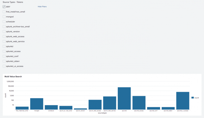
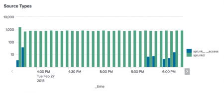
This example panel includes a check box for users to specify sourcetypes to render in the chart.
Search to generate multiple selected values
To handle one or more user selected values in a multiselect or check box, use a search that generates results for one or more values.
To specify the source type values in the above form, build a search string indicating the values to return. For this example, the following search string allows the selection of multiple values for source types:
(sourcetype="splunkd" OR sourcetype="splunk_web_access" OR sourcetype="splunkd_access")
The search driving the panel accesses the token value of check box and multiselect differently than the other form inputs. Use the submitted modifier to the token.
index=_internal $src_type_tok$ | chart count by sourcetype
The Input Editor provides editing fields to specify multiple values for selection in a check box or multiselect. The table below describes these fields and provides example values that build the following search string:
(sourcetype="selected value" OR sourcetype="selected value" OR ... )
| Editor Field | Description | Example Values |
|---|---|---|
| Token Prefix | String prefixed to the value of the input element. For multiple selections, this is typically an open parenthesis to enclose the string selecting the values. |
(
|
| Token Suffix | String appended to the value of the input element. For multiple selections, this is typically a close parenthesis to enclose the string selecting the values. |
)
|
| Token Value Prefix | String prefixed to the value of the input element. Can be a regular expression. Default value is an opening double quote ("). Typically, this is the opening part of a sub-string that selects the multiple values. |
sourcetype="
|
| Token Value Suffix | String appended to the value of the input element. Can be a regular expression. Default value is an closing double quote ("). Typically, this is the closing part of a sub-string that selects the multiple values. |
"
|
| Delimiter | A string placed between each selected value. Typically, you specify " OR " or " AND " using upper case. Do not specify the quote marks, but specify a space character before and after the string. Default value: " " Default value does not include quote marks. The quote marks show that the default value is a space character. |
OR
|
The following procedure shows how to enable multiple selections for a check box or multiselect input.
- From the dashboard, click Edit to open the dashboard editor.
- Select Add Input. Select either Checkbox or Multiselect.
- Specify Label, Search on Change, and Token.
- Specify choices as described in Specify choices with static options and Specify choices with dynamic options.
- Build the multiselect search string using the editing fields in the above table.
(Recommended) Use the preview feature to verify the multiselect search string. - (Optional) Specify a default value.
- Click Apply. Click Done.
Form input examples
This section provides an example of each form input, with a list of the key fields for implementing the example.
Check box
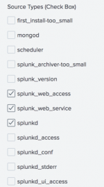
This example uses the check box input to indicate which source types to display in a timechart. A populating search specifies the available options to select. Three source types are selected by default:
- splunk_web_access
- splunk_web_service
- splunkd
This example enables Search on Change. The form loads when a selection is made.
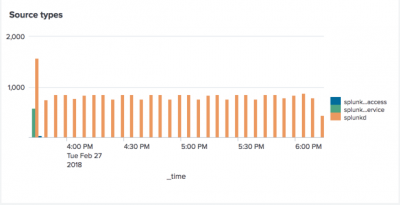
The panel displays results in the default column chart, using the following base search. The visualization references the input values using the value specified for Token. In this example, the token name is src_type_tok.
index=_internal $src_type_tok$ | timechart count by sourcetype
General settings
Specify the Label for the input and the Search on Change behavior. This example enables search on change.
Token options
Use the Token Options to specify the value returned by the check box input.
For the Token field, specify a name for the token that returns the value. The base search for the visualization references this token. In this example, specify src_type_tok.
Use the following fields to build the search for the returned value. The Preview field in the Input Editor updates as you edit these fields.
- Token Prefix
- Token Suffix
- Token Value Prefix
- Token Value Suffix
- Delimiter
The example values listed in the table below build the following search string:
(sourcetype="splunkd" OR sourcetype="splunk_web_access" OR ...)
After you dynamically create the check boxes, from the Default field, select the check boxes that are enabled by default.
Static options
Use the static options to explicitly define the Name and Value of the check boxes for the input.
This example leaves the static options blank. It uses a populating search to define the check boxes for the input.
Dynamic Options
Reference a report or define an inline populating search to define the check boxes for the input.
This example uses the following inline search:
| metadata type=sourcetypes index=_internal
The example runs the search against all time.
Use field names to specify a name/value pair for the check boxes. This example specifies the sourcetype field for both Field for Label and Field for Value.
Example values for check box input
This table lists the example values for the check box input example.
| Editor Field | Example Values |
|---|---|
| General | |
Label |
Source Types (Check Box)
|
Search on Change |
Enabled
|
| Token Options | |
Token |
src_type_tok
|
Default |
splunk_web_access
splunk_web_service splunkd |
Token Prefix* |
(
|
Token Suffix* |
)
|
Token Value Prefix* |
sourcetype="
|
Token Value Suffix* |
"
|
Delimiter* |
OR
|
| Dynamic Options | |
Content Type |
Inline Search
|
Search String |
| metadata type=sourcetypes index=_internal |
Time Range |
All time
|
Field for Label |
sourcetype
|
Field for Value |
sourcetype
|
| *These fields build the search string that dynamically create the check boxes. For the Delimiter field, be sure to specify an opening and closing space. |
Dropdown input
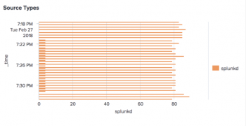
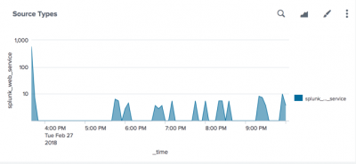
This example uses a dropdown input to indicate which source types to display as a time chart. The panel displays results as a bar chart, using the following base search.
index=_internal sourcetype=$src_type_tok$ | timechart count by sourcetype
The token $src_type_tok$ references the values specified by the dropdown.
The example uses static options to define choices for the dropdown.
The example specifies splunk for Token Prefix. Each selected value prefixes the token prefix to the value.
There is a default value for the dropdown.
The example relies on a Submit button to run the search. Changes to the selection do not apply until you click the Submit button.
| Editor Field | Example Values |
|---|---|
| General | |
Label |
Source Types (Dropdown)
|
Search on Change |
Not specified
|
| Token Options | |
Token |
src_type_tok
|
Default |
Daemon
|
Token Prefix |
splunk
|
| Static Options | |
Name : Value |
Daemon : d
|
Name : Value |
Web Service : _web_service
|
Name : Value |
Web Access : _web_access
|
Name : Value |
Daemon Access : d_access
|
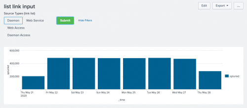
Link list
This example uses a link list input to indicate which source types to display as a time chart. The panel displays results as a bar chart, using the following base search. This is basically the same workflow as adding a dropdown input.
index=_internal sourcetype=$src_type_tok$ | timechart count by sourcetype
The token $src_type_tok$ references the values specified by the link list. For example:
The example uses static options to define choices for the link list.
The example specifies splunk for Token Prefix. Each selected value prefixes the token prefix to the value.
There is a default value for the link list input.
The example relies on a Submit button to run the search. Changes to the selection do not apply until you click the Submit button.
| Editor Field | Example Values |
|---|---|
| General | |
Label |
Source Types (link list)
|
Search on Change |
Not specified
|
| Token Options | |
Token |
src_type_tok
|
Default |
Daemon
|
Token Prefix |
splunk
|
| Static Options | |
Name : Value |
Daemon : d
|
Name : Value |
Web Service : _web_service
|
Name : Value |
Web Access : _web_access
|
Name : Value |
Daemon Access : d_access
|
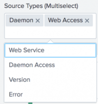
Multiselect
This example uses a multiselect input to indicate which source types to display in a timechart. The panel displays results in the default column chart, using the following base search.
index=_internal $src_type_tok$ | timechart count by sourcetype
The example uses static options to define choices for the dropdown.
Two source types are selected by default:
- Daemon
- Web Access
This example enables Search on Change. The form loads when a selection is made.
For a multiselect input, you define multiple values to select by building the following search string.
(sourcetype="splunkd" OR sourcetype="splunk_web_access" OR ...)
The token $src_type_tok$ references this search string in the search that drives the panel contents. The fields that build the search string are indicated in the table below.
| Editor Field | Example Values |
|---|---|
| General | |
Label |
Source Types (Multiselect)
|
Search on Change |
Enabled
|
| Token Options | |
Token |
src_type_tok
|
Default |
Daemon
Web Access |
Token Prefix* |
(
|
Token Suffix* |
)
|
Token Value Prefix* |
sourcetype="
|
Token Value Suffix* |
"
|
Delimiter* |
OR
|
| Static Options | |
Name : Value |
Daemon : splunkd
|
Name : Value |
Web Service : splunk_web_service
|
Name : Value |
Web Access : splunk_web_access
|
Name : Value |
Daemon Access : splunkd_access
|
Name : Value |
Version : splunk_version
|
Name : Value |
Error : splunkd_stderr
|
| *These fields build the search string that supplies the token value. For the Delimiter field, be sure to specify an opening and closing space. |
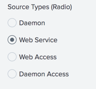
Radio input
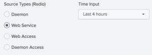
This example uses a radio input to indicate which source types to display as a time chart. The panel displays results as an area chart, using the following base search.
index=_internal sourcetype=$src_type_tok$ | timechart count by sourcetype
The token $src_type_tok$ references the values specified by the dropdown.
The example uses static options to define choices for the dropdown.
There is a default value for the radio input.
This example enables Search on Change. The form loads when a selection is made.
| Editor Field | Example Values |
|---|---|
| General | |
Label |
Source Types (Radio)
|
Search on Change |
Enabled
|
| Token Options | |
Token |
src_type_tok
|
Default |
Web Service
|
| Static Options | |
Name : Value |
Daemon : splunkd
|
Name : Value |
Web Service : splunk_web_service
|
Name : Value |
Web Access : splunk_web_access
|
Name : Value |
Daemon Access : splunkd_access
|
Text input
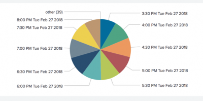
This example uses a text input to indicate which source types to display as a time chart. The panel displays results as a pie graph, using the following base search.
index=_internal sourcetype=$src_type_tok$ | timechart count by sourcetype
The token $src_type_tok$ references the values specified in the text input.
This example specifies an initial value of splunkd* without specifying a default value. Upon initial load, the seed value is applied. The form reloads when you specify a new value.
Because there is no default value, an empty text input does not return any results.
| Editor Field | Example Values |
|---|---|
| General | |
Label |
Source Types (Text input)
|
Search on Change |
Enabled
|
| Token Options | |
Token |
src_type_tok
|
Default |
Not specified
|
Initial |
splunkd*
|
Time input
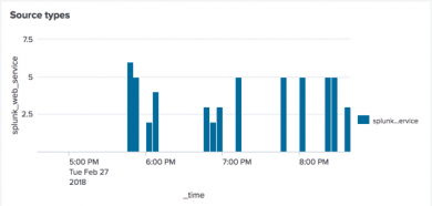
This example shows how to use a time input to specify time ranges for a panel in a form. The form contains a radio input to indicate which source types to display as a time chart. The panel displays results as a column chart, using the following base search.
index=_internal sourcetype=$src_type_tok$ | timechart count by sourcetype
The examples specifies time_input_tok to reference the time input in a panel.
In the Panel Editor, select Edit Search String. From the Time Range Scope dropdown, select Shared Time Picker (time_input_tok).
The default value for the time input is Last 4 days.
The example enables Search on Change for the time input. The form loads when a new time range is selected.
| Editor Field | Example Values |
|---|---|
| General | |
Label |
Time Input
|
Search on Change |
Enabled
|
| Token Options | |
Token |
time_input_tok
|
Default |
Last 4 days
|
| Edit visualizations | Convert a dashboard to HTML |
This documentation applies to the following versions of Splunk® Enterprise: 7.1.0, 7.1.1, 7.1.2, 7.1.3, 7.1.4, 7.1.5, 7.1.6, 7.1.7, 7.1.8, 7.1.9, 7.1.10, 7.2.0, 7.2.1, 7.2.2, 7.2.3, 7.2.4, 7.2.5, 7.2.6, 7.2.7, 7.2.8, 7.2.9, 7.2.10, 7.3.0, 7.3.1, 7.3.2, 7.3.3, 7.3.4, 7.3.5, 7.3.6, 7.3.7, 7.3.8, 7.3.9, 8.0.0, 8.0.1, 8.0.2, 8.0.3, 8.0.4, 8.0.5, 8.0.6, 8.0.7, 8.0.8, 8.0.9, 8.0.10, 8.1.0, 8.1.1, 8.1.2, 8.1.3, 8.1.4, 8.1.5, 8.1.6, 8.1.7, 8.1.8, 8.1.9, 8.1.10, 8.1.11, 8.1.12, 8.1.13, 8.1.14, 8.2.0, 8.2.1, 8.2.2, 8.2.3, 8.2.4, 8.2.5, 8.2.6, 8.2.7, 8.2.8, 8.2.9, 8.2.10, 8.2.11, 8.2.12, 9.0.0, 9.0.1, 9.0.2, 9.0.3, 9.0.4, 9.0.5, 9.0.6, 9.0.7, 9.0.8, 9.0.9, 9.0.10, 9.1.0, 9.1.1, 9.1.2, 9.1.3, 9.1.4, 9.1.5, 9.1.6, 9.1.7, 9.1.8, 9.1.9, 9.2.0, 9.2.1, 9.2.2, 9.2.3, 9.2.4, 9.2.5, 9.2.6, 9.3.0, 9.3.1, 9.3.2, 9.3.3, 9.3.4, 9.4.0, 9.4.1, 9.4.2



 Download manual
Feedback submitted, thanks!