Punchcard charts
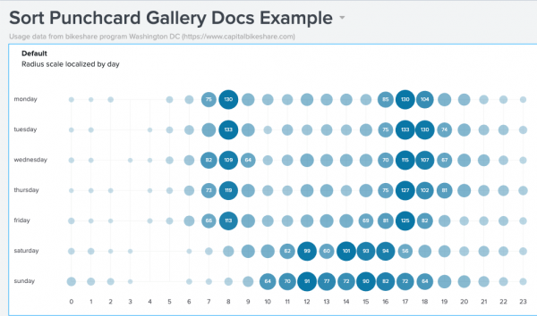
Punchcards can visualize cyclical trends in your data. This visualization shows circles representing a metric aggregated over two dimensions, such as hours of the day and days of the week. Using a punchcard, you can see relative values for a metric where the dimensions intersect.
Data formatting
To build a punchcard, use any data that contains a timestamp and the metric you are tracking. Use a query that returns data in the correct format.
Query syntax
Use this syntax to generate a punchcard.
... | <stats_function>[(metric_field)] [<stats_function>(color_field)] by <first_dimension> <second_dimension>
Query components
<stats_function>
- Required
- Determines circle size.
- Use this function to aggregate the metric you are tracking.
color_field
- Optional
- Determines circle color.
- Use a
statsfunction to aggregate values in this field. - For sequential color mode, values in this field must be numerical.
<first_dimension>
- Required
- Represents the first dimension for plotting results.
- Typically, you can use a time field such as
date_hour.
<second_dimension>
- Required
- Represents the second dimension for plotting results, usually more granular than the first dimension.
- Typically, you can use a time field such as
date_wday.
Search results
After running the search in Search & Reporting, click the Statistics tab. The results table includes columns representing the metric, color field, and two time dimensions.
Make sure that the results table has columns for required fields in this order.
| First | Second | Third | Fourth |
|---|---|---|---|
| first_dimension | second_dimension | count or other aggregated value | color_field (optional) |
Generate a punchcard
- Select the punchcard chart using the visual editor by clicking the Add Chart button (
 ) in the editing toolbar and either browsing through the available charts, or by using the search option.
 - Select the chart on your dashboard so that it's highlighted with the blue editing outline.
- Set up a new data source by adding a search to the Search with SPL window.
- To select an existing data source, close the Configuration panel and reopen it. In the Data Configurations section, click +Setup Primary Data Source and click + Create Ad hoc Search to create a new search from this window. You can also choose a new ID that describes the search better than the default.
Configuration Panel options for punchcard charts
You can use the Configuration panel to configure the following line chart components.
Title
Give your visualization a name. This is also helpful when searching for individual visualizations in the dashboard definitions. This name is not the same as the automatically assigned unique ID.
Description
Give your visualization a description to explain what the user is viewing.
Data Configurations
Choose an existing ad hoc search or create a new one.
Position & Size
You can use your mouse to change the size or location of the visualization, or the Position & Size section of the Configuration panel for pixel perfect sizing and placement.
Visualization Settings
- Toggle the Pulsate Max Value switch to make the biggest bubble pulse.
- Background Color
Choose a background color for your chart. Either select a color from the palette by clicking the color box, or enter a hex code in the field provided. For example, entering #D3D3D3 will give your chart a light gray background. - Show Bubble Labels Choose whether to show the value for all bubbles, only the maximum value, or no values.
- Bubble Row Scale
- Global
- Row
- Bubble Scale Choose whether you want to scale the bubbles by their radius or area.
Color Mode
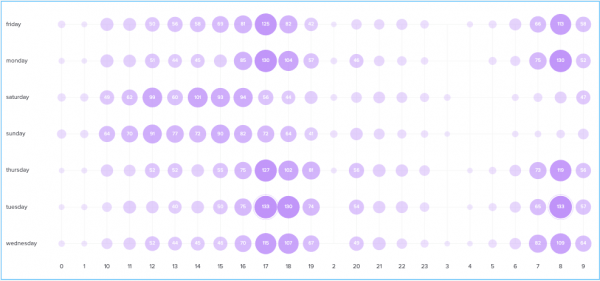
- Use Sequential mode if your search does not have a fourth column in the statistics table. For example, the following search only returns three statistic columns, so you should use the sequential option
| inputlookup bikeshare.csv | stats count by date_hour date_wday
- Use Categorical mode if your search has a
statscommand resulting in a category field that creates colors
Code
Select your visualization or its search to view and edit the source code in real-time. You can also change the Visualization ID to a more readable ID to help identify this visualization in the source code.
Use encoding to modify the punchcard graph
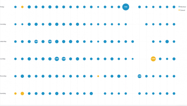
A single group-by field in the query generates a visualization with all bubbles in the same color. To get series colors with the stats command, use two or more group-by fields. This generates a bubble for each unique combination of fields. The value of the field you choose determines the series color.
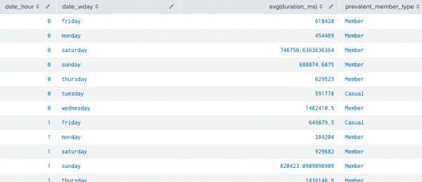
For example, the following search generates 4 columns of data in the statistics table
| inputlookup bikeshare.csv
| eval duration = duration_ms/60000
| eval is_member = if(member_type=="Registered", 1, 0)
| eval is_casual = if(member_type=="Casual", 1, 0)
| stats avg(duration_ms) sum(is_member) as sum_m, sum(is_casual) as sum_c by date_hour date_wday
| eval prevalent_member_type = if(sum_m > sum_c, "Member", "Casual")
| fields - sum_m, sum_c
This search generates the following table:
The four columns can be used to determine the size of the bubbles, the size of the x and y-axis, and the colors of the bubbles. The first column is usually the time field values . For example:
"encoding": {
	"x": "primary[0]",
	"y": "primary[1]",
	"size": "primary[2]",
	"category": "primary[3]"
primary[n] represents the order of the field columns. You can also use field column names, for example:
"encoding": {
	"x": "primary.date_hour",
	"y": "primary.date_wday",
	"size": "avg(duration_ms)",
	"category": "primary.prevelent_member_type"
The gold colored bubbles represent the fourth column. These are "casual" Bike Share riders, while the blue bubbles represent "member" riders.
Dashboard definition example
Source code
Expand the box to view the complete dashboard definition for the dashboard above. If you do not have the correct look-up file, it will not render in your dashboard.
{
	"visualizations": {
		"viz_1": {
			"type": "viz.punchcard",
			"options": {},
			"dataSources": {
				"primary": "search_1"
			},
			"encoding": {
				"x": "primary[0]",
				"y": "primary[1]",
				"size": "primary[2]",
				"category": "primary[3]"
			}
		}
	},
	"dataSources": {
		"search_1": {
			"type": "ds.search",
			"options": {
				"query": "| inputlookup bikeshare.csv\n| eval duration = duration_ms/60000\n| eval is_member = if(member_type==\"Registered\", 1, 0)\n| eval is_casual = if(member_type==\"Casual\", 1, 0)\n| stats avg(duration_ms) sum(is_member) as sum_m, sum(is_casual) as sum_c by date_hour date_wday\n| eval prevalent_member_type = if(sum_m > sum_c, \"Member\", \"Casual\")\n| fields - sum_m, sum_c"
			}
		}
	},
	"inputs": {},
	"layout": {
		"type": "absolute",
		"options": {
			"display": "auto-scale",
			"height": 1550,
			"width": 1500
		},
		"structure": [
			{
				"item": "viz_1",
				"type": "block",
				"position": {
					"x": -10,
					"y": 10,
					"w": 1460,
					"h": 940
				}
			}
		]
	},
	"title": "Categorical with encoding"
}
Source options for punchcard charts
While some of these options can be set using the visual editor, there are additional options that can only be set in the source editor for viz.punchcard. These options are added to the options field of the visualization stanza. For example, the following example shows the addition of background color using a hex code and a color mode setting using one of the available settings.
"viz_25NNIqLF": {
			"type": "viz.punchcard",
			"options": {
				"backgroundColor": "#0000FF",
                                "colorMode": "categorical"
			},
			"dataSources": {
				"primary": "ds_gcEN4c7Q"
			}
		}
To read more on how visualization stanzas are structured see: Elements of a visualization. Below are all of the options available.
Punchcard chart options
The following options are available for editing punchcard charts in the source editor:
| Property | Type | Default | Description |
|---|---|---|---|
| backgroundColor | string | transparent | Specify the hex code for the color used for the chart background. For example: "#0000FF".
|
| showBubbleLabels | string | all | Specify when a bubble label will be displayed. The options are max, all, and none.
|
| bubbleRowScale | string | global | Specify how bubbles scale relative to the rows. global scales the bubbles in relation to all of the rows in the chart, while row scales the bubbles only in relation to the row that each are in.
|
| bubbleScale | string | area | Specify whether the bubble size should be based on the value being proportional to the radius or the area.
|
| colorMode | string | categorical | When category data is returned, the categorical option will color the bubbles by category and the sequential option will color the bubbles by value.
|
| seriesColors | array | (dark and light mode defaults) ["#1E93C6", "#F2B827", "#D6563C", "#6A5C9E", "#31A35F"] | Specify the hex color codes for the bars to use in order from largest to smallest. For example, ["#FF0000","#0000FF","#008000"].
|
| bubbleColor | string | #C093F9 | Specify in hex code the color used for the bubble when colorMode is sequential. For example: "#0000FF".
|
| fieldColors | object | N/A | Specify the color used for a field by specifying the hex code. For example, {"count": "#ff0000","percent": "#cb3b43"}.
If you would like to maintain a space between two fields, you can use the backslash and quotes to surround the string and maintain the space. In this example:
|
| isBubbleSizeDynamic | boolean | true | Specify whether the bubble size should be dynamic or fixed. The default true means the bubbles scale with the values associated with them.
|
| minBubbleColorIntensity | number | 0.25 | Specifies the minimum opacity of the bubbles when the colorMode options is set to sequential .
Values can range from 0 (transparent) to 1 (opaque). |
| maxBubbleRadius | number | 15 | Specifiy the maximum radius in pixels of the bubbles when isBubbleSizeDynamic is set to false. Numbers must be greater than 0.
|
| minBubbleRadius | number | 1 | Specify the minimum radius in pixels of the bubbles when isBubbleSizeDynamic is set to false. The number must be greater than 0.
|
| maxBubbleSize | number | 1 | Specify the maximum percentage (in decimal format) of space a bubble should take up within a cell when the isBubbleSizeDynamic option is set to true. The number specified must be between 0 and 1.
|
| minBubbleSize | number | 0.25 | Specifies the minimum percentage (in decimal format) of space a bubble should take up within a cell when isBubbleSizeDynamic is set to true . The number must be between 0 and 1.
|
| showMaxValuePulsation | boolean | true | Specify whether the maximum bubble should pulsate. |
| showLegend | boolean | true | Specify whether a legend should be rendered in categorical colorMode.
|
| useDefaultSort | boolean | false | If set to true, axes will be sorted in the order of time order, digit values, and strings. |
| Pie charts | Scatter charts |
This documentation applies to the following versions of Splunk® Enterprise: 8.2.1, 8.2.2, 8.2.3, 8.2.4, 8.2.5, 8.2.6, 8.2.7, 8.2.8, 8.2.9, 8.2.10, 8.2.11, 8.2.12


 Download manual
Feedback submitted, thanks!