The source code stanza of a visualization
When you add a visualization to your dashboard, a corresponding JSON stanza is created in the dashboard definition and given a unique ID.
There are two types of visualizations, those that begin with viz.<visualization>, such as the pie chart, viz.pie, and those that begin with splunk.<visualization>, such as splunk.table. Those visualizations that are of type splunk.<visualization> have options and settings that look different than many of the static and dynamic settings of those of the viz.<visualization> type. Additionally, while viz.<visualization> types that support dynamic elements, or thresholding, have a section called encoding where ranges and colors are set, splunk.<visualization> stanzas have an different section called context, where option variables are set before they are called in the options section of the visualization.
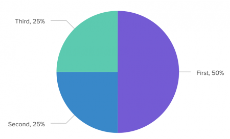
Most viz.<visualization> visualizations follow the same general format. For example, the following stanza represents a basic pie chart:
"viz_8bucihWZ": {
	"type": "viz.pie",
	"options": {
		"chart.showPercent": true
	},
	"dataSources": {
		"primary": "ds_IULrzuI8"
	}
}
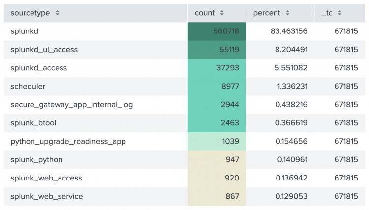
Most splunk.<visualization> visualizations have the same initial format as the viz.<visualization> type, but become more complex when you apply dynamic formatting. For example, the following stanza represents a table with one column, the field count, formatted by gradient coloring. The colors are represented by the countRowBackgroundColorsEditorConfig property set in the context section of the stanza and called in the top-level options section of the visualization stanza.
{
  "type": "splunk.table",
	"options": {
		"columnFormat": {
			"count": {
				"data": "> table | seriesByName(\"count\") | formatByType(countColumnFormatEditorConfig)",
				"rowColors": "> table | seriesByName('count') | pick(countRowColorsEditorConfig)",
				"rowBackgroundColors": "> table | seriesByName(\"count\") | rangeValue(countRowBackgroundColorsEditorConfig)"
			}
		}
	},
	"dataSources": {
		"primary": "ds_rHF7Ybld"
	},
	"context": {
		"countColumnFormatEditorConfig": {
			"number": {
				"thousandSeparated": false,
				"unitPosition": "after"
			}
		},
		"countRowColorsEditorConfig": [
			"#3c444d"
		],
		"countRowBackgroundColorsEditorConfig": [
			{
				"value": "#EEE8CE",
				"to": 1000
			},
			{
				"value": "#B6ECD4",
				"from": 1000,
				"to": 2000
			},
			{
				"value": "#45D4BA",
				"from": 2000,
				"to": 50000
			},
			{
				"value": "#249F86",
				"from": 50000,
				"to": 500000
			},
			{
				"value": "#14846C",
				"from": 500000
			}
		]
	}
   }
The following is an example of a table visualization with dynamic elements.
Visualization fields and settings
Each visualization can have the following fields:
| Field | Description | Required |
|---|---|---|
| The unique ID | The unique ID is automatically generated, but can be changed. If you change it, however, you must also change the visualization's ID in the layout. | Yes |
| type | The type is the kind of visualization you are using. For example, the table visualization type is splunk.table. You can change the type in the source code, much like using the Visualization Picker in the visual editor. It might or might not render depending on the way your data is structured.
|
Yes |
| title | This is the title name you can give your visualization. It is not the same as the unique ID and will not change the unique ID. | No |
| description | You can use this field to describe your visualization within the visualization panel. | No |
| options | List your options in this field. The formatting depends on the type of option and its setting format. For example, boolean values and integer values don't have quotes, strings require quotes, and arrays and objects have their own formatting requirements. Each value that you can only add to a visualization through the source editor has an example and its correct formatting in the visualization's topic section. | No |
| context | This is the field where dynamic variable elements are defined. For example, if you've formatted a table to have a specific column colored according to value ranges, the associated variable is defined with the colors and their ranges. This variable is then called in the options section, possibly as a setting that is a top-level option or an option that is nested within a top level option.
|
If dynamic elements are used, and only with visualizations of type, splunk.<visualization>.
|
| dataSources.primary | This is where the unique ID of your primary data source is listed. A visualization can have only one primary data source. | No |
| dataSources.secondary | This is where the unique IDs of all secondary data sources are listed. | No |
| dataSources.annotation | This is where the unique ID of your annotation data source is listed. Currently, "annotation" is the only secondary data source that has its own designated name. | No |
Available visualizations
You can configure the following visualization types using the source editor:
| Visualization type | Syntax |
|---|---|
| Area chart | viz.area
|
| Bar chart | viz.bar
|
| Bubble chart | viz.bubble
|
| Choropleth map (US or world) | viz.geojson.us or viz.geojson.world
|
| Choropleth SVG | splunk.choropleth.svg
|
| Column chart | viz.column
|
| Ellipse | viz.ellipse
|
| Filler gauge | viz.fillergauge
|
| Image | viz.img
|
| Line chart | viz.line
|
| Line shape | abslayout.line
|
| Marker gauge | viz.markergauge
|
| Pie chart | viz.pie
|
| Punchcard | viz.punchcard
|
| Rectangle | viz.rectangle
|
| Scatter chart | viz.scatter
|
| Single value | splunk.singlevalue
|
| Single value icon | splunk.singlevalueicon
|
| Single value radial chart | viz.singlevalueradial
|
| Table | splunk.table
|
| Text box | viz.text
|
| Format a choropleth SVG | How to format JSON stanzas |
This documentation applies to the following versions of Splunk® Enterprise: 8.2.0, 8.2.1, 8.2.2, 8.2.3, 8.2.4, 8.2.5, 8.2.6, 8.2.7, 8.2.8, 8.2.9, 8.2.10, 8.2.11, 8.2.12


 Download manual
Feedback submitted, thanks!