Design guidelines
To create a user experience that is consistent with standard Splunk visualizations, follow these guidelines.
Visualization picker
Custom visualization preview icons, labels, and descriptions appear in the Visualization Picker user interface.
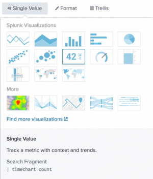
Icon
Create a custom visualization preview icon. Follow these screenshot guidelines.
| Recommendation | What to do | What to avoid | |
|---|---|---|---|
| preview.png | Provide a preview.png file in the app directory. |
If no screenshot is available, a generic image appears. |
|
| detail | Use an appropriate detail level in the screenshot. | These visualization icons are difficult to understand. | |
| size | Use an 116px by 76px image. Make sure that the image fills the available space fully. | Do not use a screenshot with gaps or borders. |
Description
Provide a visualization label and description to display in the Visualization Picker. List these attributes in the custom visualization visualizations.conf stanza.
Example visualizations.conf stanza
[single]
label = Single Value
...
description = Track a metric with context and trends.
Guidelines
Character limits
Make sure that all strings in visualizations.conf follow these character limits before publishing the app.
- Label: 30 characters
- Description : 80 characters
- Search fragment: 80 characters
Description best practices
| Recommendation | What to do | What to avoid |
|---|---|---|
| Help users decide whether to use the visualization. | Tell users what they can do with the visualization. Best practice: "Track a metric and trends over time." |
Do not describe what the visualization looks like. Avoid: "This visualization has a circle with an arrow." |
| Use active voice to engage users. | Focus on a task that users can accomplish. Best practice: "Show how a metric varies across geographic regions." |
Avoid technical descriptions of components. Avoid: "This visualization has a map that can be used with searches that generate an aggregate value." |
| Keep the description minimal. | Convey only the necessary information. Best practice: "Compare values or fields." |
Do not repeat the visualization name. Avoid: "A color meter visualization shows a value in a range." |
Best practice examples
- Horizon chart
- Use a baseline to show positive and negative changes for multiple time series.
- Real-time location tracker
- Show physical asset locations in real time.
Description template and terms
You can use the following components and term suggestions to create a custom visualization description.
| Component | Suggested terms | |
|---|---|---|
|
|
|
|
| |
|
| |
|
|
Text
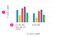
Use the following settings for all chart axis, label, and legend text. For tooltip text guidelines, see Tooltips.
- Font
- Lucida Grande typeface. Specify the CSS font-family property as shown here.
font-family: 'Lucida Grande', 'Lucida Sans Unicode', Arial, Helvetica
- Color
- #3C444D (Dark gray)
- Label settings
| 1. X- and Y-axis titles | 2. Tick mark labels | |
|---|---|---|
|
|
Color
Use one of the following color palettes.
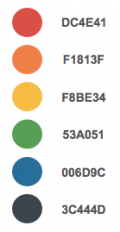
Semantic colors
Use semantic colors to show meaning. For example, these colors can indicate value ranges in a results set.
| Hex values | Palette |
|---|---|
[ '#DC4E41', '#F1813F', '#F8BE34', '#53A051', '#006D9C', '#3C444D' ] |
Categorical colors
Categorical colors show how results belong to different categories.
| Hex values | Palette |
|---|---|
[ '#006D9C', '#4FA484', '#EC9960', '#AF575A', '#B6C75A', '#62B3B2', '#294E70', '#738795', '#EDD051', '#BD9872' ] |

|
| Hex values | Palette |
|---|---|
[ '#5A4575', '#7EA77B', '#708794', '#D7C6B', '#339BB2', '#55672D', '#E6E1A', '#96907F', '#87BC65', '#CF7E60' ] |

|
| Hex values | Palette |
|---|---|
[ '#7B5547', '#77D6D8', '#4A7F2C', '#F589AD', '#6A2C5D', '#AAABAE', '#9A7438', '#A4D563', '#7672A4', '#184B81' ] |

|
Divergent colors
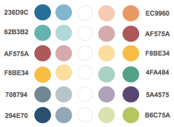
Divergent colors emphasize high and low values in a results set. Shades for values between the maximum and minimum depend on the number of bins configured for results.
| Hex values | Palette |
|---|---|
[ '#236D9C', '#EC9960' ] [ '#62B3B2', '#AF575A' ] [ '#AF575A', '#F8BE34' ] [ '#F8BE34', '#4FA484' ] '#708794', '#5A4575' ] [ '#294E70', '#B6C75A' ] |
Sequential colors
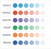
Sequential colors emphasize high values in a results set. The following hex values correspond to base colors for maximum values. Show minimum values using a lighter version of the base color.
Ensure that the minimum value appears in a visualization by using a value no lighter than 10% of the base color. Colors for values between the maximum and minimum are set according to the number of bins configured for results.
| Hex values | Palette |
|---|---|
[ '#1D92C5', '#D6563C', '#6A5C9E', '#31A35F', '#ED8440', '#3863A0' ] |
Layout
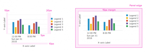
Proper spacing between tick marks, labels, and legends makes a visualization look clean and legible. Follow the spacing and margin guidelines shown here.
Spacing
| Between | Use this spacing |
|---|---|
| Y-axis label and visualization | 10px |
| X-axis label and tick mark labels | 10px |
| Visualization and legend | 20px |
| Tick mark labels and visualization | 5px |
Margin
Set a 15px margin around the visualization panel.
Chart elements
Axis and gridline color
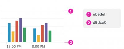
Keep gridlines and axis lines muted to maintain user focus on the data. Use the color settings shown here.
- Gridlines
- #ebedef
- Axis lines
- #d9dce0
Legend swatch
Use a 16x12px swatch for each item in a legend.
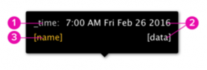
Tooltips
Padding
10px
Text settings
| Size | Line-height | Color | ||
|---|---|---|---|---|
|
1. | 12px | 16px | #CCC |
| 2. | 12px | 16px | #FFF | |
| 3. | 12px | N/A | category color |
Pointer position
Position the tooltip pointer at the center of any tooltip edge.
Display size variation
Make sure that the custom visualization accommodates different display sizes.
Guidelines
- Scale horizontally when panel or window size changes
- Best practice: Adjust all elements so that the visualization scales the whole width.
- Avoid: Do not use fixed sizes for horizontal dimensions.
- Implement a responsive design
- Best practice: For small display widths, hide unnecessary labels and other elements.
| Data handling guidelines | Custom visualizations in Simple XML |
This documentation applies to the following versions of Splunk® Enterprise: 7.1.0, 7.1.1, 7.1.2, 7.1.3, 7.1.4, 7.1.5, 7.1.6, 7.1.7, 7.1.8, 7.1.9, 7.1.10, 7.2.0, 7.2.1, 7.2.2, 7.2.3, 7.2.4, 7.2.5, 7.2.6, 7.2.7, 7.2.8, 7.2.9, 7.2.10, 7.3.0, 7.3.1, 7.3.2, 7.3.3, 7.3.4, 7.3.5, 7.3.6, 7.3.7, 7.3.8, 7.3.9, 8.0.0, 8.0.1, 8.0.2, 8.0.3, 8.0.4, 8.0.5, 8.0.6, 8.0.7, 8.0.8, 8.0.9, 8.0.10, 8.1.0, 8.1.1, 8.1.2, 8.1.3, 8.1.4, 8.1.5, 8.1.6, 8.1.7, 8.1.8, 8.1.9, 8.1.10, 8.1.11, 8.1.12, 8.1.13, 8.1.14, 8.2.0, 8.2.1, 8.2.2, 8.2.3, 8.2.4, 8.2.5, 8.2.6, 8.2.7, 8.2.8, 8.2.9, 8.2.10, 8.2.11, 8.2.12, 9.0.0, 9.0.1, 9.0.2, 9.0.3, 9.0.4, 9.0.5, 9.0.6, 9.0.7, 9.0.8, 9.0.9, 9.0.10, 9.1.0, 9.1.1, 9.1.2, 9.1.3, 9.1.4, 9.1.5, 9.1.6, 9.1.7, 9.1.8, 9.1.9, 9.2.0, 9.2.1, 9.2.2, 9.2.3, 9.2.4, 9.2.5, 9.2.6, 9.3.0, 9.3.1, 9.3.2, 9.3.3, 9.3.4, 9.4.0, 9.4.1, 9.4.2
 Download manual
Feedback submitted, thanks!