Part 7 Add a map
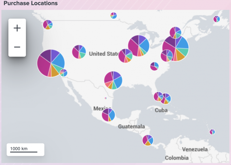
Perhaps you want to show purchases of Buttercup Games across a geographical map with each metric categorized by game type. In this part of the tutorial, create an interactive map that uses visual bubbles to illustrate purchase quantity and type.
- Select the add chart icon (
 ) in the editing toolbar, and then select Map.
 - In the New Data Source panel, name the source Purchase Locations.
- Add your search. For this tutorial, copy and paste the following search into the Search with SPL box:
index=main sourcetype=access_* action=purchase status=200 productName="*"
| iplocation clientip
| geostats latfield=lat longfield=lon count by categoryId
- Expand the Code section and change the Data Source ID to ds_purchase_locations.
- Select Apply & Close. At this point, you've created a new data source, given it a unique ID, and assigned it to the map.
- Expand the Code section and change the Visualization ID to viz_purchase_locations.
- Use the drag handle to move and resize the map to the center of the top right gray rectangle.
- To configure the map to have a different view by default, expand the Code section and add the following to the options stanza in the editor:
"options": { "center": [ 35, -100 ], "zoom": 2 }, - Add a title to the map visualization by selecting the add Markdown icon (
 ) in the editing toolbar.
 - Enter #### Purchase Locations in the text box.
- Resize and position the text box to fit above the map and inside the gray rectangle. Resize the map again if necessary to include the text.
After completing Part 7, your map looks similar to the following:
Next step
You've completed Part 7 of the Splunk Dashboard Studio tutorial.
Now your dashboard has a map showing the connection between geographic locations and purchases. Next, add a drop-down menu input to filter the visualizations you've added so far. Continue to Part 8: Add an input.
| Part 6 Add a single value visualization using a chain search | Part 8 Add an input |
This documentation applies to the following versions of Splunk Cloud Platform™: 8.2.2203, 9.0.2205, 9.0.2208, 9.0.2209

 Download manual
Feedback submitted, thanks!