Parallel coordinates
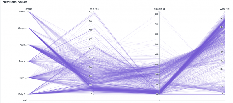
Parallel coordinates are used to depict relationships in multi-dimensional datasets. This visualization is ideal for comparing many variables together and seeing the relationships between them. Each variable is given its own axis and corresponding scale. Lines then map item values for each variable. The ordering of axes can help discover patterns or correlations across variables.
Generate a parallel coordinate
- Select the parallel coordinate chart using the visual editor by clicking the Add Chart button (
 ) in the editing toolbar and either browsing through the available charts, or by using the search option.
 - Select the chart on your dashboard so that it's highlighted with the blue editing outline.
- Set up a new data source by adding a search to the Search with SPL window if you are selecting a chart, or by clicking + Setup Primary Data Source if you've selected a shape.
- To select an existing data source, close the Configuration panel and reopen it. In the Data Configurations section, click +Setup Primary Data Source and click + Create Ad hoc Search to create a new search from this window. You can also choose a new ID that describes the search better than the default.
Configuration panel options
You can use the Configuration panel to configure the following parallel coordinates components.
Title
Give your visualization a name. This is also helpful when searching for individual visualizations in the dashboard definitions. This name is not the same as the automatically assigned unique ID.
Description
Give your visualization a description to explain what the user is viewing.
Data Configurations
You can choose one of the following data sources:
- An existing data source or create a new data source
- A chain search
- A saved search
The order of your fields must correlate with their associated columns data points. For an example, see the Parallel coordinates chart example.
Position & Size
You can use your mouse or the Position & Size section of the Configuration panel to change the size or location of the visualization for pixel-perfect sizing and placement.
Coloring
- Background - Specify the color used for the background. The default for enterprise light is "#FFFFFF". The default for enterprise dark is "#000000".
- Line Color - Specify the data source color for the lines with a hexadecimal code. For example, #FFFFFF is white.
- Line Opacity - Specify the opacity of the lines. Choose a number in the range of 0 - 1 (inclusive). You can also express the value as a percentage. For example, "0.50" in source or "50%" in UI.
Display
Use Show Null Axis to select whether you would like to show or hide the null value axis.
Code
Select your visualization or its search to view and edit the source code in real-time. You can also change the Visualization ID to a more readable ID to help identify this visualization in the source code.
Parallel coordinates chart example
The following example uses a parallel coordinate chart to demonstrate the nutritional value of different food categories.
Source code
The following source code is an example of a parallel coordinate chart.
{
    "visualizations": {
        "viz_parallelCoordinateChart": {
            "type": "splunk.parallelcoordinates",
            "options": {},
            "dataSources": {
                "primary": "ds_MsUzUdhT"
            }
        }
    },
    "dataSources": {
        "ds_MsUzUdhT": {
            "type": "ds.search",
            "options": {
                "query": "| inputlookup examples.csv\n| fields nutrients*\n| search \"nutrients_protein (g)\" != null\n| stats count by nutrients_group nutrients_calories \"nutrients_protein (g)\" \"nutrients_water (g)\" \n| fields - count"
            },
            "name": "Search_1"
        }
    },
    "defaults": {
        "dataSources": {
            "ds.search": {
                "options": {
                    "queryParameters": {
                        "latest": "$global_time.latest$",
                        "earliest": "$global_time.earliest$"
                    }
                }
            }
        }
    },
    "inputs": {
        "input_global_trp": {
            "type": "input.timerange",
            "options": {
                "token": "global_time",
                "defaultValue": "-24h@h,now"
            },
            "title": "Global Time Range"
        }
    },
    "layout": {
        "type": "absolute",
        "options": {
            "width": 1440,
            "height": 960,
            "display": "auto"
        },
        "structure": [
            {
                "item": "viz_parallelCoordinateChart",
                "type": "block",
                "position": {
                    "x": 0,
                    "y": 0,
                    "w": 700,
                    "h": 400
                }
            }
        ],
        "globalInputs": [
            "input_global_trp"
        ]
    },
    "description": "",
    "title": "Parallel coordinates example"
}
Source options for parallel coordinates
| Property | Type | Default | Description |
|---|---|---|---|
| backgroundColor | string | > themes.defaultBackgroundColor | Specify the color used for the background. The default for enterprise light is "#FFFFFF". The default for enterprise dark is "#000000". The default for prisma dark is "#0b0c0e". |
| lineColor | string | #7B56DB | Specify the dataSource color for the lines. The hexadecimal value format should be #FFFFFF. |
| lineOpacity | number | 0.5 | Specify the opacity of the lines. Choose a number in the range of 0 - 1 (inclusive). You can also express the value as a percentage. For example, "0.50" in source or "50%" in UI. |
| showNullAxis | boolean | TRUE | Select whether you would like to show or hide the null value axis. |
| Maps | Pie charts |
This documentation applies to the following versions of Splunk Cloud Platform™: 9.0.2209, 8.2.2201, 8.2.2202, 8.2.2203, 9.0.2205, 9.0.2208

 Download manual
Feedback submitted, thanks!