Adding and configuring inputs
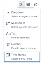
You can add, delete, and modify inputs using the visual editor. To add an input, click the Add Input icon (![]() ) and select the input you want to add.
) and select the input you want to add.
When you add inputs using the visual editor, their layout configuration is automatically generated in the dashboard definition. When you create an input in the source editor, you must add it in two places in the dashboard definition. You define the input stanza, with all of its options, in the inputs section. If you define the input ID, it must begin with input_. You must also list the unique ID of the input in the globalInputs area of the layout section.
The order that the inputs are listed in the dashboard is the order they will be listed in the source code. The global inputs are the inputs at the top of the dashboard. The dashboard definition lists global inputs in the globalInputs section. In contrast, inputs in the dashboard's canvas are not global. The dashboard definition lists canvas inputs in the structure section.
Example of input order
In the following code example, input_3Fh6Evau represents a Country input, and input_2k4rfudu represents a Region input. When viewing the dashboard, the Country input is to the left of the Region input. This order means that the globalInputs section lists input_3Fh6Evau first and input_2k4rfudu second in the source code.
{
  "visualizations": {
    "viz_USCUMdZx": {
      "type": "splunk.map",
      "options": {
        "center": [
          2.842170943040401e-14,
          0
        ],
        "zoom": 0,
        "layers": [
          {
            "type": "marker",
            "latitude": "> primary | seriesByName('lat')",
            "longitude": "> primary | seriesByName('lon')"
          }
        ]
      },
      "dataSources": {
        "primary": "ds_hf4OdRZr"
      },
      "title": "Filtered Map",
      "description": "Country: $tok_country|s$  | Region: $tok_region|s$"
    },
    "viz_hqaDICFD": {
      "type": "splunk.table",
      "dataSources": {
        "primary": "ds_LUzvuQpA"
      },
      "title": "Raw Results"
    }
  },
  "dataSources": {
    "ds_LUzvuQpA": {
      "type": "ds.search",
      "options": {
        "query": "| inputlookup geomaps_data.csv\n| iplocation device_ip\n",
        "queryParameters": {
          "earliest": "-24h@h",
          "latest": "now"
        }
      },
      "name": "Search_1"
    },
    "ds_hf4OdRZr": {
      "type": "ds.chain",
      "options": {
        "query": "| search Region IN ($tok_region|s$)",
        "extend": "ds_LUzvuQpA"
      },
      "name": "Search_2"
    },
    "ds_KvSXG9FI": {
      "type": "ds.chain",
      "options": {
        "extend": "ds_LUzvuQpA",
        "query": "| where Country=\"$tok_country$\""
      },
      "name": "Region Input"
    }
  },
  "defaults": {
    "dataSources": {
      "ds.search": {
        "options": {
          "queryParameters": {
            "latest": "$global_time.latest$",
            "earliest": "$global_time.earliest$"
          }
        }
      }
    }
  },
  "inputs": {
    "input_2k4rfudu": {
      "options": {
        "items": ">frame(label, value) | prepend(formattedStatics) | objects()",
        "token": "tok_region"
      },
      "title": "Region",
      "type": "input.multiselect",
      "dataSources": {
        "primary": "ds_KvSXG9FI"
      },
      "context": {
        "formattedConfig": {
          "number": {
            "prefix": ""
          }
        },
        "formattedStatics": ">statics | formatByType(formattedConfig)",
        "statics": [],
        "label": ">primary | seriesByName(\"Region\") | renameSeries(\"label\") | formatByType(formattedConfig)",
        "value": ">primary | seriesByName(\"Region\") | renameSeries(\"value\") | formatByType(formattedConfig)"
      },
      "hideWhenNoData": true
    },
    "input_3Fh6Evau": {
      "options": {
        "items": ">frame(label, value) | prepend(formattedStatics) | objects()",
        "token": "tok_country"
      },
      "title": "Select Country",
      "type": "input.dropdown",
      "dataSources": {
        "primary": "ds_LUzvuQpA"
      },
      "context": {
        "formattedConfig": {
          "number": {
            "prefix": ""
          }
        },
        "formattedStatics": ">statics | formatByType(formattedConfig)",
        "statics": [],
        "label": ">primary | seriesByName(\"Country\") | renameSeries(\"label\") | formatByType(formattedConfig)",
        "value": ">primary | seriesByName(\"Country\") | renameSeries(\"value\") | formatByType(formattedConfig)"
      }
    }
  },
  "layout": {
    "type": "grid",
    "options": {},
    "structure": [
      {
        "item": "viz_USCUMdZx",
        "type": "block",
        "position": {
          "x": 0,
          "y": 0,
          "w": 1200,
          "h": 400
        }
      },
      {
        "item": "viz_hqaDICFD",
        "type": "block",
        "position": {
          "x": 0,
          "y": 400,
          "w": 1200,
          "h": 400
        }
      }
    ],
    "globalInputs": [
      "input_3Fh6Evau",
      "input_2k4rfudu"
    ]
  },
  "description": "",
  "title": "Cascading Inputs"
}
You define inputs by their type. For example, a dropdown input is of type input.dropdown. You can set properties for their title and define options that depend on the input type. For example, two common options are token and defaultValue.
The following input types are supported:
input.timerange
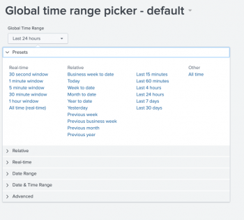
A version of this input is automatically added to every dashboard by default and is applied to all data sources except those of type ds.savedSearch. This input can be deleted or edited to set search intervals for individual data sources or global defaults. You can also add your own custom time range picker. For more information, see input.timerange
input.dropdowninput.multiselectinput.textinput.number
Add a submit button
You can add a submit button so the dashboard does not refresh until the user has selected all input choices. However, if you add a submit button, searches will not run until a user interacts with the submit button, even if the inputs have default values.
To have the dashboard load using the default input values, add the option submitOnDashboardLoad, which will automatically run searches on the first dashboard load. After the initial load, the user must select the submit button to refresh the dashboard's searches and visualizations.
You add submitOnDashboardLoad and submitButton in the layout section of the dashboard definition as options. The settings are the boolean values, true and false. When set to true, a user must click a submit button for an input selection to take effect. If set to false or if not specified at all, the dashboard will immediately refresh when a user makes a selection. If you don't add submitButton then submitOnDashboardLoad doesn't work.
The following layout example shows where to add submitOnDashboardLoad and submitButton settings:
{
	"layout": {
		"globalInputs": [],
		"type": "absolute",
		"options": {
			"submitButton": true,
			"submitOnDashboardLoad": true,
			"display": "auto-scale"
		},
		"structure": []
	}
}
Input configuration options available in the visual editor
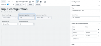
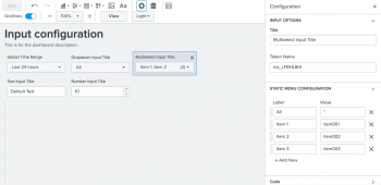
Using the visual editor, you can add, delete, and move inputs along the top of the dashboard canvas.
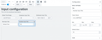
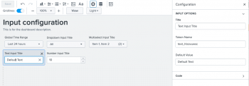
The following table lists the configuration options available to you for each input in the UI.
Input configuration options
The settings for the options field available to you will vary depending on the input type. For certain inputs like dropdown and multiselect you can use static values, dynamic values, or a combination of both. The following is a table of settings, options, and option settings for inputs. Settings are not options, but are values set at the same level as the options field.
| name | setting or option | description |
|---|---|---|
| token | option | Assign tokens values or options created by a connected data source query. |
| defaultValue | option | The default value of the input on dashboard load. This will remain the value until changed by the user. |
| items | option | Set static label/value pairs for users to select in input menus. |
| min | option | Set the minimum number a user can select for input.number.
|
| max | option | Set the maximum number a user can select for input.number.
|
| step | option | Set the interval for the up and down arrows when a user clicks them for input.number.
|
| clearDefaultOnSelection | option | When set to false the defaultValue remains selected when a user selects other options for input.multiselect. The default is true.
|
| type | setting | The type of input. For example input.multiselect, input.text.
|
| title | setting | Title of the input that will be displayed in edit & view mode. |
| Time range | Setting tokens on a visualization click |
This documentation applies to the following versions of Splunk Cloud Platform™: 9.0.2209, 8.2.2201, 8.2.2202, 8.2.2203, 9.0.2205, 9.0.2208
 Download manual
Feedback submitted, thanks!