Generate a choropleth map
To create a choropleth map, aggregate your data to create a table with one row per feature, or polygon, in the geographic feature collection you're using to draw the geospatial boundaries on the map. The color shading on each polygon in the map represents its aggregate value.
Prerequisites
- Locate and download USDM data
- Upload and configure your data
- Download a California counties shapefile
- Create a new geospatial lookup
Create a choropleth statistics table
Use the Splunk Search Processing Language (SPL) to create a table that contains aggregations corresponding to polygon names. In this case, we're mapping California by county, so you need a table with one row for each county in California.
- Navigate to the Search & Reporting app.
- Type the following into the search bar to restrict the year to 2018 and state to CA so that your table includes only the data you want to map.
source="us_drought_monitor.csv" State = CA date_year=2018 - Add the following to the search to remove the word "County" from the County field so that it matches the
featureIdfield in the lookup.
| rex field=County "(?<County>.+) County" - Add the following to calculate an aggregate drought score to synthesize the four drought severity categories into one value you can map. See the Drought Severity and Coverage Index page of the USDM website for more information about this aggregate value.
| eval droughtscore = D1 + D2*2 + D3*3 + D4*4 - Add the following to aggregate the weekly drought scores to generate a table with one row per county.
| stats avg(droughtscore) as "2018 Drought Score" by CountyAveraging the data using
avg()helps normalize the data and tighten the range over which the color bins are spread. Usingsum()ormax()to aggregate the data instead would result in a larger spread, making the bin-widths larger and generating a less informative map. - Add the following to your search to associate the polygons in your geospatial lookup file with the corresponding county row using the
geomcommand.| geom ca_county_lookup featureIdField=County
Putting the whole search together, it looks like the following (the search will eventualy require an index and a time range of All Time):
source="us_drought_monitor.csv" State = CA date_year=2018
| rex field=County "(?<County>.+) County"
| eval droughtscore = D1 + D2*2 + D3*3 + D4*4
| stats avg(droughtscore) as "2018 Drought Score" by County
| geom ca_county_lookup featureIdField=County
The results appear in the Statistics tab, and include the following:
- A County column, which serves as the
featureId. In choropleth maps, each polygon is known as a feature, and its unique name is called thefeatureId. - A 2018 Drought Score column, which is the value shaded in the choropleth map.
- A featureCollection column, which indicates the geographic feature collection from which the
geomcommand retrieved the polygon boundaries. - A
geomcolumn, which contains the geographic polygon coordinates.
The statistics table looks like the following example:
| County | 2018 Drought Score | featureCollection | geom |
|---|---|---|---|
| Alameda | 16.037 | ca_county_lookup | {"type":"MultiPolygon","coordinates":[[[[-122.31109619140625, 37.8634033203125],[-122.31109619140625, 37.8634033203125]]]]} |
| Alpine | 0 | ca_county_lookup | {"type":"MultiPolygon","coordinates":[[[[-119.93537902832031, 38.8084831237793],[-119.93537902832031, 38.8084831237793]]]]} |
| Butte | 23.843 | ca_county_lookup | {"type":"MultiPolygon","coordinates":[[[[-121.63543701171875, 40.000885009765625],[-121.63543701171875, 40.000885009765625]]]]} |
| Calaveras | 3.614 | ca_county_lookup | {"type":"MultiPolygon","coordinates":[[[[-120.21088409423828, 38.500003814697266],[-120.21088409423828, 38.500003814697266]]]]} |
Generate and configure your choropleth map
Follow these steps to transform your table into an informative choropleth map:
- Select the Visualization tab below the search bar.
- Ensure the visualization type is set to Choropleth Map. If not, select the name of the current visualization type and choose Choropleth Map under Recommended.
- Zoom to California to view your map by clicking the + button or double-clicking the map.
- (Optional) Increase the number of bins to create a more informative visualization.
- Click Format > Colors.
- Under Number of Bins, select a higher number such as 8 or 9. Using more bins increases the number of shades representing groups of drought score values and reflects more subtle differences between counties.
- (Optional) To preserve your zoom settings for the next time you run the search, select Populate with current map settings under General.
- Save your map to a dashboard.
- Select Save as > Existing Dashboard or New Dashboard
- Under Dashboard, select New.
- Under Dashboard Title, enter
CA Drought Monitor. - Under Panel Title, enter
Drought score by county. - Under Panel Content, select
Choropleth Map. - Click Save.
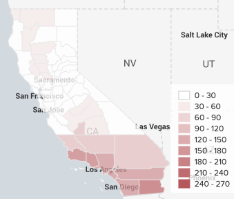
The finished product is the following choropleth map that demonstrates the severity of drought conditions by California county in 2018:
To zoom in further and inspect a specific subregion of California, select Tiles > Populate from preset configuration > Open Street Map to change the background layer to a more detailed map.
Next step
(Optional) Use Trellis view to visualize multiple aggregate functions
| Create a new geospatial lookup | (Optional) Use Trellis view to visualize multiple aggregate functions |
This documentation applies to the following versions of Splunk Cloud Platform™: 9.3.2411, 8.2.2112, 8.2.2201, 8.2.2202, 8.2.2203, 9.0.2208, 9.0.2205, 9.0.2209, 9.0.2303, 9.0.2305, 9.1.2308, 9.1.2312, 9.2.2403, 9.2.2406, 9.3.2408 (latest FedRAMP release)

 Download manual
Feedback submitted, thanks!