Use the Alerts dashboard
The Alerts dashboard gives you information on the alerts that the Splunk App for Unix and Linux has triggered, when those alerts triggered, and which hosts the alerts have triggered on. It also displays alert severity (as has been configured for each alert in the Settings: Alerts dialog.)
How the Alerts dashboard works: An example scenario
Following is an example scenario on how the Alerts dashboard works:
It's 10am on Monday and, as the data center manager for your enterprise, you receive a report of a system outage the previous night.
To investigate what went wrong, you open the Splunk App for Unix and Linux and review the alerts that triggered overnight in the Alerts dashboard. First, you click the time range picker in the Alert Time Range panel and select "Last 24 hours" because you know from the report that the outage occurred within that period. The Splunk App for Unix and Linux updates the page to show alerts that have triggered in the last 24 hours. You notice that a large number of alerts occurred around 1:30am that morning.
You click and drag in the area on the Alert Time Range where the spike of events is, and the Splunk App for Unix and Linux updates the Statistics and Summary panels to show alerts that occurred in that timeframe. There you discover that all of your application servers triggered Memory_Exceeds_Percent_by_Host alerts. You click an alert link in the Summary panel and the Splunk App for Unix and Linux opens a detailed screen with information about when the alert triggered, the host that triggered the alert, and a snapshot of CPU, memory, process, and commands that were running at the time the alert fired. Using this panel, you find out that something caused your application servers to consume all available memory and crash. This coincides with the report that services went offline.
You take screenshots of the failure and email the engineering, software development, and management teams with the details. Soon afterward, the software development team acknowledges that the latest code changes might have introduced a bug which, in certain circumstances, causes application servers to exhaust all available memory. They roll back the change and, after a few days of tests, find and fix the memory exhaustion bug. Soon afterward, they roll out updated code to the application servers with no adverse effects. The Splunk App for Unix and Linux helped resolve and prevent future outages.
Alerts dashboard overview
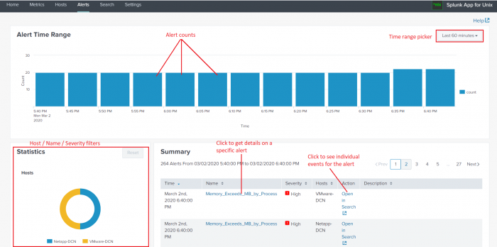
The Alerts dashboard splits into three panels:
- The Alert time range panel on the top displays a timeline that shows the number of alerts that have arrived within a given time period. You can also select a custom time period from the time range picker.
- The Statistics panel in the lower left displays information about which hosts have triggered alerts, which alerts have triggered, and the severity of those alerts. You can drill down into specifics about hosts that triggered alerts and find out how many alerts the host triggered.
- The Summary panel on the lower right shows a listing of the most recent alerts that have triggered.
Choose the alert time range
You can choose the time range to show alerts from. In the Alert Time Range panel, select the desired time range the time range picker.
The Splunk App for Unix and Linux updates the Statistics and Summary panel to include only events that have occurred since the chosen time period.
Statistics
The Statistics panel displays three donut charts which show:
- The number of Hosts that have fired alerts in the time range selected in the Alert Time Range panel.
- The Names of the alerts that have fired in this time period.
- The Severity of the alerts that have triggered in this period.
Each donut chart divides into different color slices depending on how many hosts, alerts, or severity levels are present in the selected time range.
You can get specific information about a single host by clicking one of the color slices in the Hosts donut chart. The donut chart updates to show you how many alerts that host triggered during the selected time range, and the Summary panel updates to show information on alerts that include the selected host.
Similarly, the Name donut chart allows you to filter which alerts have fired. When you click on a donut chart slice for a specific alert, the chart updates to show you how many times that alert has fired in the selected time range. The Summary panel also updates to show you only those alerts.
The Severity donut chart allows you to filter alerts based on severity. When you click a slice in that chart, the chart updates to show the number of times that alerts of the selected severity level have triggered in the selected time frame. The Summary panel also updates with only alerts of the selected severity level.
You can reset the filter for each donut chart by click the reset link inside each chart.
Summary
The Summary panel shows you information about the alerts that have triggered in a specific time range which you select using the Alert Time Range picker or custom range selector, as well what you filter by using the Statistics donut charts.
For the selected time range and filter level, it displays:
- The time the alert fired.
- The name of the alert that fired.
- The alert's severity.
- The host(s) which triggered the alert.
- A link which allows you to open the underlying search which fired the alert.
- A description of the alert.
The Summary panel displays 10 alerts per page by default. You can see earlier alerts by using the pagination links on the upper right corner of the Summary panel.
You can sort each column in the Summary panel in ascending or descending order by clicking on the link in the column.
Get details on an alert

Click for a larger image
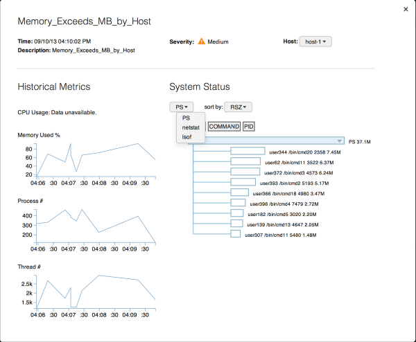
The Name column in the Alert Summary shows a list of the names of the alerts that have fired in the selected time range. When you click on the name for a specific alert, the Splunk App for Unix and Linux opens a page that contains detailed information about the specific alert. It lists:
- The time that the alert fired.
- A description of the alert.
- The alert's severity.
- A list of hosts that triggered the alert at that time. You can select the other hosts that triggered the same alert at the same time.
- Graphs that show historical information about CPU usage, memory usage, number of processes, and number of threads around the time that the alert fired. You can click each graph to get search results that power the graph.
- A System Status subpanel that shows statistics on commands that were running at the time the alert fired. You can select the available commands and sort them by various statistics.
To close the information page on the alert, click anywhere on the screen outside of the alert page.
| Use the Hosts dashboard | Troubleshoot the Splunk App for Unix and Linux |
This documentation applies to the following versions of Splunk® App for Unix and Linux (EOL): 6.0.0, 6.0.1, 6.0.2

 Download manual
Feedback submitted, thanks!