Proactive Monitoring
Use the Proactive Monitoring dashboard to quickly troubleshoot your environment and get to the details to identify problems in your infrastructure. You can see how different entities in your environment perform for different performance metrics. Use this data to directly manage any performance concerns that you have in your IT environment (at scale) and to prevent bottlenecks and outages in other areas of the enterprise.
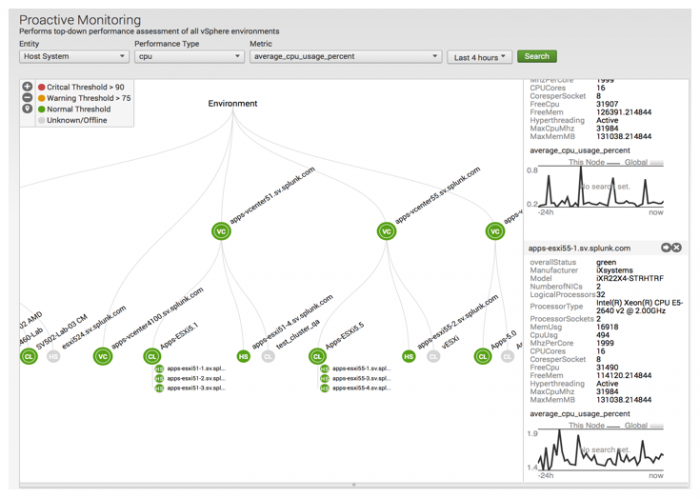
The main focus of the Proactive Monitoring dashboard is the topology tree, built from topology information from vCenter. The topology tree provides insight to the overall state of your virtual environment. The tree is sorted based on the count of critical entities in your environment, with the most critical entities shown on the left hand side of the tree.
You can:
- Change how you view the topology tree. You can display the topology from the host system or the virtual machine perspective.
- Change the performance metric type displayed. The tree is redrawn to display your environment for the new metric.
- Navigate around your environment expanding and reducing the view of your environment.
- Drill down to the entity level to get a more detailed view of that entity.
- Compare how entities perform for different metrics.
The data displayed in the topology map is performance data based on the metrics data that the app collects and uses to monitor the performance of your environment. Note that in the Splunk App for VMware, the performance metric name (for example, average_cpu_usage) and the value used to measure it (percent) are connected as shown by the display name for the metric (average_cpu_usage_percent).
The Topology Tree
The Topology tree is a top down representation of the hierarchy of the entities in your VMware environment (from the selection point). The environment displayed by the topology tree depends upon how you navigate to the Proactive Monitoring dashboard. The entire tree is sorted based on the count of critical em the left hand side will always have the most critical stuff.
- Drill down from the Home dashboard. In this case the tree displayed is predetermined by the source of the data. For example, if you click High CPU Usage in the Hosts panel and drill down to the Proactive Monitoring dashboard from the Home dashboard, the tree is generated and populates with information from the host level for the metric used to determine High CPU Usage (average_cpu_usage_percent).
- Navigate using the App menu. You can navigate to the Proactive Monitoring view using the App menu. In this case the tree is generated when you use the drop-down lists to filter your selection for displaying the topology map of your environment.
Each node in the tree represents an entity in your environment. Environments, virtual centers, clusters, and hosts stack horizontally in the tree. Virtual machines are displayed in a vertical stacks underneath their parent host node, to the right side of the anchor point. Each of the entities are sorted by criticality (red, yellow, green).
The severity levels displayed by each node (and node indicator) are driven by the thresholds set for the metrics selected. You can change a metric for the displayed entities or change the entity and the tree updates and repopulates with the latest information (within seconds).
You can select how you want to view your environment. You can view the topology map down to the hosts system level or get a complete view down to the virtual machine level. The ability to pan across the topology map or zoom in to specific entities enables you to get the visibility you need to actively monitor your environment.
The color coding of the nodes on the topology tree provides a bottom up indication of the status of your environment. Nodes are colored red, yellow, or green indicating the level of criticality in the entity or in the child entities. This color coding gives you a quick status of the node. You can get more details when you hover over a node to display the associated tooltip.
You can compare the entities for selected metrics when you pin them on the pinboard. You can drill down on nodes in the topology tree to more detailed views of specific entities to find the root cause of problems in your environment.
Use the drop-down lists on the dashboard to filter your selection for displaying the topology map of your environment.
To create a topology map using the drop-down lists:
- Select an Entity type. This can be virtual machine or host system.
- Select a Performance Type. This is the type of performance data (such as cpu, mem, disk, and so on) upon which to base the performance measurement of your environment.
- Select a Metric. Each performance data type has a set of metrics associated with it. Metrics have thresholds set for them in the Splunk App for VMware. The level of criticality in the system is determined by the average of the metric for a particular entity in relation to the metric's threshold settings.
- Select a time range over which you want to run the search.
- Click Search to create the topology map.
The topology tree populates only if you have set values in the drop-down lists on the dashboard. These values power the searches that generates the topology map.
Note that the topology tree does not function in real time.
Nodes
A node represents a single entity in your VMware vSphere hierarchy. It contains references to its parents and children, threshold status, name, identifiers, and so on. Nodes are used to show the overall state of the entity it represents (cluster, host, virtual machine) and are color coded to provide a quick view of the state of your environment. The nodes display green, yellow, or red depending on the state of the environment. Nodes at the virtual machine level are organized by criticality. Virtual machines that are in the most critical state appear higher in the hierarchy, while those in a healthier state appear lower on the hierarchy.
Nodes have a status associated with them. All leaf nodes show a single color, which is the status for that node, while parent nodes display a color indicating the highest level of criticality for the nodes in the environment below it. Parent nodes also display node status indicators. You can:
- Hover on a node to display the tooltip for the node.
- Click on a node to expand it and display the child nodes.
- Pin a node to the dashboard so that you can compare the details of that node with other nodes.
Node status indicator
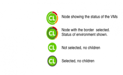
The node status indicator is a doughnut indicator that encompasses a node. Only nodes that have children (parent nodes) display this indicator. It provided a quick view into the status of your environment. The absence of an indicator indicates that the node does not have children and does not expand further.
The node status indicator can be divided into three segments to show the state of the selected performance metric for the entities in the environment. A metric for an entity can be in one of four states - normal, warning, critical, or unknown/offline. Each segment of the three segment chart around the node indicates the portion of children nodes in each of the three status states (red, yellow, green). The color of the node itself (the color in the center) indicates the status of the largest group of entities in your environment.
Tooltips
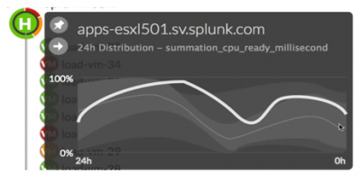
A tooltip is displayed when you hover on a node in the topology map. Tooltips are displayed for specific entities (virtual machines, hosts, clusters) in your environment. They display data for that entity, the complete environment, and/or a branch of the hierarchy.
Using the tooltip you can:
- See the state of the metric (in this example, summation_cpu_ready_millisecond) measured for the selected entity over time.
- Pin the entity. This enables you to compare it ( on the pinboard) to other entities in your environment.
- Drill down to get detailed information on the entity.
For example, if you hover over a virtual machine, the tooltip displays the following information:
- The name of the virtual machine.
- The the time range over which the data is mapped.
- The metric used to measure the performance of the particular virtual machine.
- A distribution stream chart that maps performance data distribution over time for a selected metric.
- The white line on the tooltip represents the performance of the virtual machine or the average of all nodes in the branch mapped for the specific metric selected, over the specific time range.
- The light grey line is the global median.
- The light grey zone displays results within 1 standard deviation of the global median.
- The dark grey zone displays results within 2 standard deviations of the global median.
Note:Host information is displayed in the tooltip when host is selected.
Pinning an entity
Having the ability to compare data for different entities in your environment is very powerful. In the Splunk App for VMware you can organize and compare various parts of your environment for different performance metrics and different entities.
The pinboard in the Proactive Monitoring dashboard is used to store pinned entities in your environment. A pinned entity is one that you selected in the topology tree to save to the pinboard so that you can compare it with other entities. Pinned entities stay on the dashboard even when you change the entity and metric used to monitor the behavior of your environment. You can drill down on the entities within a pinned entity.
The pinboard is a collection of detailed views. When a parent node is pinned, detail information for it and the child entities is displayed in the detail pinned panel. When a leaf node is pinned, a detail pinned panel is displayed showing information only for that entity.
Note that the data displayed for pinned entities is not affected by changing the time range on the page. Pinned entities are not preserved upon reloading a page. Once a page reloads you must pin entities once again. You can delete the entity or minimize it. All other actions on the page have no effect on it.
To pin an entity:
- Hover over a node to display the tooltip for that node.
- Click the pin in the tooltip.
- The entity is pinned on the pinboard.
- The detail pinned panel is displayed for the particular entity.
Virtual Center detail pinned panel
When you pin a virtual center to the pinboard, detailed information about the virtual center is displayed in the detail pinned panel. This information includes the following:
- A title bar showing the name of the virtual center and a link to navigate to details page (arrow).
- The total number of hosts managed by the virtual center.
- The total number of virtual machines on the hosts.
- The number of clusters.
- For each host, a sparkline chart is displayed that shows the event count trend for cpu performance for the hosts. Now you can easily compare systems and see patterns in your data that may have been invisible before. For example, if you monitor cpu performance (based on percentage usage) of the host systems in your environment, when you pin a virtual center (or cluster) to the pinboard, a sparkline chart is displayed that shows the event count trend for cpu performance for the hosts over the specified time period for the selected metric.
Cluster detail pinned panel
When you pin a cluster to the pinboard, the following information is displayed in the detail pinned panel for the cluster:
- A title bar that shows the name of the cluster and a link to navigate to details page (arrow).
- AvgEffCpu_MHz. The total available CPU resources of all hosts within a cluster (in MHz).
- AvgEffMem. The total amount of memory of all hosts in the cluster that can be used for virtual machine memory.
- A list of all of the hosts in the cluster. The following is displayed for each host:
- An indicator showing the current status of the host. The list of hosts is sorted by criticality, with the most critical shown at the top of the list.
- The name of the host.
- A sparkline chart that shows the event count trend for the host for the specific performance metric.
Host detail pinned panel
When you pin a host system to the pinboard, detailed information about the host is displayed in the detail pinned panel. This information includes, but is not limited to, the following:
- A title bar showing the host name and a link to navigate to details page (arrow).
- The overall status of the host (green, yellow, red).
- The manufacturer and model number of the host.
- System specifications such as the number of NICs, processors, and sockets.
- Memory and cpu usage of the host.
- Information about the cores.
- A chart showing the last 24 hours of processing load on the host system for the selected metric.
Virtual Machine detail pinned panel
When you pin a virtual machine to the pinboard, the following information is displayed in the tooltip for the virtual machine:
- A title bar. The tooltip title bar displays the virtual machine name and a link to navigate to the virtual machine details page (arrow).
- Power State. This shows if the virtual machine is powered on.
- numCPU. The number of vCPUs allocated to the virtual machine.
- guestFullName. The full name of the guest operating system installed and running in the virtual machine.
- toolsStatus. The status of VMTools, if it is installed.
- numCoresPerSocket. The number of cores per virtual socket.
- memorySizeMB. The amount of memory (in MB) allocated to the virtual machine.
- cpuReservation. The guaranteed cpu (in MHz) allocated to the virtual machine.
- memoryReservation. The guaranteed memory allocated to the virtual machine to ensure stable performance.
- memSharesLevel. The memory allocation level for the virtual machine.
- memSharesShares.
- cpuSharesLevel. The cpu allocation level for the virtual machine.
- cpuSharesShares.
- Performance chart. A graph showing the load on the virtual machine for the last 24 hour period. This is overlaid on a chart of the average load for all virtual machines on this host.
| Knowledge Objects | Virtual Machine Detail |
This documentation applies to the following versions of Splunk® App for VMware (EOL): 3.1, 3.1.1, 3.1.2, 3.1.3, 3.1.4, 3.2.0, 3.2.1, 3.2.2, 3.3.0


 Download manual
Feedback submitted, thanks!