Advanced Threat dashboards
Use the Advanced Threat dashboards to identify potential threats in your environment.
Threat List Activity
| Information for this dashboard is currently a work in progress; expect frequent near-term updates. |
Use the Threat List Activity dashboard to detect threat activity in your deployment, determined by known threats from threat list information.
Click on chart elements or table rows on this dashboard to display the raw events that are represented.
These field filter options are available:
| Filter | Description |
|---|---|
| Data Model | Specifies the data model (from a drop-down list) for the search. Available data models are shown in the drop-down list. Choose a data model on which to base your search. |
| IP Address | Specifies the IP address for the search. Enter an IP address for the search. |
| Threat List | Specifies the Threat List for the search. Choose all of the available threat lists, or a specific threat list for the search. |
| Time picker | Specify the time range for the search. |
Choose a data model, IP address, threat list, and time range and click Search.
Dashboard panels
| Panel | Description |
|---|---|
| Dashboard filter | Restricts the view on the current dashboard to events that match the selected criteria. Selections apply to the current dashboard only. These filters are available:
|
| Threat List Activity Over Time | |
| Most Active Threat Lists | |
| Most Active Threats | |
| Recent Threat List Activity |
Drilldown is available for graphs and tables. See dashboard drilldown for more information.
For information on configuring the Threat List Activity dashboard, see "Threat List Activity" in the Splunk App for Enterprise Security Installation and Configuration Manual.
HTTP Category Analysis dashboard
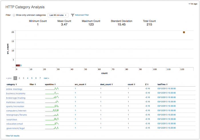
The HTTP Category Analysis dashboard looks at categories of traffic data. Any traffic data -- firewall, router, switch, or network flows -- can be summarized and viewed in this dashboard.
Use the unknown categories filter in the HTTP Category Analysis dashboard to find 'unknown' HTTP traffic. Compare statistical data to identify outliers in your traffic, different from what is typically found in your environment. Look for category counts that fall outside of the norm (small or large) that may indicate a possible threat. Find low volume traffic activity and drill down from the summarized data to investigate events. Use sparklines to identify suspicious patterns of activity by category.
Summary statistics
The HTTP Category Analysis dashboard collects and calculates statistics to help analyze the categories present in your environment. These summary statistics are calculated based on the time period selected on the time picker for analysis.
The statistics that are calculated include:
- Minimum Count: Represents the minimum category count found in the data sample.
- Mean Count: Represents the average category count in the data sample.
- Maximum Count: Represents the maximum category count found in the data sample.
- Standard Deviation: The standard deviation (or variance from the average) of category counts found in this data set. A low standard deviation number indicates that the category counts are very close to the mean or average; high number indicates that the category counts are spread out over a large range of values.
- Unique Count: The total number of unique category events in this data set.
Unknown traffic categories
Click the "Show only unknown categories" filter on the HTTP Category Analysis dashboard to filter and view unknown categories of web traffic.
You will need to define unknown categories using tags.conf. For instance, to specify the category "undetected" as an unknown category, create the following local/tags.conf configuration.
## TA-websense/local/tags.conf
[category=undetected]
unknown = enabled
This stanza can be created in any add-on or in DA-ESS-NetworkProtection.
Dashboard filters
The dashboard includes filters that can help to reduce the category list. The basic filters include:
- Time Picker - Select the time range menu from the drop-down to search over and collect data to be analyzed.
- Advanced Filter - Click to see the list of categories that can be filtered. In the list panel, click "Previous" and "Next" to scroll through the list.
Use the Advanced Filter with the HTTP Category Analysis dashboard
Click Advanced Filter to see the list of category events that can be filtered for this dashboard. In Filter Results from Panel, click an item to whitelist it and remove it from the dashboard view. Click Update to return to the dashboard and refresh the view.
See "Advanced Filter" in this manual for information about the using the Advanced Filter to whitelist or blacklist events.
Category analysis scatter plot
The category counts are displayed as a scatter chart, with count as the x-axis and src_count as the y-axis. Use the filters to change the time range to view. The chart updates when you change the filters or the time range. Hover over an item to see details.
Category table
The table view in the HTTP Category Analysis dashboard displays each of the categories and details found in the data used to populate the dashboard.
The data fields include:
| Column name | Value |
|---|---|
| category | name of the category (for example, computers/internet, business, education, malicious, blogs) |
| filter | any filter specified for the category (for example, whitelist, blacklist, none) |
| sparkline | activity from this category over 24 hours |
| src_count | number of sources for this category |
| dest_count | number of destinations for this category |
| count | total number of events for category |
| Standard Deviations (Z) | The variance from the average of category count found in this data set. The percentage (%) indicates the amount of data that would be excluded (filtered out) by using that number of standard deviations as filter. |
| lastTime | most recent event for category |
Sparklines in the table show the activity from a category over the past 24 hours. You can control the timeframe and span shown by the sparkline using macros. See "Configure sparklines" in the Splunk App for Enterprise Security Installation and Configuration Manual for details on configuring sparkline macros.
For information on configuring the HTTP Category Analysis dashboard, see "HTTP Category Analysis" also in the Installation and Configuration Manual.
HTTP User Agent Analysis dashboard
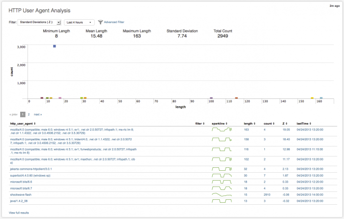
Use the HTTP User Agent Analysis dashboard to investigate long user agent strings in your proxy data and determine if there is a possible threat to your environment. A bad user agent string, where the browser name misspelled (like Mozzila) or the version number is completely wrong (v666), can indicate an attacker or threat.
The Advanced Filter can be used to whitelist or blacklist specific user agents. Use the statistical information to visually identify outliers. In the summarized data, you can evaluate user agents for command and control (C&C) activity, and find unexpected HTTP communication activity.
Long user agent strings are often an indicator of malicious access. Use the HTTP User Agent Analysis dashboard to statistically profile the user agent strings accessing your environment, to identify user agent strings that are different from what is typical. User agent strings that fall outside of the normal size (small or large) may indicate a possible threat that should be looked at and evaluated.
Summary statistics
The HTTP User Agent Analysis dashboard collects and calculates a number of statistics to help with the analysis of user agent strings in your environment. These summary statistics are calculated based on the time period selected on the time picker for analysis. The statistics that are calculated include:
- Minimum Length: Represents the shortest user agent string found in the data sample.
- Mean Length: Represents the average length of a user agent string in the data sample.
- Maximum Length: Represents the longest user agent string found in the data sample.
- Standard Deviation: The standard deviation (or variance from the average) of user agent strings found in this data set. A low standard deviation number indicates that the user agent string lengths are very close to the mean or average; high number indicates that the length agent strings are spread out over a large range of values.
- Unique Count: The total number of unique user agent strings in this data set.
Dashboard filters
The dashboard includes a number of simple and advanced filters that can help to reduce the user agent list. The basic filters include:
- Standard Deviations (Z) - The default is to show all user agent string counts for the selected time period. The percentage (%) shows the amount of the data that will be excluded (filtered out) by using that number of standard deviations. Choose a larger number of deviations to see fewer user agent strings; choose a smaller number of deviations to see a greater number of user agent strings.
- Time Picker - Select the time range menu from the drop-down to search over and collect data to be analyzed.
- Advanced Filter - Click to see the list of user agent strings that can be filtered. In the list panel, click "Previous" and "Next" to scroll through the list.
Use the Advanced Filter with the HTTP User Agent Analysis dashboard
Click Advanced Filter to see the list of user agent strings that can be filtered for this dashboard. In the Filter Results from Panel, click an item to whitelist it and remove it from the dashboard view. Click Update to return to the dashboard and refresh the view.
See "Advanced Filter" in this manual for information about the using the Advanced Filter to whitelist or blacklist events.
User agent string scatter plot
The user agent strings are displayed as a scatter chart, with length as the x-axis and count as the y-axis. Use the filters to change the time range to view. The chart updates when you change the filters or the time range. Hover over an item to see details about the raw data.
User agent table
The table view in the HTTP User Agent Analysis page displays each of the user agent strings and related details found in the data used to populate the dashboard.
The data fields include:
| Column name | Value |
|---|---|
| http_user_agent | user agent string name |
| filter | name of any specified filter |
| sparkline | activity trend for this user agent string over 24 hours |
| length | byte length of user agent string |
| count | total number of events for this user agent string |
| Standard Deviations (Z) | The variance from the average of user agent strings found in this data set. The percentage (%) indicates the amount of data that would be excluded (filtered out) by using that number of standard deviations as filter. |
| lastTime | most recent event for this user agent string |
Sparklines in the table show the activity from a user agent string over the past 24 hours. You can control the time frame and span shown by the sparkline using macros. See Configure sparklines for details on configuring sparkline macros.
Click on a row in the user agent table to see the raw data for that event, displayed in the Search dashboard. Click View full results to see all of the results for the table in the Search dashboard.
For information on configuring the HTTP User Agent Analysis dashboard, see "HTTP User Agent Analysis" in the Splunk App for Enterprise Security Installation and Configuration Manual.
New Domain Analysis dashboard
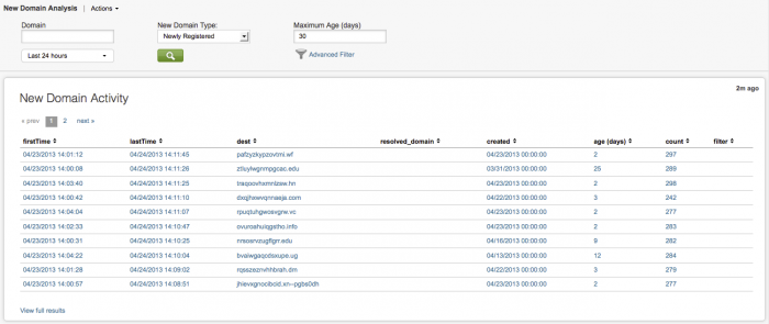
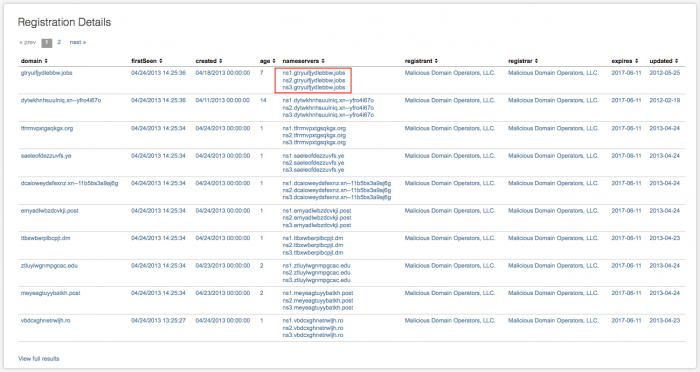
The New Domain Analysis dashboard shows any new domains that appear in your environment. These domains can be newly registered, or simply newly seen by the app. Panels display New Domain Activity events, New Domain Activity by Age, New Domain Activity by Top Level Domain (TLD), and Registration Details for these domains.
Use the New Domain Analysis dashboard to view hosts talking to recently registered domains. Discover outlier activity directed to newly registered domains in the New Domain Activity by Age panel. Identify unexpected top level domain activity in the New Domain Activity by TLD panel.
If there is a high count of new domains, use the dashboard to drill down and investigate, to find out if you have a Trojan, botnet, or other malicious entity, active in your deployment.
Dashboard filters
The dashboard includes a number filters to help reduce the list of domains displayed. The basic filters include:
- Domain - Type in the domain (Access, Endpoint, Network)
- New Domain Type - Select Newly Registered or Newly Seen to filter the types of domains to be viewed.
- Maximum Age (days) - The time range for the newly seen or newly registered domains. The default is 30 days.
- Time Picker - Select the time range to search over and collect data to be analyzed. Use the drop-down menu to change the time range.
- Advanced Filter - Click to see the list of all current domains that can be filtered. In the list panel, click "Previous" and "Next" to scroll through the list.
Use the Advanced Filter with the New Domain Analysis dashboard
Click Advanced Filter to see the list of domains that can be filtered for this dashboard. In the Filter Results from Panel, click an item to whitelist it and remove it from the dashboard view. Click Update to return to the dashboard and refresh the view.
See "Advanced Filter" in this manual for information about the using the Advanced Filter to whitelist or blacklist events.
Dashboard panels
| Panel | Description |
|---|---|
| New Domain Activity | A table view of information about new domain activity |
| New Domain Activity by Age | A scatter chart with with Age as the x-axis and Count as the y-axis. Hover over a square for the exact age and number of new domains.
|
| New Domain Activity by TLD (Top Level Domain) |
A bar chart with Count as the x-axis and TLD as the y-axis. Hover over a bar for the current number of events for a top level domain.
|
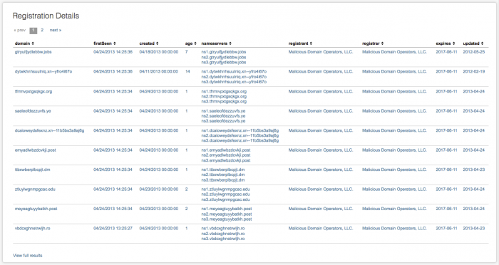
| Registration Details | A table view of information about new domain registrations |
The New Domain Activity panel includes these fields:
| Column name | Value |
|---|---|
| firstTime | the first time this domain was seen |
| lastTime | most recent event for this domain |
| dest | destination domain |
| resolved_domain | the resolved domain name |
| created | date and time domain was created |
| age(days) | the age of the domain in days |
| count | total number of events for this domain |
| filter | filter for this domain, if any (none, whitelist, or blacklist) |
Click on a table row for details about the specific new domain events that generated the summarized data. A table with the additional information about new domain activity is shown beneath the New Domain Activity table.
The details panel includes these fields:
| Column name | Value |
|---|---|
| firstTime | the first time this domain was seen |
| lastTime | most recent event for this domain |
| sparkline | trend for activity from this domain over 24 hours |
| src | IP address for the new domain |
| dest | destination domain |
| user | name of user (if available) |
| count | total number of events for this domain |
Sparklines in the table show the activity from a new domain over the past 24 hours. You can control the timeframe and span shown by the sparkline using macros. See Configure sparklines in the Splunk App for Enterprise Security Installation and Configuration Manual for details on configuring sparkline macros.
Click View full results to see all of the raw data summarized, along with the raw search string.
Notice that there may be more than one name server associated with the new domain.
The Registration Details panel includes these fields:
| Column name | Value |
|---|---|
| domain | the domain name |
| firstSeen | time of first event for this domain |
| created | date and time domain was created |
| age | age of the domain (in days) |
| nameservers | servers used by this domain |
| registrant | This is the name of the organization that registered the domain |
| registrar | This is the name of the organization with which the domain is registered For example, "Verisign" is a domain registrar that holds the domain registration data for "splunk.com." In this instance the "registrant" would be "Verisign" and the "registrar" would be "Splunk" (assuming that the data could be retrieved correctly). |
| expires | date that the domain expires |
| updated | This date is the last time the registrant updated their WHOIS database |
Click View full results to see all of the raw data summarized, along with the raw search string that generated the data.
For information on configuring the New Domain Analysis dashboard, see "New Domain Analysis" in the Splunk App for Enterprise Security Installation and Configuration Manual.
Traffic Size Analysis dashboard
Use the Traffic Size Analysis dashboard to investigate traffic data byte lengths to find those connections with a large byte count per requests, or those that are making a high number of connection attempts, but with small byte count sizes. Any traffic data -- firewall, router, switch, or network flows -- can be summarized and viewed in this dashboard.
Use the Traffic Size Analysis dashboard to compare traffic data with statistical data to find outliers, traffic that differs from the what is normal in your environment. Use the graph to spot suspicious patterns of data being sent. Drill down into the summarized data to look for anomalous source/destination traffic.
Summary statistics
The Traffic Size Analysis dashboard collects and calculates a number of statistics to help with the analysis of the byte size of traffic events in your HTTP and proxy data.
The statistics that are calculated include:
- Minimum Bytes: Represents the shortest byte length found in the data sample.
- Mean Bytes: Represents the average byte length of a traffic event in the data sample.
- Maximum Bytes: Represents the longest byte length found in the data sample.
- Standard Deviation: The standard deviation (or variance from the average) of URL strings found in this data set. A low standard deviation number indicates that the URL string lengths are very close to the mean or average; high number indicates that the length of URL strings are spread out over a large range of values.
- Total Count: The total number of traffic events in this data set.
These summary statistics are calculated based on the time period selected on the time picker for analysis. Use the statistics to compare each byte lengths for traffic events to identify those byte lengths that are different from what is typically found in your environment. Byte lengths that fall outside of the normal size (small or large) may indicate a possible threat that should be looked at and evaluated.
Dashboard filters
The dashboard includes a number of simple and advanced filters that can help to reduce the volume of the traffic size events list.
The filters include:
- Standard Deviations (Z) - The default is to show all traffic events for the selected time period. The percentage (%) shows the amount of the data that will be excluded (filtered out) by using that number of standard deviations. Choose a larger number of deviations to see fewer traffic events; choose a smaller number of deviations to see a greater number of traffic events.
- Time Picker - From the drop-down menu, select the time range to search over and collect data to be analyzed.
- Advanced Filter - Click to see the list of traffic events. In the list panel, click "Previous" and "Next" to scroll through the list.
Use the Advanced Filter with the Traffic Size Analysis dashboard
Click Advanced Filter to see the list of traffic events that can be filtered for this dashboard. In Filter Results from Panel, click an item to whitelist it and remove it from the dashboard view. Click Update to return to the dashboard and refresh the view.
See "Advanced Filter" in this manual for information about the using the Advanced Filter to whitelist or blacklist events.
Traffic Size Analysis chart
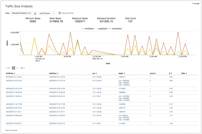
The chart displays the minimum, average, and maximum bytes of traffic as a line graph over time, using time as the x-axis and bytes as the y-axis. Use the filters to change the time range to view. The chart refreshes when you change the filters or time range. Hover over a line for more detail.
Traffic Size Analysis table
The table view in the Traffic Size Analysis dashboard displays each of the traffic events and details found in the data used to populate the dashboard.
The data fields include:
| Column name | Value |
|---|---|
| firstTime | first time this traffic event was seen |
| lastTime | most recent traffic event |
| src | source IP address for traffic event |
| bytes | total number of bytes for this event |
| count | total number of events |
| Z | The variance (standard deviation) of this traffic event from the average byte count of traffic events in this data set |
| filter | name of any specified filter(s), for example, none, whitelist or blacklist |
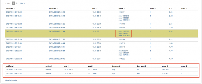
If there is more that one event from a source IP address, the count column shows how many events have been seen. In the bytes column, the minimum, maximum, and average number of bytes for the traffic event are shown.
Click on a table row for details about the specific traffic events that generated the summarized data. A table with the additional information is shown beneath the Traffic Size Analysis table.
In the details table, these fields provide more information about a specific event or set of events:
| Column name | Value |
|---|---|
| lastTime | most recent traffic event |
| action | action associated with this event (for example allowed or blocked) |
| src | source IP address for traffic event |
| dest | destination IP address for the traffic event |
| transport | the transport protocol used (for example, udp or tcp_ |
| dest_port | destination port number for the traffic event |
| bytes | the total number of bytes set |
| count | total number of traffic events |
Click View full results to see the raw search that generated all of the events shown in the main table.
For information on configuring the Traffic Size Analysis dashboard, see "Traffic Size Analysis" in the Splunk App for Enterprise Security Installation and Configuration Manual.
URL Length Analysis dashboard
The URL Length Analysis dashboard looks at any proxy or HTTP data that includes URL string information. Any traffic data containing URL string or path information -- firewall, router, switch, or network flows -- can be summarized and viewed in this dashboard.
Use the URL Length Analysis dashboard to compare each URL statistically to identify outliers. Investigate long URLs that have no referrer. Look for abnormal length URLs that contain embedded SQL commands for SQL injections, cross-site scripting (XSS), embedded command and control (C&C) instructions, or other malicious content. Use the details table to see how many assets are communicating with the URL.
Use the dashboard statistics to compare each new URL and identify URL strings that are different from what is typically found in your environment. URLs that fall outside of the normal size (small or large) may indicate a possible threat. Unusually long URL paths from unfamiliar sources and/or to unfamiliar destinations are often indicators of malicious access and should be looked at and evaluated
Select a standard deviation by which to determine if a URL string is long, to control the volume of data that is returned in the search, so that only the connections greater than the standard deviation are displayed.
Summary statistics
The URL Length Analysis dashboard collects and calculates a number of statistics to help with the analysis of URL strings in your HTTP and proxy data. These summary statistics are calculated based on the time period selected on the time picker for analysis. The statistics that are calculated include:
- Mean Length: Represents the average length of a URL string in the data sample.
- Maximum Length: Represents the longest URL string found in the data sample.
- Standard Deviation: The standard deviation (or variance from the average) of URL strings found in this data set. A low standard deviation number indicates that the URL string lengths are very close to the mean or average; high number indicates that the length of URL strings are spread out over a large range of values.
- Unique Count: The total number of unique URL strings in this data set.
Dashboard filters
The dashboard includes a number of simple and advanced filters that can help to reduce the volume of the user agent string list.
The filters include:
- HTTP Method - Choose HTTP, get, or post. Use "HTTP Method" to view URLs from HTTP requests. Choose "get" to view GET requests where no referrer exists in proxy or HTTP data, so that you can find potential outbound threats due to applications or malicious software. Choose "post" to view inbound POST requests where no referrer exists in proxy or HTTP data.
- HTTP Referrer - Use "HTTP Referrer" to view only those URLs with HTTP referrer data in the URL. Choose "any" to view any URL, whether or not it contains HTTP referrer information. Choose "-" to view only those URLs with no HTTP referrer data in the URL.
- Standard Deviations (Z) - The default is to show all URLs for the selected time period. The percentage (%) shows the amount of the data that will be excluded (filtered out) by using that number of standard deviations. Choose a larger number of deviations to see fewer URLs; choose a smaller number of deviations to see a greater number of URLs.
- Time Picker - From the drop-down menu, select the time range to search over and collect data to be analyzed.
- Advanced Filter - Click to see the current list of URLs. In the list panel, click "Previous" and "Next" to scroll through the list.
Use the Advanced Filter with the URL Length Analysis dashboard
Click Advanced Filter to see the list of events that can be filtered for this dashboard. In the Filter Results from Panel, click a URL to whitelist it and remove it from the dashboard view. Click Update to return to the dashboard and refresh the view. To blacklist a URL, click View/edit filtered entries. In the editor, type "blacklist" in the filter column for that URL.
See "Advanced Filter" in this manual for information about the using the Advanced Filter to whitelist or blacklist events.
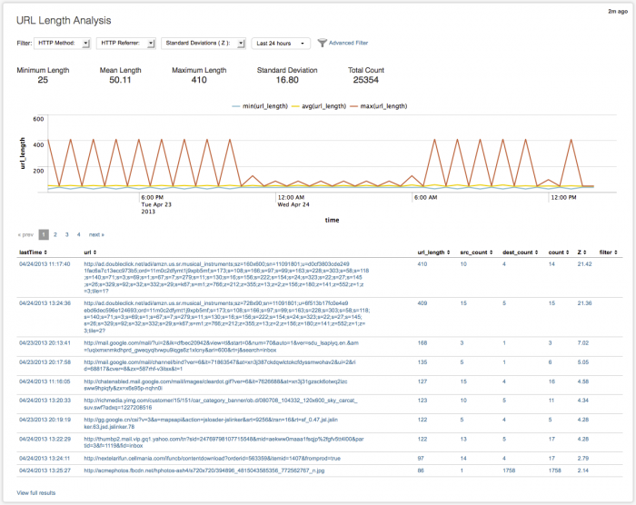
URL Length chart
The chart displays the minimum, average, and maximum URL lengths over time, using time as the x-axis and url_Length as the y-axis. Use the filters to change the time range to view. The chart refreshes when you change the filters or time range. Hover over a line for more detail.
URL Length table
The table view in the URL Length Analysis dashboard displays each of the URL strings and details found in the data used to populate the dashboard.
The data fields include:
| Column name | Value |
|---|---|
| lastTime | time of most recent event for this URL |
| uri_string | URI string name |
| src | source IP address of the URL |
| dest | destination IP address for the URL |
| url | contents of the URL |
| url_length | character length of URL string |
| count | the number of events for this URL |
| Z | The variance (standard deviation) of this URL from the average length of URLs in this data set |
| filter | name of any specified filter(s), for example, whitelist or blacklist |
Click on a row to see the raw events for that summary data, displayed in the Search dashboard. At the bottom of the panel, click View full results to see all of the raw data summarized, along with the raw search string.
For information on configuring the URL Length Analysis dashboard, see "URL Length Analysis" in the Splunk App for Enterprise Security Installation and Configuration Manual.
| Risk Analysis | Access dashboards |
This documentation applies to the following versions of Splunk® Enterprise Security: 3.1, 3.1.1, 3.2, 3.2.1, 3.2.2



 Download manual
Feedback submitted, thanks!