Custom visualizations in the Machine Learning Toolkit
The Splunk Machine Learning Toolkit includes several reusable custom visualizations that you can use in your own dashboards. Each visualization expects data in a certain format with certain fields, that you can see in the syntax portion of the visualization descriptions.
To apply a custom visualization to your data:
- Run a search from the Search page in the Splunk Machine Learning Toolkit or the default Search & Reporting app on the Splunk platform.
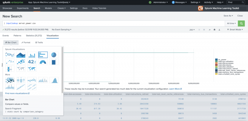
- Click the Visualization tab, then click the menu at the top left to display available visualizations.
- Select a visualization.
You can use these custom visualizations on any Splunk platform instance on which the Splunk Machine Learning Toolkit is installed.
Many of these visualizations are also displayed when using particular Machine Learning Toolkit Assistants including the Predict Numeric Fields Assistant, Detect Numeric Outliers Assistant, Forecast Time Series Assistant, and Cluster Numeric Events Assistant.
3D Scatter Plot
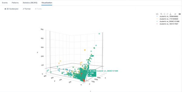
Use the 3D Scatter Plot to see patterns in your data. Look for clusters of similar data points, or drill down to identify singular data points.
Users upgrading to version 4.4.0 of the MLTK where a custom theme is in place for the 3D Scatter Plot must change the 3D Scatter Plot background color format setting to the new option of Auto for the visualization to adhere to your global light/ dark Splunk dashboard theme.
Syntax
| eval clusterColor = case(clusterId=0, "teal", clusterId=2, "#09B1DF")
| table clusterId x y z clusterColor
The clusterColor parameter is optional. The clusterColor parameter supports written color names or any hex color code. To review the list of supported color names, see the GitHub bahamas10 css color names. If no clusterColor parameter is provided the scatter plot uses default css colors supported in all modern web browsers.
The | table clusterId x y z line must be provided for the visualization to render properly.
Example
The following example uses 3D Scatter Plot on a test set.
| inputlookup firewall_traffic.csv
| eval clusterId=serial_number, x=bytes_received, y=bytes_sent, z=packets_received, clusterColor = case(clusterId="sn_0009C101998", "#56BD93")
| table clusterId x y z clusterColor
Example output
Boxplot Chart
Use the Boxplot Chart to show the minimum, lower quartile, median, upper quartile, and maximum of each field.
Syntax
search_fragment = | boxplot ...
Boxplot requires the input of the macro | `boxplot` in order to render. Failing to include the macro displays an error.
The box plot chart visualization expects five rows corresponding to min, max, median, lower quartile and upper quartile, in any order.
exactperc25is the lower quartileexactperc75is the upper quartile
Example
The following example uses Boxplot Chart on a test set.
... | inputlookup app_usage.csv | `boxplot`
Downsampled Line Chart
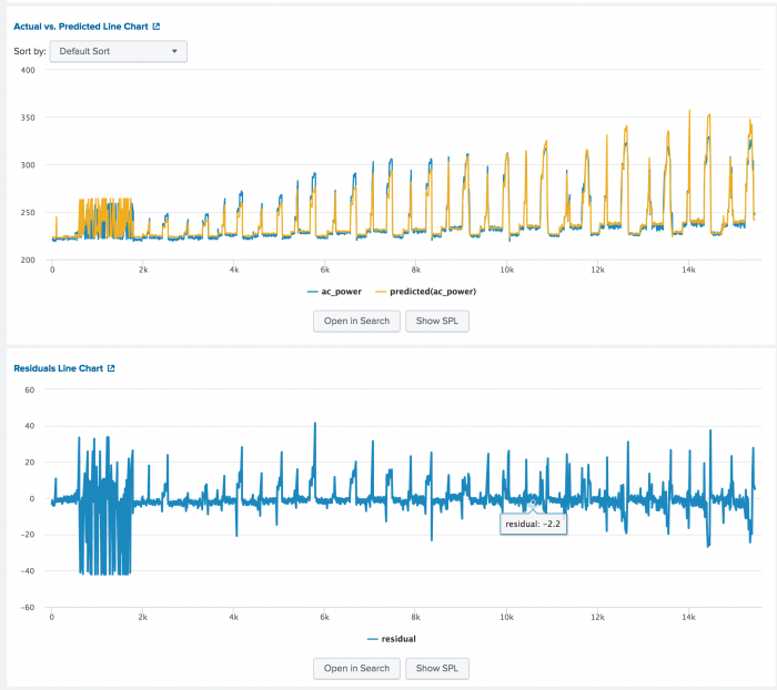
Use the Downsampled Line Chart to show values and trends over time implementing downsampling to show large numbers of points.
The following image shows the Actual vs. Predicted Line Chart and the Residuals Line Chart that are also available when using the Predict Numeric Fields Assistant.
Syntax
search_fragment = | table <xAxis> <yAxis1> <yAxis2> ...
Example
The following example uses Downsampled Line Chart on a test set.
... | table _time, "median_house_value", "predicted(median_house_value)" ...
Forecast Chart
Use the Forecast Chart to show the forecasted value for data This visualization is available in the Forecast Time Series Assistant and Smart Forecasting Assistant, which use different macros to produce the output:
- The Forecast Time Series Assistant uses the
fitorpredictcommands with the ARIMA algorithm. - The Smart Forecasting Assistant uses the
fitcommand with the StateSpaceForecast algorithm.
The following image shows the Forecast Chart on test data.
Syntax
search_fragment = | fit ARIMA [_time] <field_to_forecast> order=<int>-<int>-<int> [forecast_k=<int>] [conf_interval=<int>] [holdback=<int>] | `forecastviz(<forecast_k>, <holdback>, <field_to_forecast>, <conf_interval>)`
search_fragment = | fit StateSpaceForecast variable_name1 [variable_name2] [variable_name3] [variable_name4] [variable_name5] output_metadata=true [conf_interval=<int>] | `smartforecastviz(<variable_name1> [,<variable_name2>] [, <variable_name3] [, <variable_name4] [, <variable_name5>])`
Examples
The following examples use Forecast Chart on a test set.
| inputlookup exchange.csv | fit ARIMA _time rate holdback=5 conf_interval=95 order=1-0-1 forecast_k=10 as prediction | `forecastviz(10, 5, "rate", 95)`
| inputlookup app_usage.csv | fields CRM ERP Expenses | fit StateSpaceForecast CRM ERP output_metadata=true holdback=0 forecast_k=50 conf_interval=50 into app_usage_model | `smartforecastviz(CRM, ERP)`
Histogram Chart
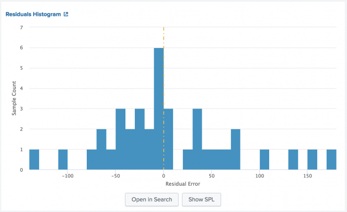
Use the Histogram Chart to show continuous data as bucketed by the bin command.
The following image shows the Residuals Histogram that is available when using the Predict Numeric Fields Assistant.
Syntax
search_fragment = | bin <field> bins=<number>
Example
The following example uses Histogram Chart on a test set.
... | bin residual bins=100 ...
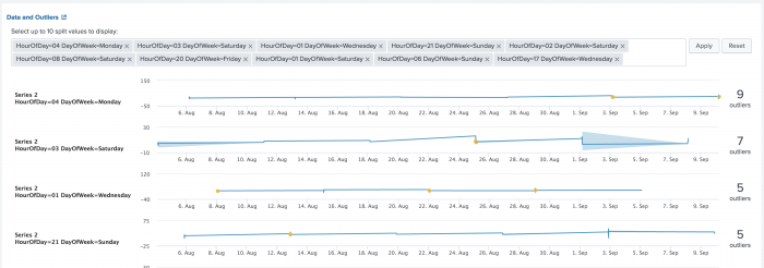
Outliers Chart
Use the Outliers Chart to show the acceptable range for a value and to highlight the points that are outside of this range.
The following image shows the Outliers Chart that is also available when using the Detect Numeric Outliers Assistant.
Syntax
search_fragment = | table _time, outlier_variable, lowerBound, upperBound
Example
The following example uses Outliers Chart on a test set.
... | table _time, quantity, lowerBound, upperBound, isOutlier ...
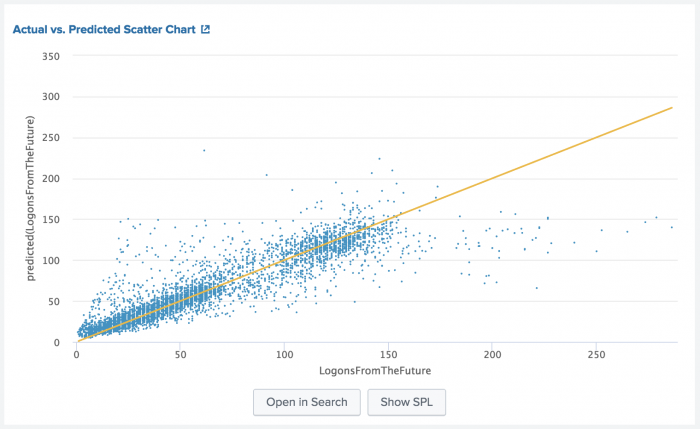
Scatter Line Chart
Use the Scatter Line Chart to show the relationships between discrete values in two dimensions, as well as an additional identity (x=y) line.
The following image shows the Actual vs. Predicted Scatter Chart that is also available when using the Predict Numeric Fields Assistant.
Syntax
search_fragment = | table <xAxis> <yAxis>
Example
The following example uses Scatter Line Chart on a test set.
... | table "median_house_value" "predicted(median_house_value)" ...
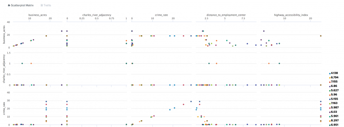
Scatterplot Matrix
Use the Scatterplot Matrix to show the relationships between discrete values in multiple dimensions.
All field values must be numeric in order to render the Scatterplot Matrix.
The following example shows the Scatterplot Matrix that is also available when using the Cluster Numeric Events Assistant.
Syntax
search_fragment = | table <name_category>, <dimension_1>, <dimension_2>, <dimension_3> ...
Example
The following example uses Scatterplot Matrix on a test set.
... | table cluster, "avg_rooms_per_dwelling", "business_acres", "median_house_value" ...
| Search macros in the Machine Learning Toolkit | Algorithms in the Machine Learning Toolkit |
This documentation applies to the following versions of Splunk® Machine Learning Toolkit: 4.4.0, 4.4.1, 4.4.2, 4.5.0








 Download manual
Feedback submitted, thanks!