Create an overlay chart and explore visualization options
In this example, you create a chart that overlays two data series as lines over three data series as columns. The overlay chart will show Actions such as Adds To Cart and Purchases on one type of chart and the Conversion Rates, such as Views To Purchases, in another type of chart.
You will use the stats command to count the user actions. The eval command is used to calculate the conversion rates for those actions. For example, how often someone who viewed a product also added the product to their cart.
This example uses the productName field from the Enabling field lookups section of this tutorial.
If you do not configure the field lookups, the searches in this section will not produce the correct results.
Let's start by a running a search and viewing the results as a chart.
- Start a new search.
- Change the time range to All time.
- Run the following search.
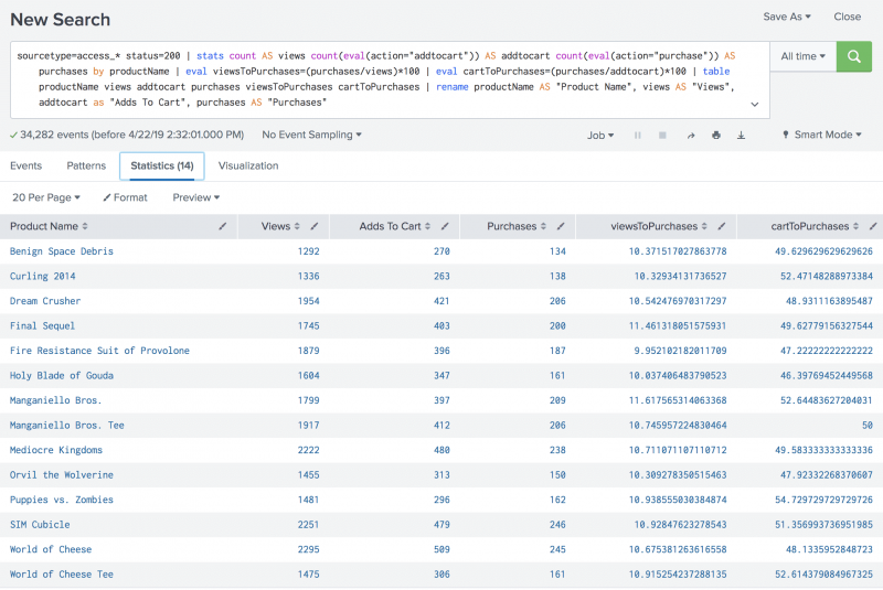
sourcetype=access_* status=200 | stats count AS views count(eval(action="addtocart")) AS addtocart count(eval(action="purchase")) AS purchases by productName | eval viewsToPurchases=(purchases/views)*100 | eval cartToPurchases=(purchases/addtocart)*100 | table productName views addtocart purchases viewsToPurchases cartToPurchases | rename productName AS "Product Name", views AS "Views", addtocart as "Adds To Cart", purchases AS "Purchases"The
evalcommand is used to define two new fields. These fields contain the conversion rates.- The viewToPurchases field calculates the number of customers who viewed the product to the number of customers who purchased the product. The calculation returns a percentage.
- The cartToPurchases field calculates the number of customers who added the product to their cart to the number of customers who purchased the product. The calculation returns a percentage.
- Click the Visualization tab.
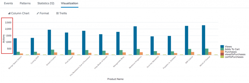
This is the same chart in the section Create a basic chart, with two additional data series, viewsToPurchases and cartToPurchases.
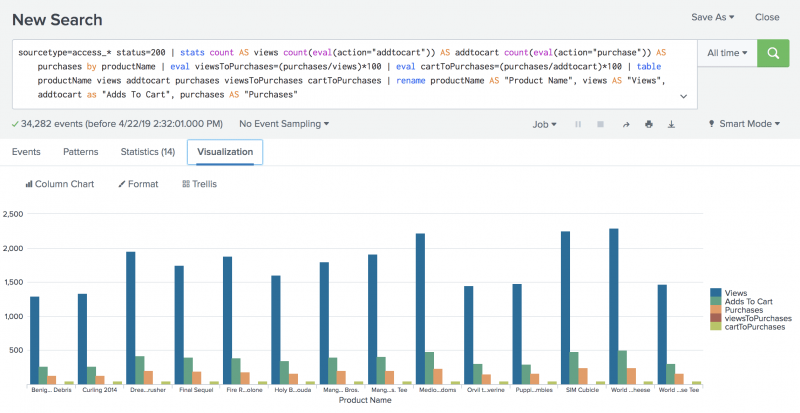


The next few steps reformat the chart visualization to overlay the two data series for the conversion rates, onto the three data series for the actions.
Format the X-Axis labels
Notice that the labels on the X-Axis are truncated. Because there are so many products, the labels are truncated making them difficult to read. Let's fix that.
- Click Format and X-Axis.
- For Label Rotation select the second option, which is -45 degrees.
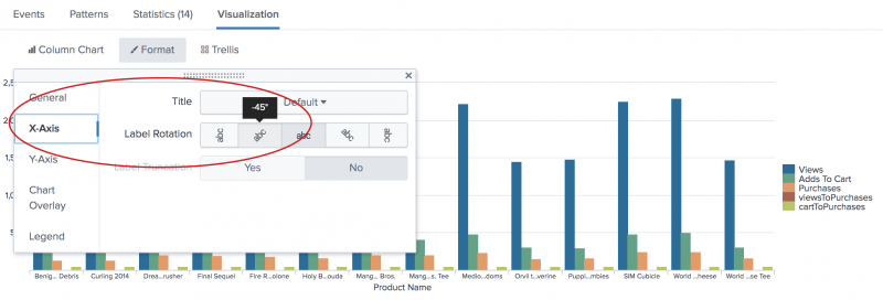
- Close the Format dialog box.
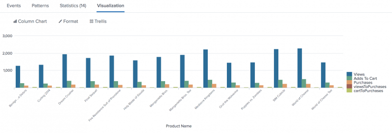
Notice the change in the labels on the X-Axis.


Format the Y-Axis values and add a title
Look at the numbers on the Y-Axis. The numbers range from 1000 to 3000 and there is no title to identify what that axis tracks. Let's make the chart easier to read,
- Click Format and Y-Axis.
We're going to add a title and specify different number intervals on the Y-Axis. - For Title, choose Custom and type
Actions. - For Interval type
500. - For Max Value type
2500.
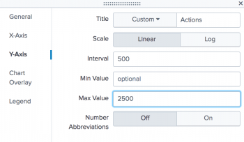
- Close the Format dialog box. Notice the changes to the label and values on the Y-Axis.


Format the second Y-Axis
Look at the legend. It shows that some of the columns represent actions such as Views and Purchases, and some columns represent conversion rates such as viewsToPurchases. The actions are counts of the values in specific fields. The conversion rates are percentages. These two types of information should be shown separately.
- To fix this issue, click Format and Chart Overlay.
To separate the actions from the conversion rates, you can overly one set of values over another set of values. In this example you will overlay the conversion rates, as lines, over the actions, which will remain as columns. - For Overlay, click inside the box. Begin and select viewsToPurchase. Click inside the box again and select cartToPurchase. This identifies the two series that you want to overlay on to the column chart.
- For View as Axis, click On.
- For Title, choose Custom
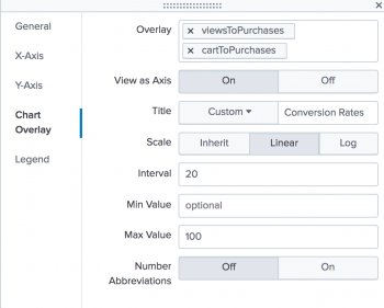
- Type
Conversion Rates. - For Scale, click Linear.
- For the Interval type
20. For the Max Value type100. - Close the Format dialog box. Notice that the conversion rates now appear as lines in the chart.
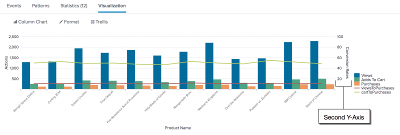


The axis on the right side of the chart is called a second Y-Axis. The label and values for the line series appear on this axis.
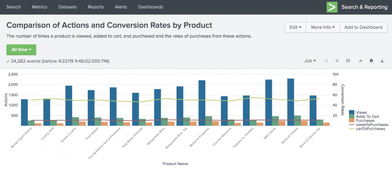
Save the revised chart as a report
You've made great changes to the chart to make it more readable. Now it's time to save the chart as a report.
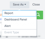
- Click Save As and select Report.
- In the Save Report As dialog box, for Title type
Comparison of Actions and Conversion Rates by Product. - For Description, type
The number of times a product is viewed, added to cart, and purchased and the rates of purchases from these actions. - Click Save
- In the confirmation dialog box, click View.


Next step
Create a report from a custom chart
See also
stats command in the Search Reference
eval command in the Search Reference
Chart overview in Dashboards and Visualizations
| Create a basic chart | Create a report from a custom chart |
This documentation applies to the following versions of Splunk® Enterprise: 7.3.0, 7.3.1, 7.3.2, 7.3.3, 7.3.4, 7.3.5, 7.3.6, 7.3.7, 7.3.8, 7.3.9, 8.0.0, 8.0.1, 8.0.2, 8.0.3, 8.0.4, 8.0.5, 8.0.6, 8.0.7, 8.0.8, 8.0.9, 8.0.10, 8.1.0, 8.1.1, 8.1.2, 8.1.3, 8.1.4, 8.1.5, 8.1.6, 8.1.7, 8.1.8, 8.1.9, 8.1.10, 8.1.11, 8.1.12, 8.1.13, 8.1.14
Feedback submitted, thanks!